Begyn
Role
UX Designer & Consultant (group project)
UX Designer & Consultant (group project)
Timeline
June-July 2021
June-July 2021
Skills
UX
User story mapping
Information architecture
UX
User story mapping
Information architecture
Tools
Figma & FigJam
Figma & FigJam
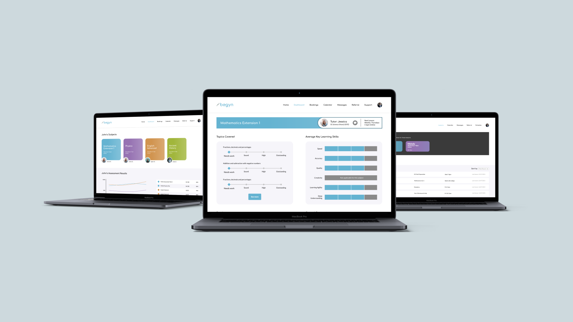
Begyn is an online platform that helps parents find trusted private tutors for their children, to help them get ahead in class. Together in a group of four, I designed a learning dashboard for Begyn, where parents could track their child’s learning progress over time as well as enabling tutors to manage their students.
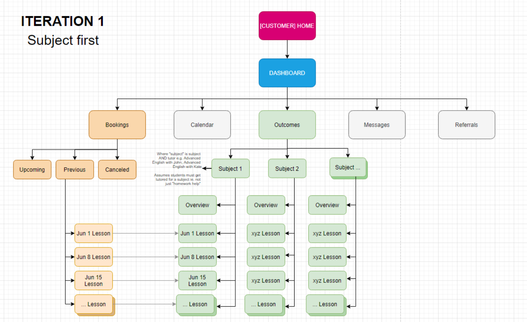
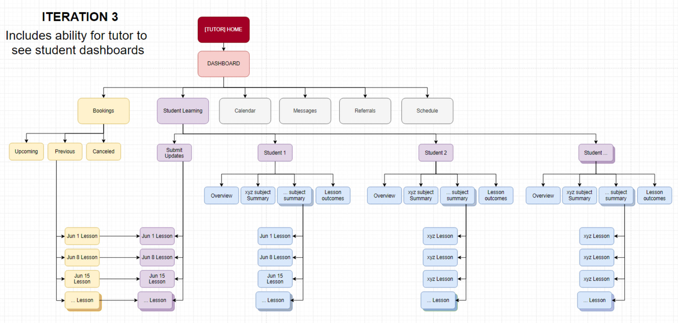
Through this project, I was introduced to the processes of user story mapping and information architecture for the first time. This provided us with a framework for ensuring our designs could feasibly be developed, which helped to prioritise our design decisions.
Through this project, I was introduced to the processes of user story mapping and information architecture for the first time. This provided us with a framework for ensuring our designs could feasibly be developed, which helped to prioritise our design decisions.
The Brief
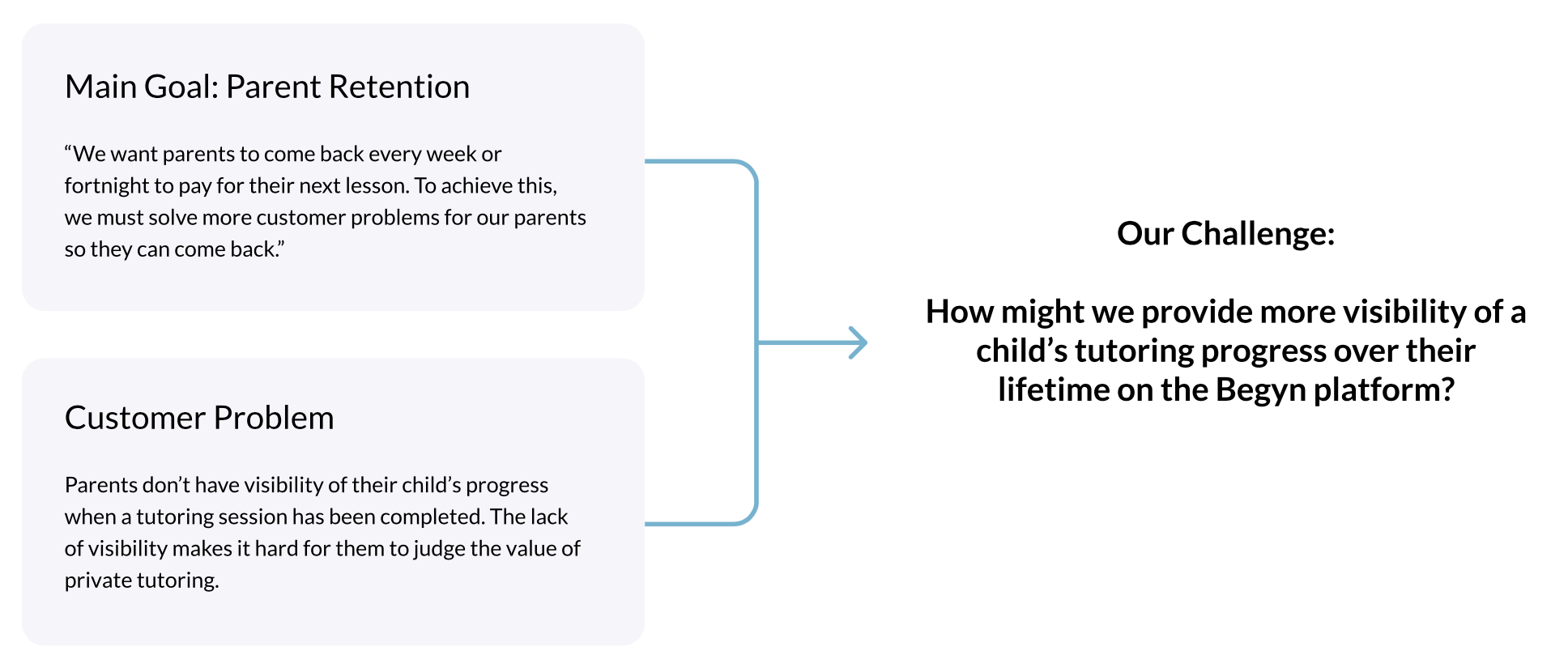
Based on customer interviews conducted by Begyn, it was discovered that parents did not have visibility of their child’s progress when a tutoring session had been completed. Specifically, most parents were unaware of what topics were being taught during each lesson, how it relates to the school curriculum, what homework the parent needs to support the child with, and more importantly, whether or not their child was learning successfully. These factors made it difficult to judge the value and effectiveness of private tutoring.
The challenge for us was therefore to design a method that would increase visibility of a child’s tutoring progress over their lifetime on the Begyn platform.
![]()
The challenge for us was therefore to design a method that would increase visibility of a child’s tutoring progress over their lifetime on the Begyn platform.
Design Process
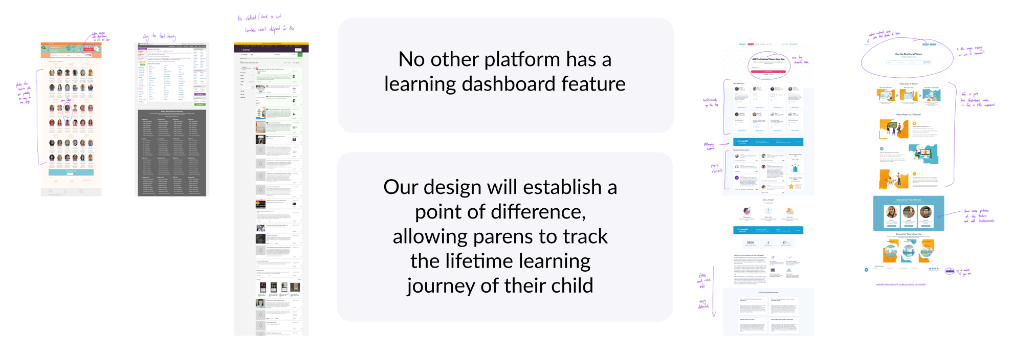
We began our design process by conducting a competitor analysis of websites including Tutorfinder, Highschooltutors, Gumtree and Airtasker, where parents could seek out tutors within their local area. We found that no other platform had a learning dashboard feature which would establish a point of difference for Begyn.
![]()
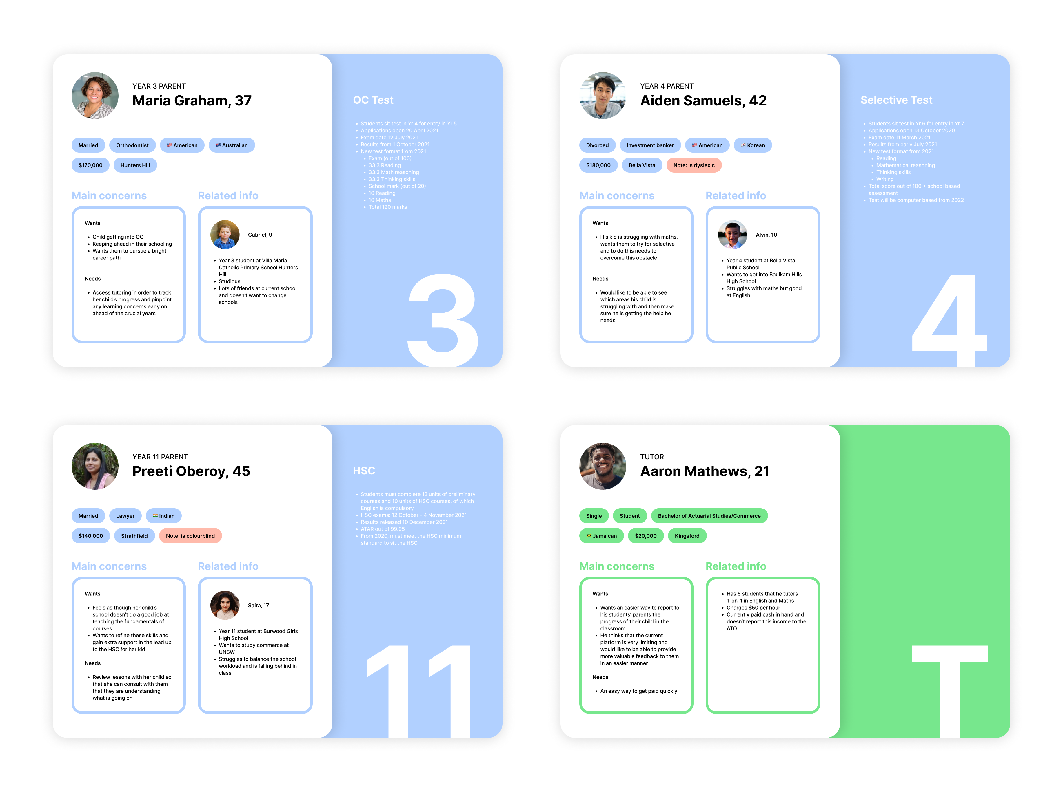
Next, we developed personas for year 3, 4, and 11 parents as well as a tutor. We chose these specific year groups to align with the OC, Selective and HSC exams which are the main reasons why students seek out tutoring.
![]()
Based on these personas, we consolidated our main design goals and established our story map and information architecture to form the basis of our designs.
![]()
![]()
![]()
![]()
Next, we developed personas for year 3, 4, and 11 parents as well as a tutor. We chose these specific year groups to align with the OC, Selective and HSC exams which are the main reasons why students seek out tutoring.
Based on these personas, we consolidated our main design goals and established our story map and information architecture to form the basis of our designs.


Prototyping
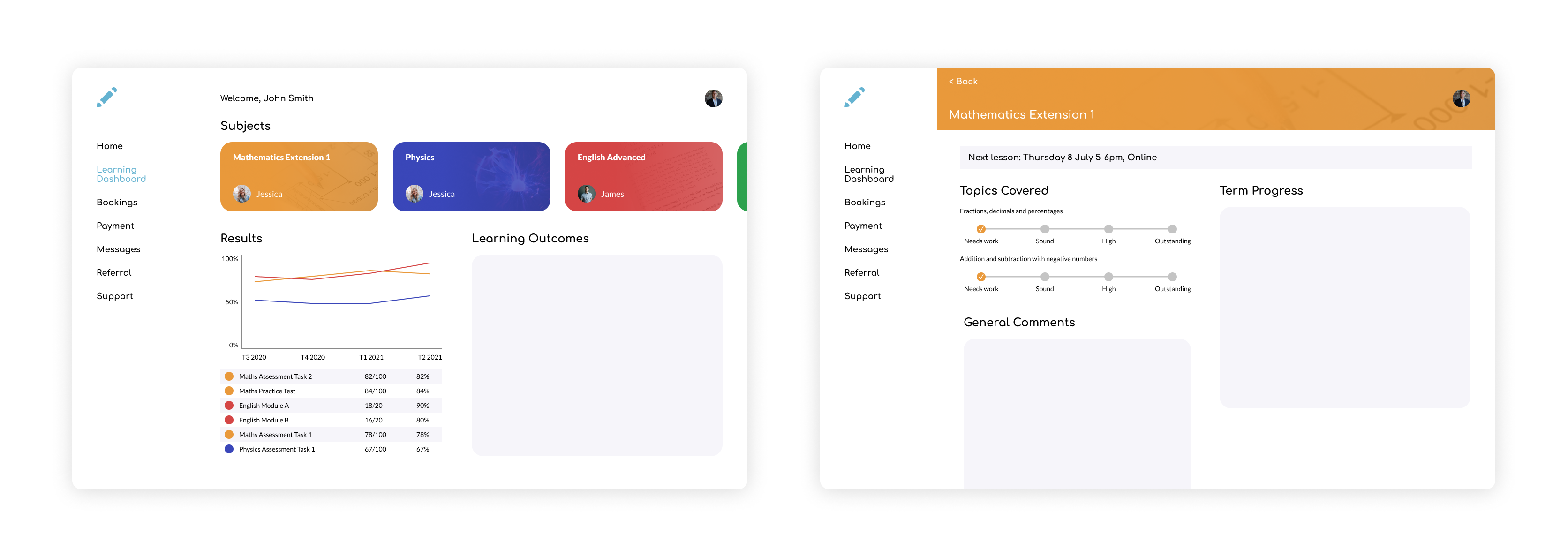
Based on the decided metrics, we each designed our own version of what we envisaged the learning dashboard to look like. My first iteration is shown below.
![]()
We then combined the best aspects from our four designs to create the next iteration. One of the main changes was reverting the menu bar back to the top of the page, to better suit the conventions of the desktop site. Vertical scrolling and other touch-based features were also removed.
![]()
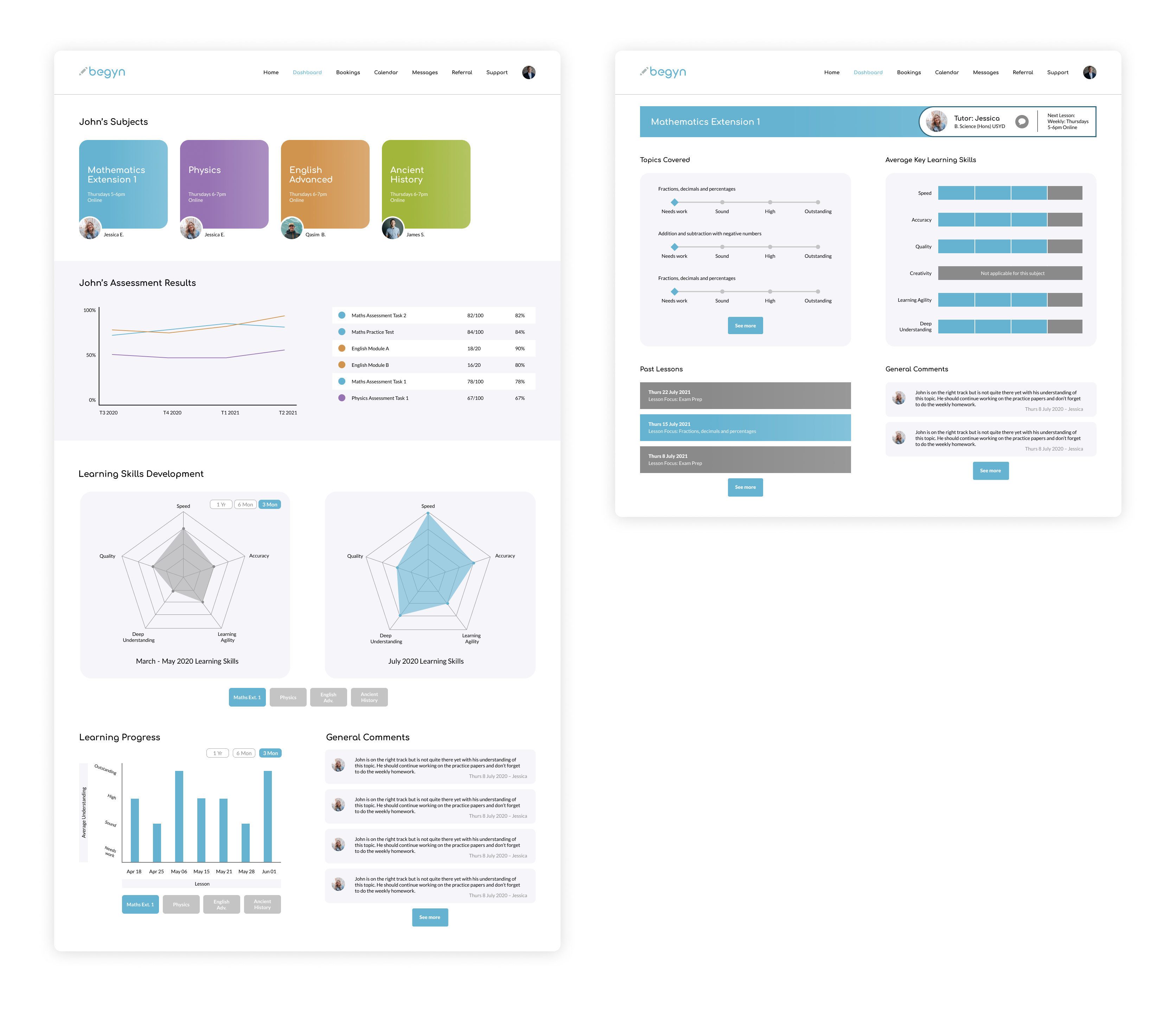
Following feedback from the client, we changed the colour palate to be more muted. Instead of each subject having a unique colour and image associated with it, the subject colour coding is now determined based on its order in the dashboard, so that the first subject will always be blue, aligning with Begyn’s brand colour.
We also iterated on the charts used to summarise a student’s learning progress on the main page of the dashboard.
![]()
We then combined the best aspects from our four designs to create the next iteration. One of the main changes was reverting the menu bar back to the top of the page, to better suit the conventions of the desktop site. Vertical scrolling and other touch-based features were also removed.

Following feedback from the client, we changed the colour palate to be more muted. Instead of each subject having a unique colour and image associated with it, the subject colour coding is now determined based on its order in the dashboard, so that the first subject will always be blue, aligning with Begyn’s brand colour.
We also iterated on the charts used to summarise a student’s learning progress on the main page of the dashboard.
Key Learnings
This project was an eye-opener for me and highlighted the importance of considering the architecture behind the product and keeping your designs within the framework of what can feasibly be developed. For example, deciding whether or not moving the menu bar to the side would be worth the effort required for the developer to make that change. Typically, my projects are all concepts that exist solely within a Figma prototype, so I rarely had to think of these considerations in the past. Overall, I really enjoyed working on this project and seeing the design process come to fruition.
 Queany the Quokka
 Podblogger
 Guidebooks
 The 4U Paper