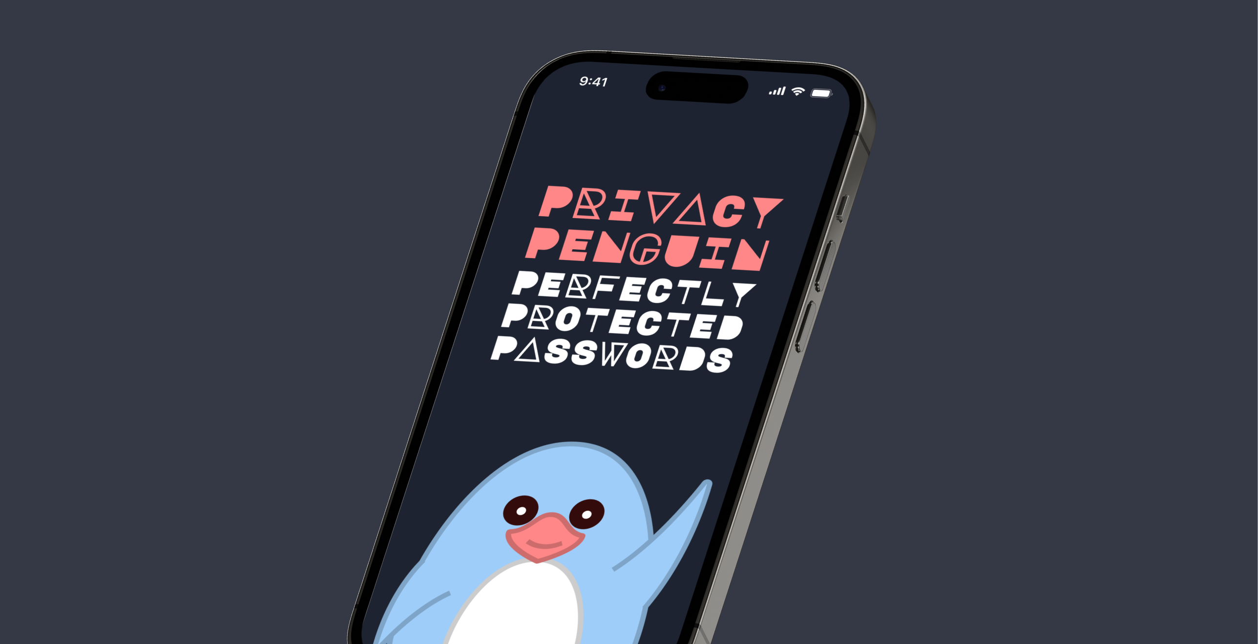
Privacy Penguin




Role
Research & Design (Individual Project)
Timeline
10 weeks (Sep - Nov 2022)
“Once we share [data] with a third party, then we have to trust them to protect it indefinitely, and that’s quite a lot to expect.”
Nik Thompson, Curtin University
INTRODUCTION
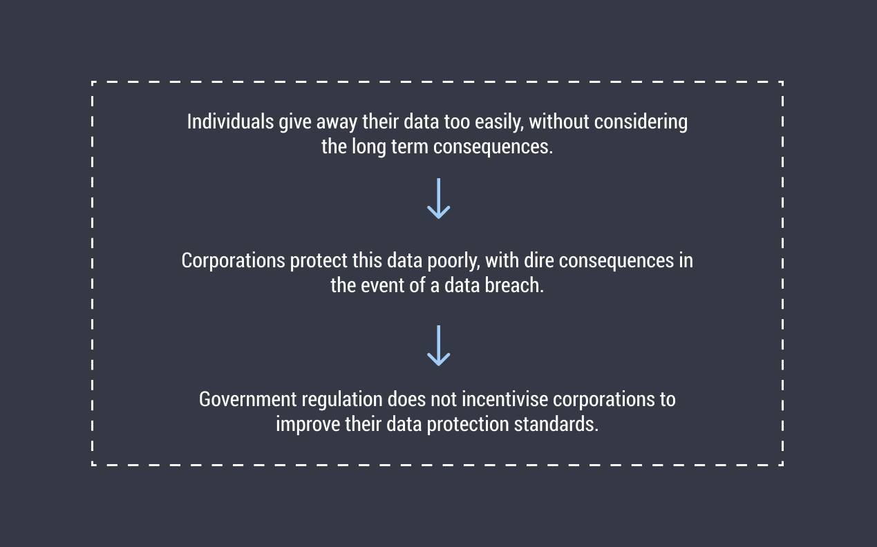
We often give away our personal data without thinking of the long term consequences. Sometimes, this data is taken without our knowledge or consent, while other times we might get a discount or promotion in return. The ramifications of this are rarely clear, until a data breach occurs. Then, lives can quickly unravel as identity fraud and scams take place with increasing frequency.
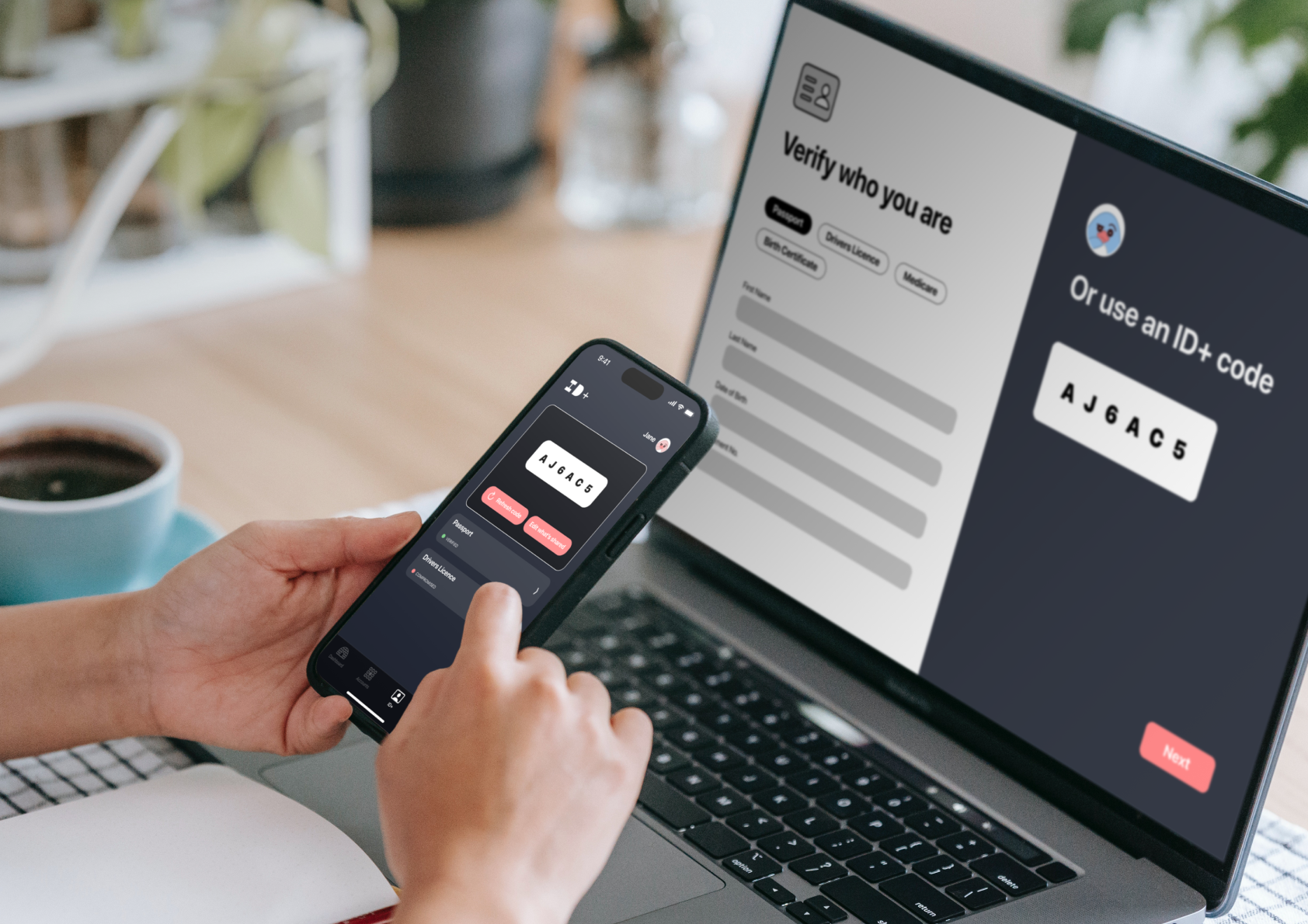
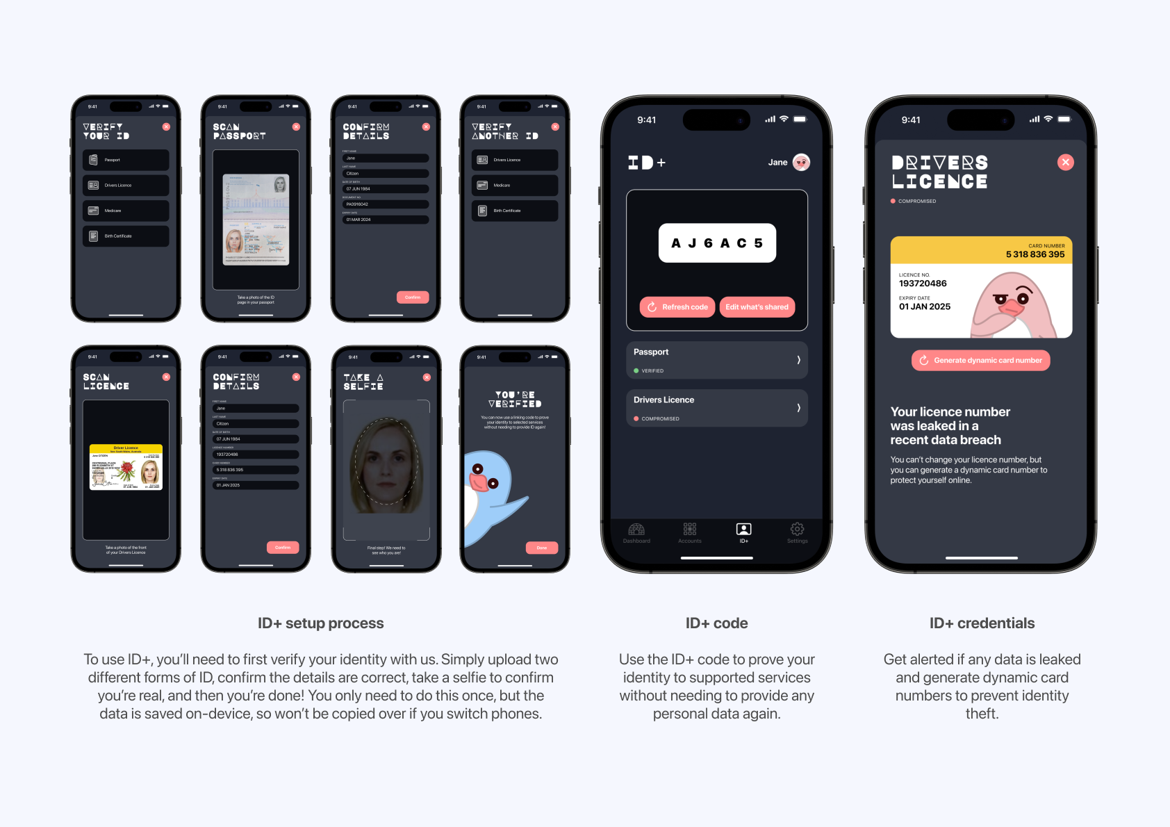
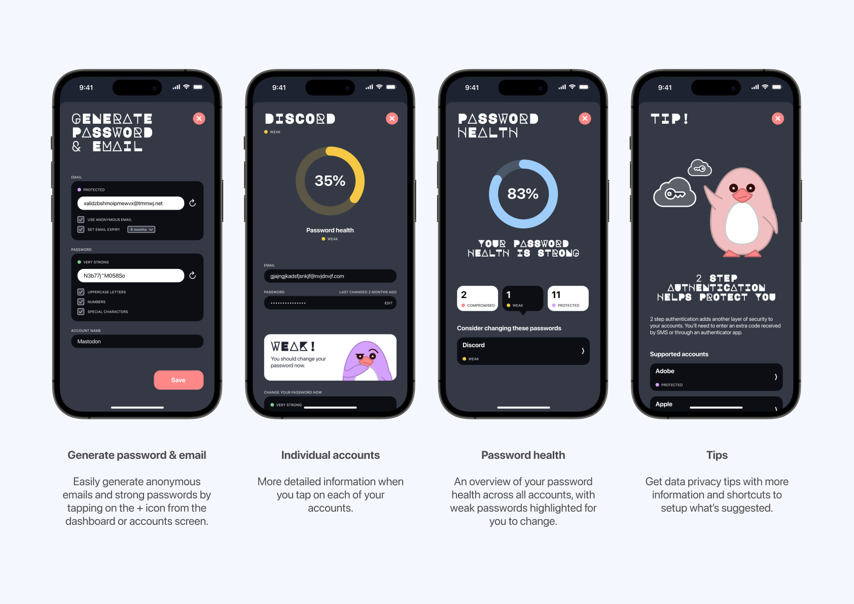
Privacy Penguin aims to address this problem space. Users can easily generate anonymous emails and stronger passwords from the app, and get notified if any accounts are breached. The dashboard screen also provides an overview of your password health and offers suggested privacy tips. Another unique feature is ID+, which verifies your identity. You can then give other websites and services your ID+ code, rather than having to give away your personal data each time, where they could be leaked. Finally, the friendly (but frustrated) Privacy Penguins make the app approachable and inviting to use.
RESEARCH
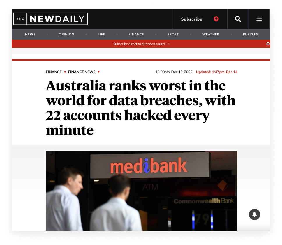
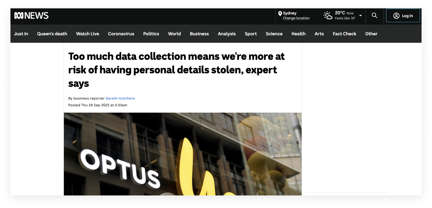
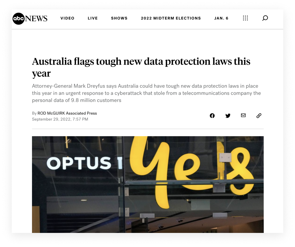
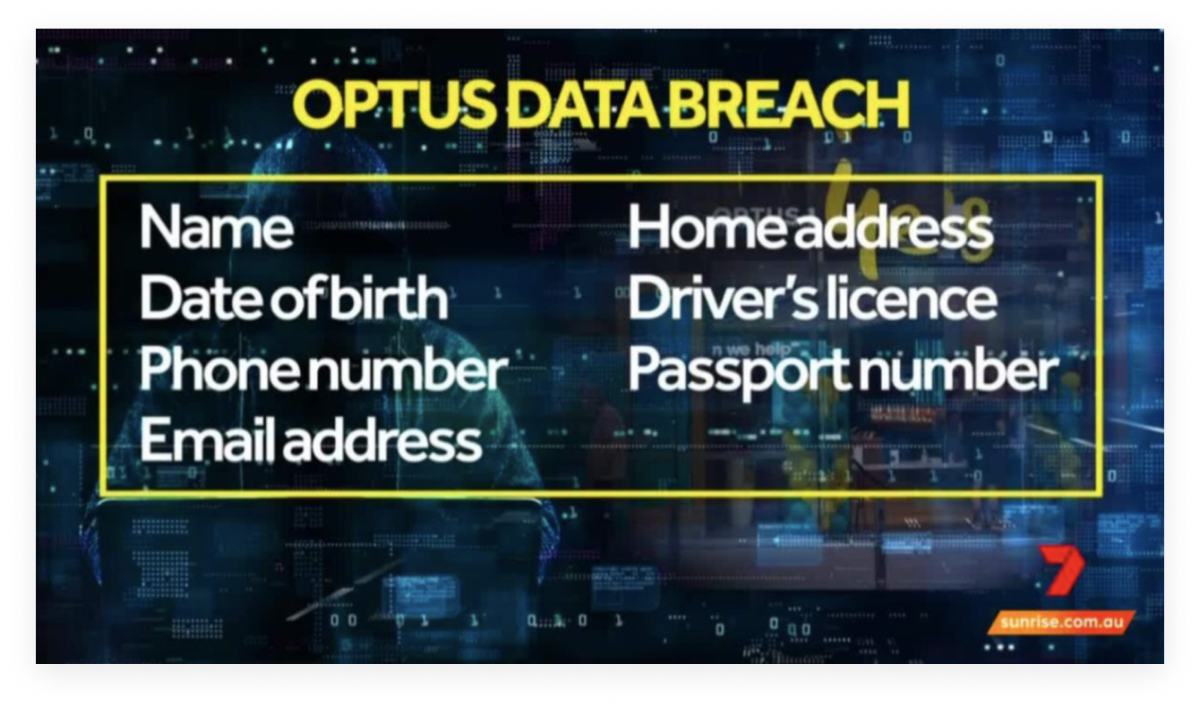
In 2022, one of Australia’s largest ever data breaches occurred, impacting 9.7 million current and former Optus customers. In the breach, personal data such as phone numbers, email addresses and passport numbers were leaked, prompting outcry and the need for millions to replace important documents. Soon afterwards, Telstra and the Australian Defence Force also suffered similar attacks.

INSIGHTS
1. Gen Z is more cautious about data privacy than other generations, and don’t trust companies to keep their data safe.
While data privacy affects all of society, it is predominantly a focus among Gen Z users – those born between 1997 and 2012. Research from Cornell University has shown that Gen Z consumers are more reluctant to share their personal information. In fact, only 39% of Gen Z internet users in the US said they trust brands to keep their data safe, the lowest confidence rate of any generation. Despite this, Gen Z were also the fastest growing victims of scams, losing over $5 million in 2019, according to the ACCC.

2. Gen Z is more inclined to give out personal information if there is a monetary reward involved.
Gen Z are also more likely to search for discounts or promotions online, which frequently require the disclosure of personal data such as an email or phone number. This willingness to disclose personal data further increased once a monetary reward was offered.
3. Individuals want more control over their personal data, but have a lack of time and knowledge, and find the process difficult.
The Office of the Australian Information Commissioner found that 84% of Australians want increased control and choice over the collection and deletion of their personal data. More than half of those surveyed experienced a problem with how their data was used in the last 12 months. 85% agreed that personal data should be protected, but only 49% knew what to do about it.
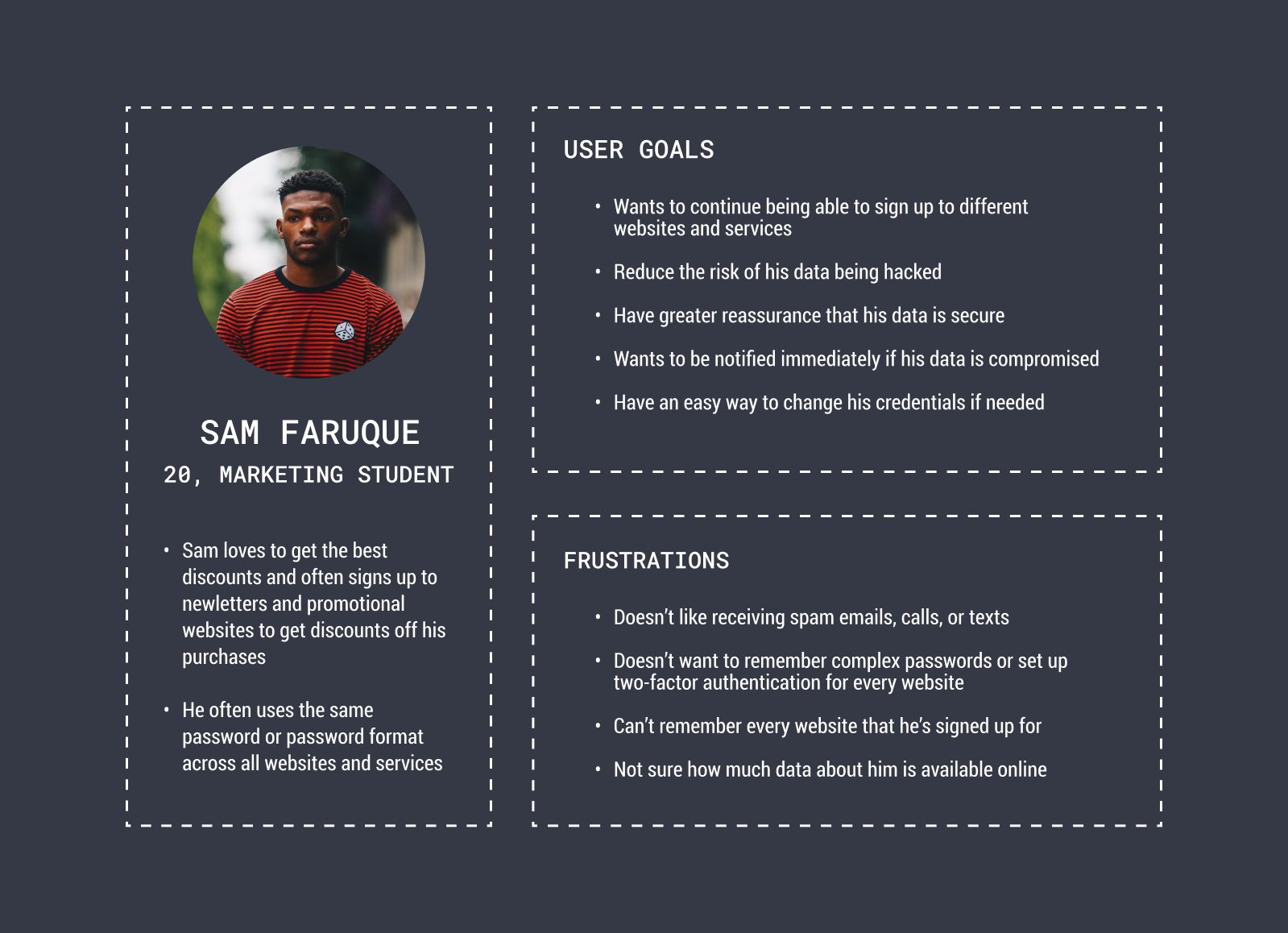
DESIGN
The design phase began with a rapid prototyping session, which was a great opportunity to quickly get some ideas down. By brainstorming some user pain points in existing solutions, I was able to narrow down the main user features of 1) preventing the data breach and 2) reacting to the data breach.

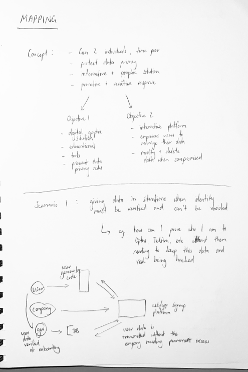
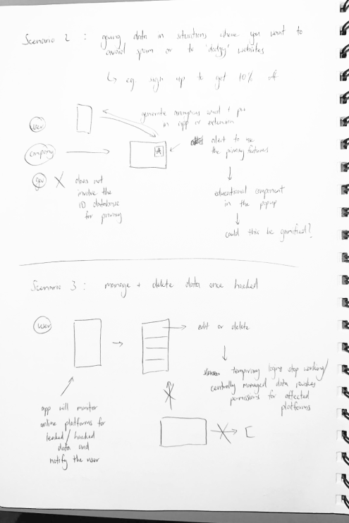

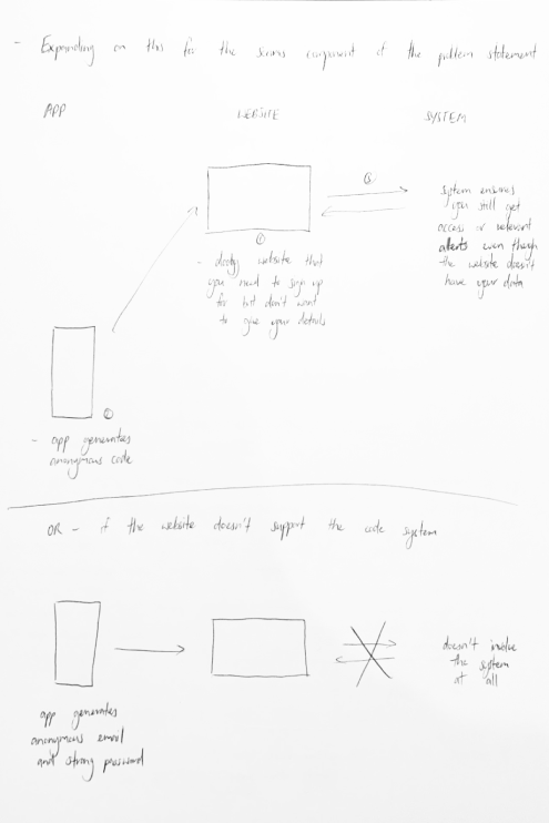
Based on these sketches, the first prototype was created. It features a simple process to verify your identity by scanning two types of identity documents and taking a selfie to confirm who you are. Once this process is complete, different accounts and services can be linked through a simple code. This enables users to prove their identity only once, and avoid the need to provide identity documents to multiple companies where there is a greater risk of a data breach. The code will also refresh periodically, much like a dynamic CVC, offering additional security. The linked platforms are then displayed in a single location and users are alerted if any accounts have been hacked.
ITERATION 1
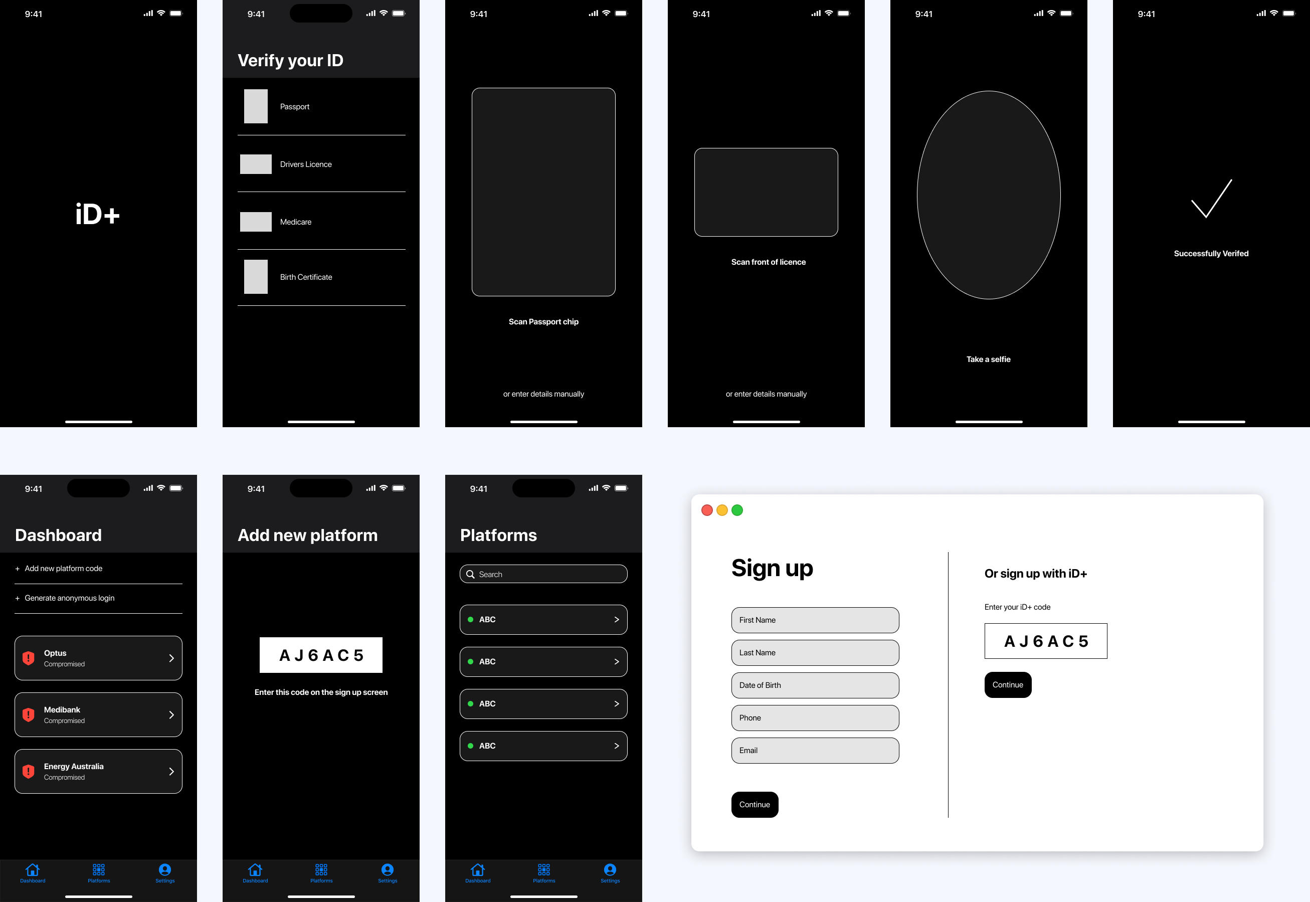
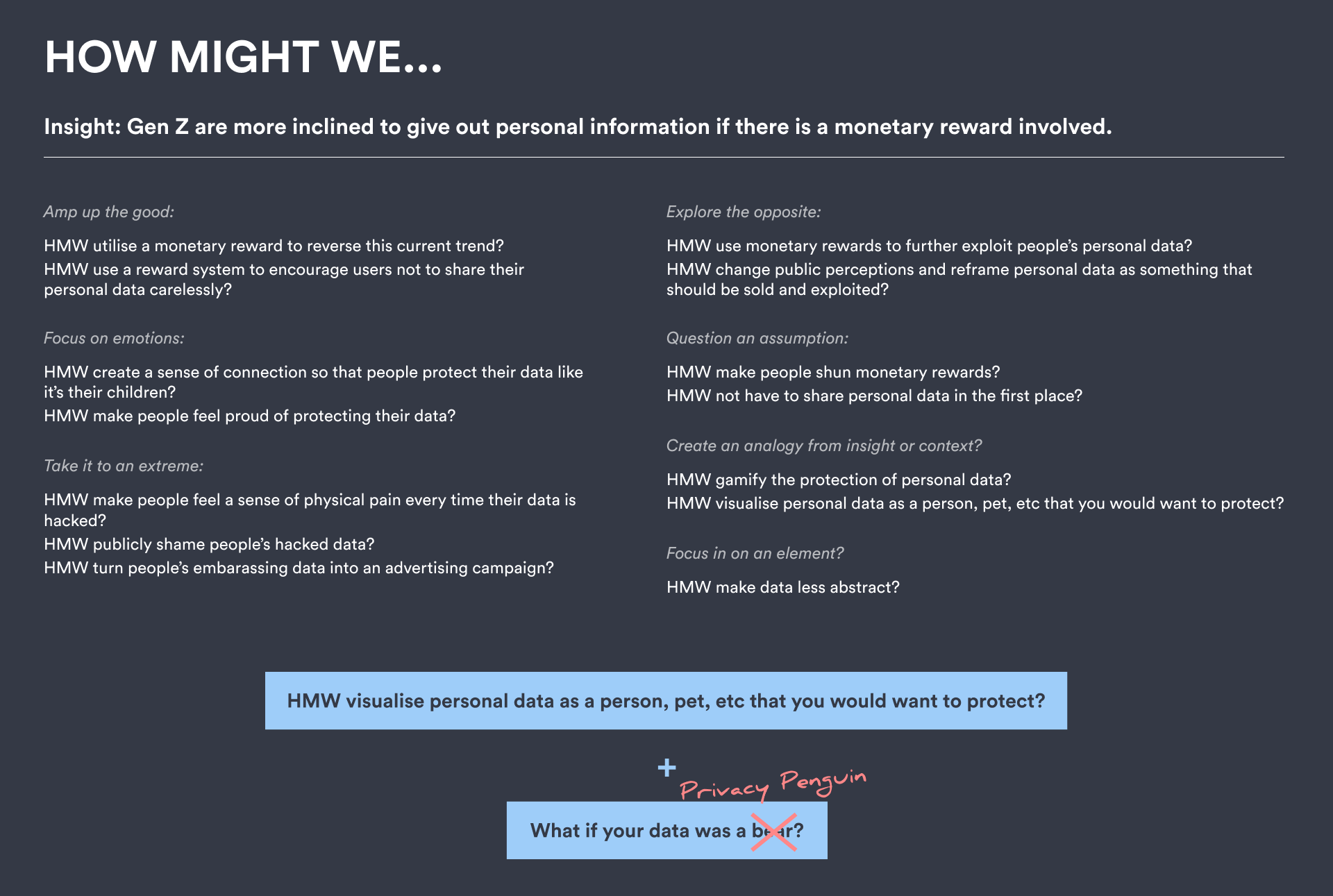
With the main features of the app sketched out, the next step was to brainstorm in a peer feedback session to gain more ideas and further improve the functionality of the app. Through asking “How Might We...” and “What If?” questions, the Privacy Penguin name and direction were envisioned.
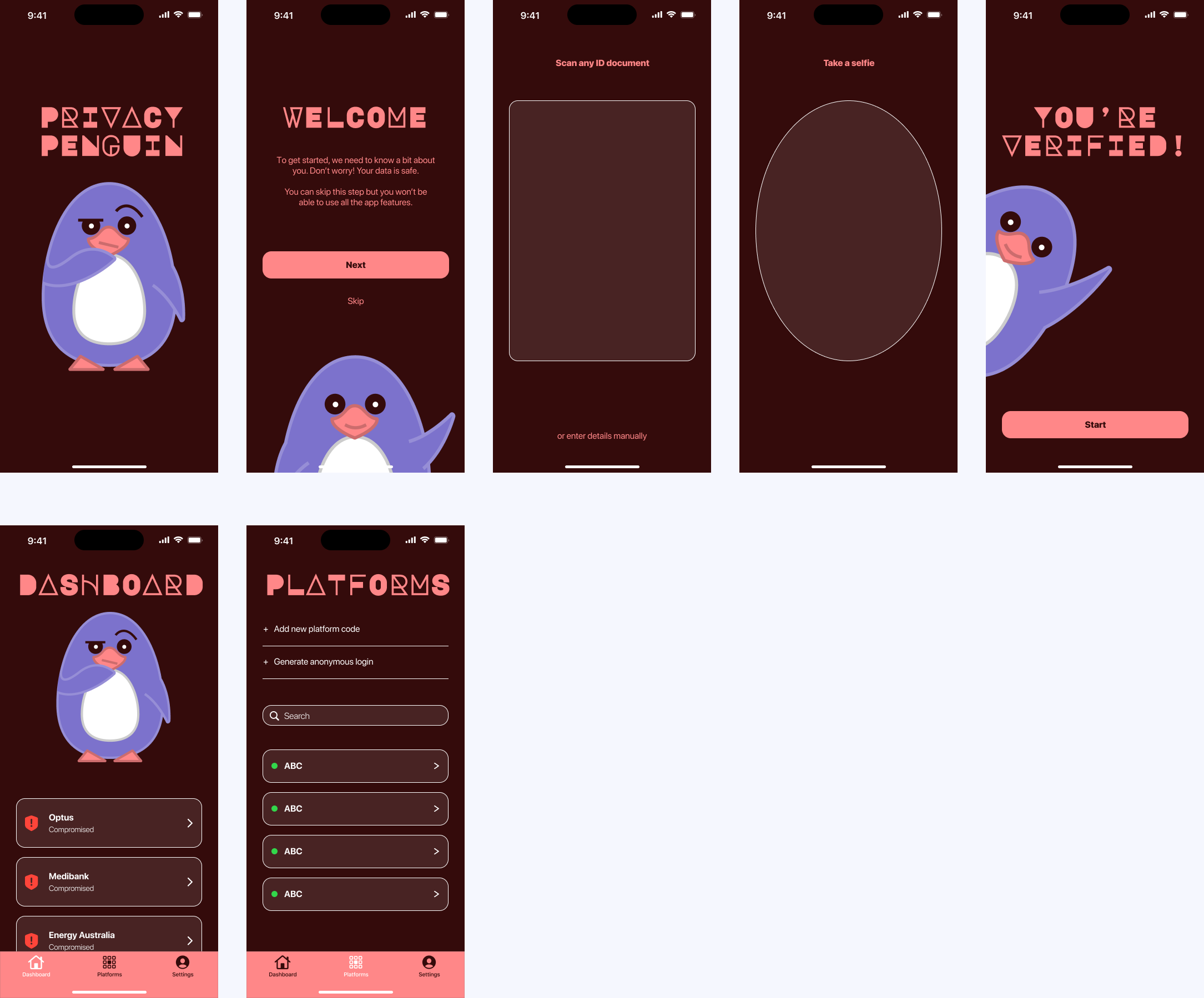
As user testing was not allowed for this project, the next few iterations centre around the branding and making adjustments to the layout of the app. With a tight timeframe towards the end of the project, the key identity elements had to be decided promptly.
ITERATION 2
ITERATION 3
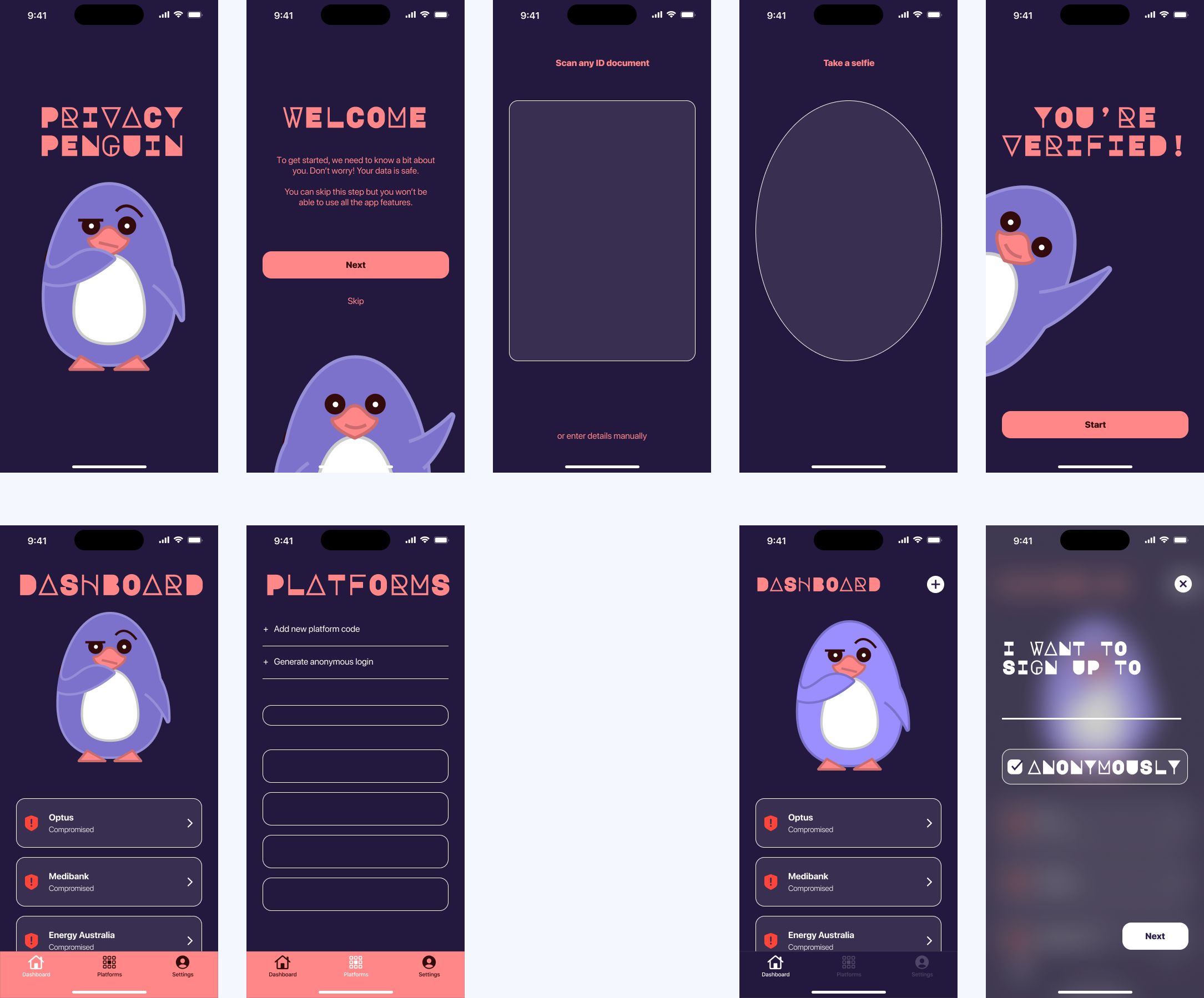
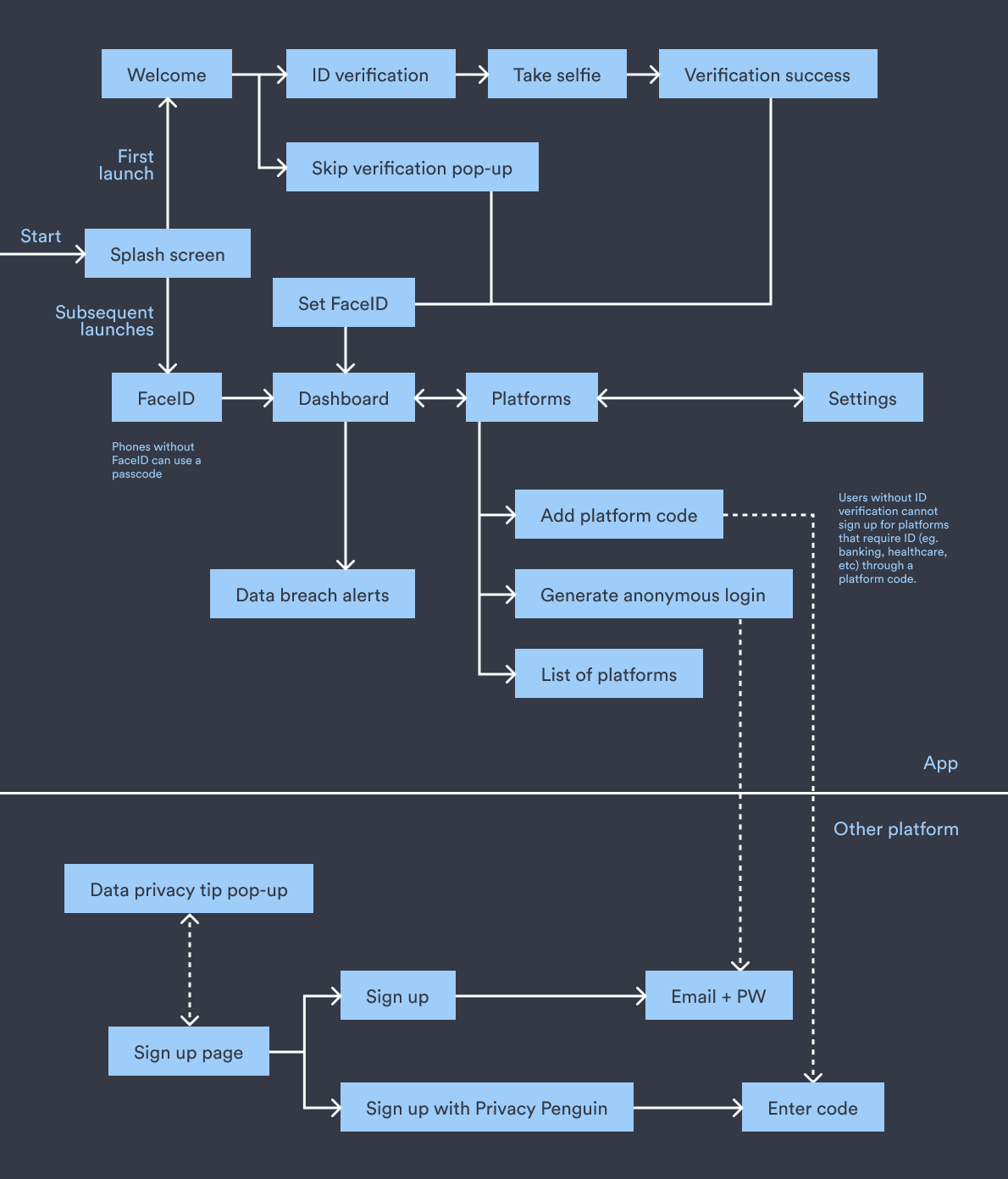
A flowchart was also created to demonstrate the procedures and flow of the app. However, I found myself getting confused trying to explain it to others. While people understood the general purpose and goal of the app, the instructional elements caused confusion too.
In the next iteration, I therefore decided to place the identity verification portion of the app under a separate tab and instead emphasise the account protection and privacy component. The visual design of the app continued to be refined.
ITERATION 4

ITERATION 5
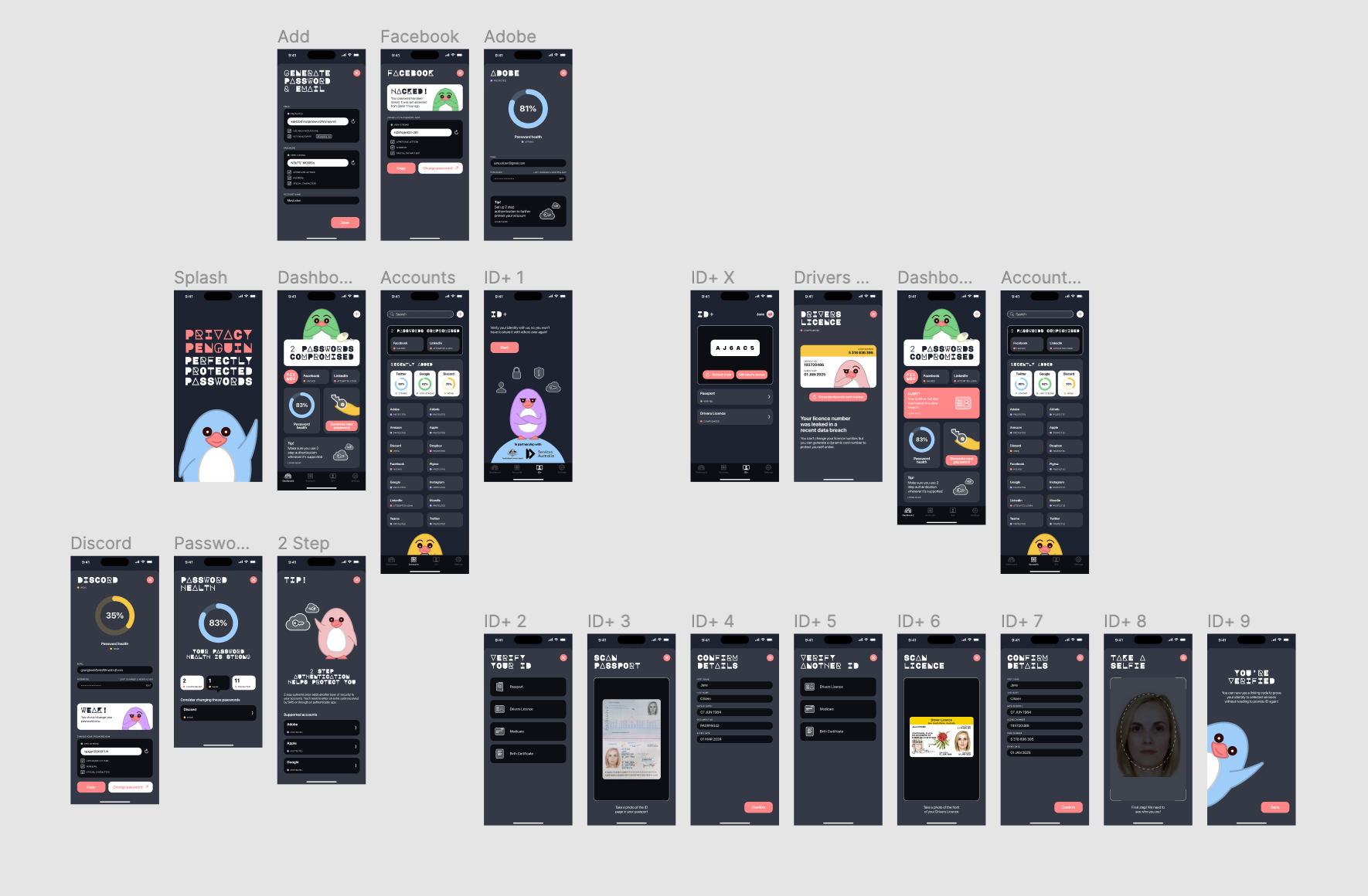
In the final iteration, more screens were developed and the user flow was fleshed out. The colour palette was again adjusted to reflect a more neutral dark grey tone. The colourful penguins provide a visual contrast that more effectively draws attention to the app, compared to the purple used in earlier iterations.
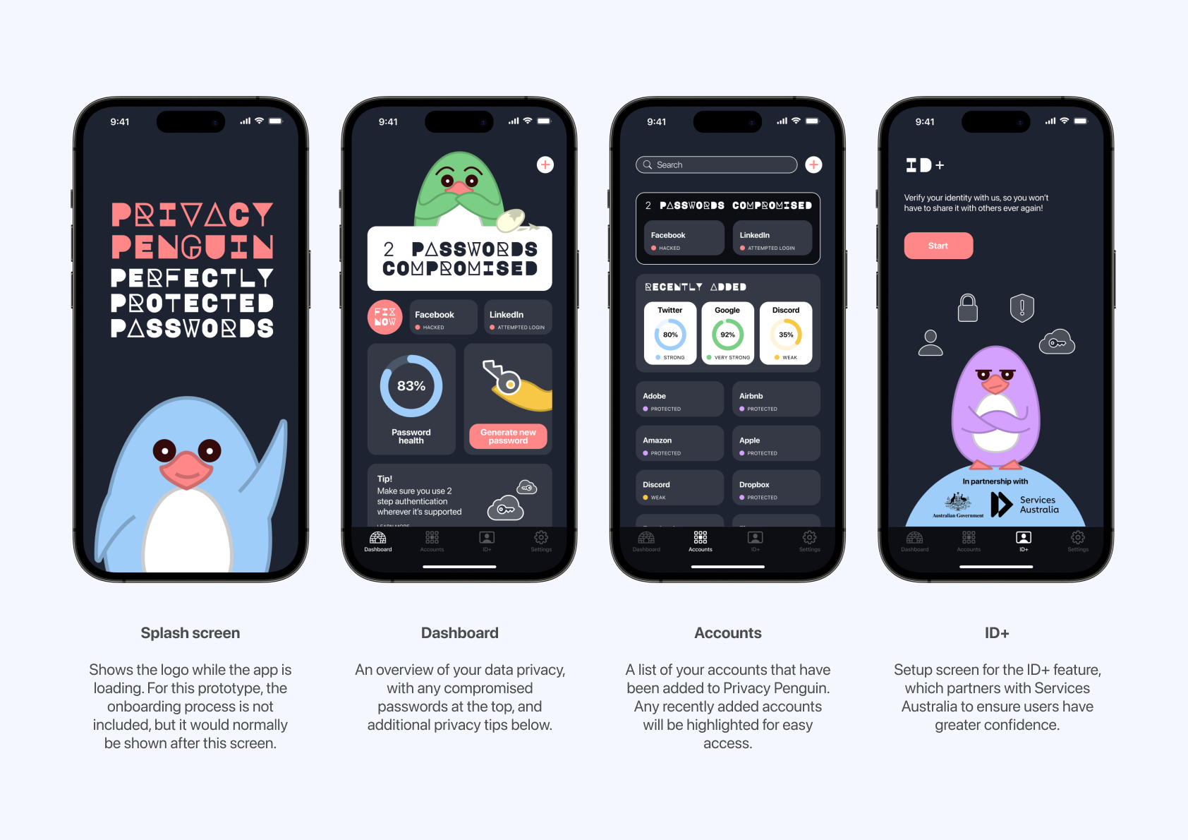
A comment that often arose in discussions was the need to exert a sense of safety and security to give users the confidence that using the app would not further jeopardise their data privacy. Hence the Services Australia logo was added to the ID+ tab, envisioning a partnership that would strengthen data privacy on both sides.
STYLE GUIDE
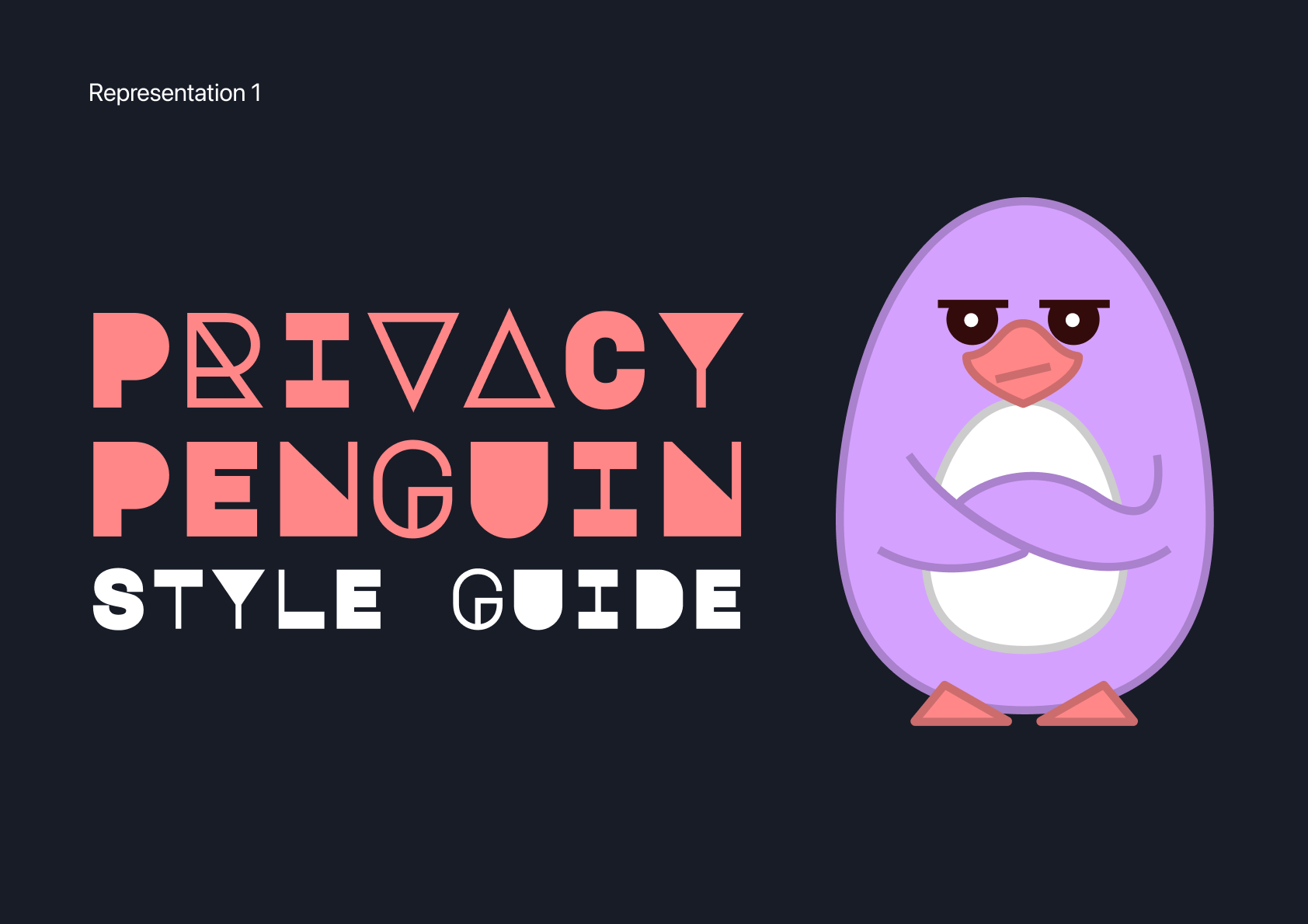
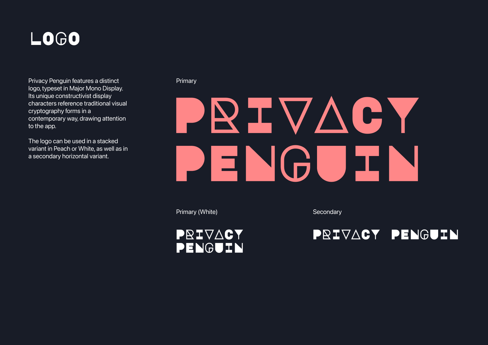
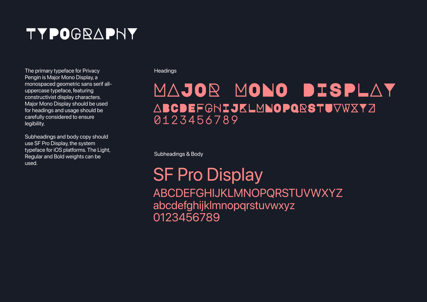
As part of the submission, a style guide was created to showcase the brand. As shown, Privacy Penguin features a distinct logo, typeset in Major Mono Display. Its unique constructivist display characters reference traditional visual cryptography forms in a contemporary way, drawing attention to the app.
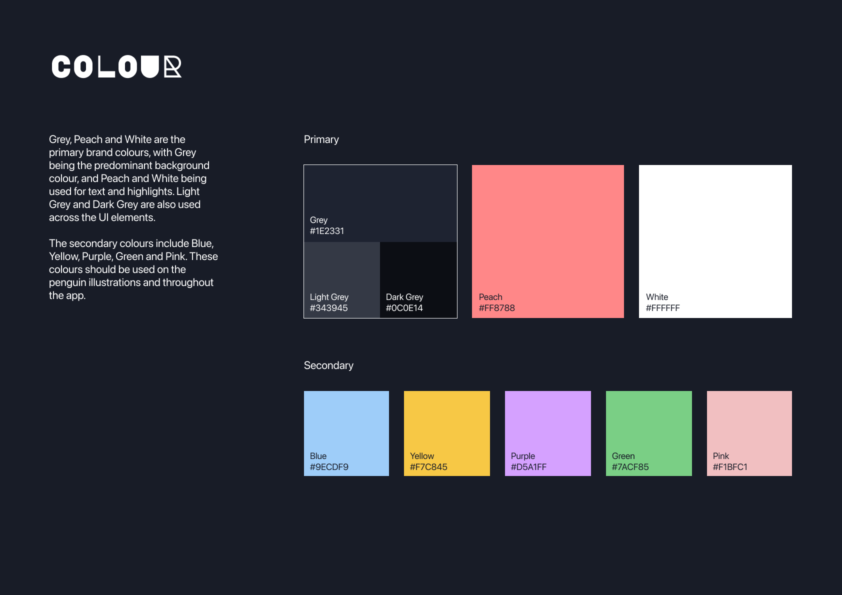
Grey, Peach and White are the primary brand colours, with Grey being the predominant background colour, and Peach and White being used for text and highlights. Light Grey and Dark Grey are also used across the UI elements.
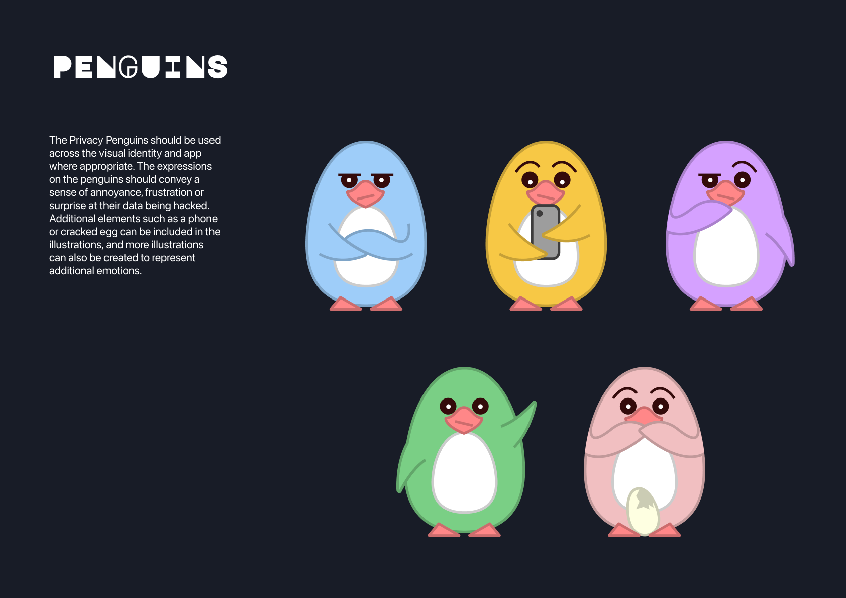
Furthermore, the penguin illustrations convey a sense of annoyance, frustration or surprise at their data being hacked. Additional elements such as a phone or cracked egg can be included in the illustrations, adding to the expressiveness of the visual identity.
USER JOURNEY MAP
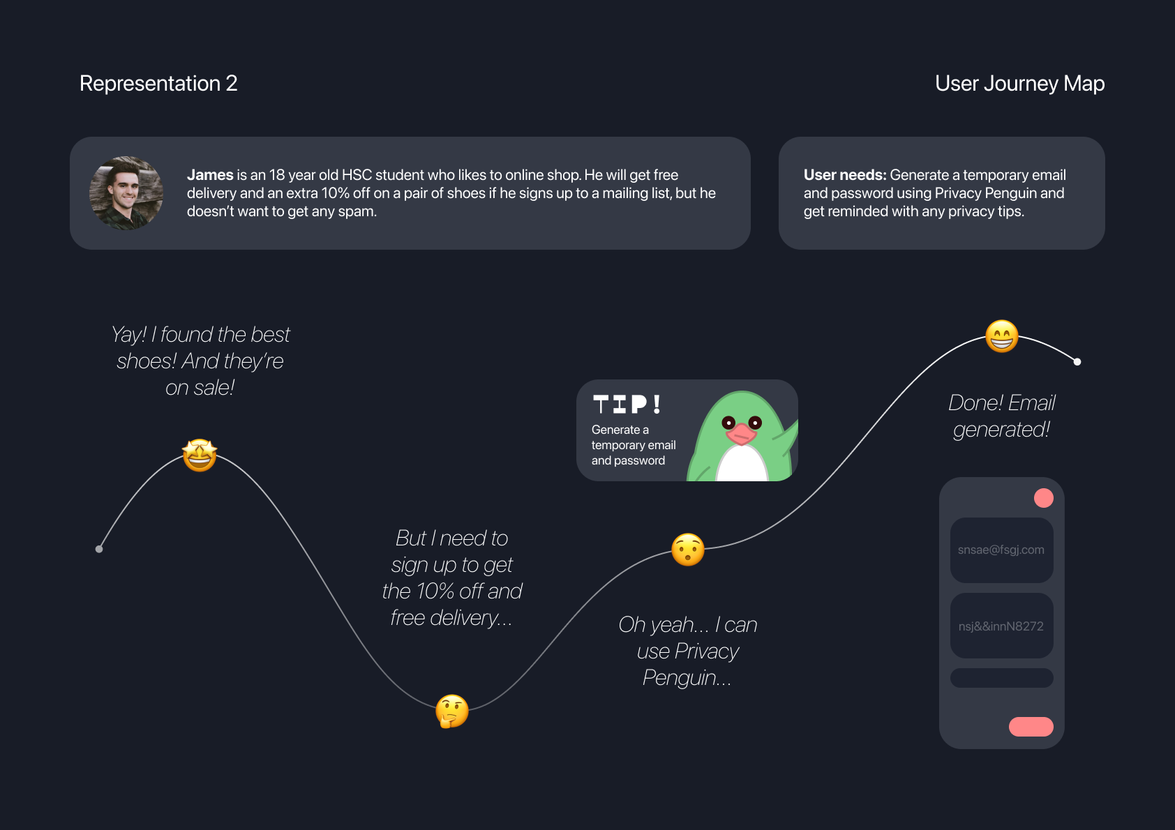
The first user journey map explores the decision making process for a young individual while online shopping. It reflects the common scenario of having to provide an email address for the transaction, and then subsequently receiving unwanted promotions and spam emails. It also places the user at a greater risk if the company’s databases are not secure. By using Privacy Penguin, temporary emails and stronger passwords can be generated to avoid this problem.
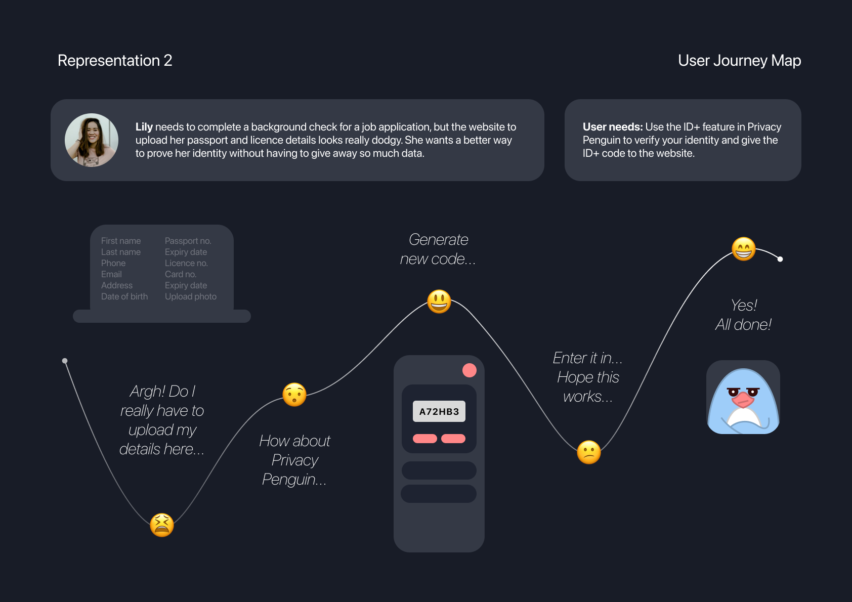
For the second user journey scenario, the user needs to upload some identity documents for the purposes of a background check. As something that I’ve experienced before, these websites tend to be poorly designed with an outdated visual style that leaves the user feeling uncomfortable and reluctant to upload their personal information. By using the ID+ feature in Privacy Penguin, users will only need to enter their generated code.
INFORMATION ARCHITECTURE
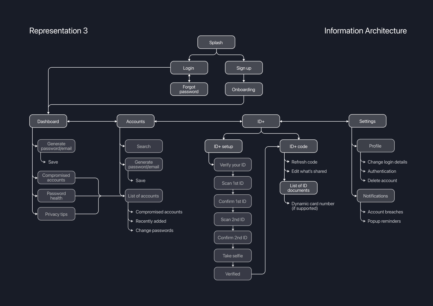
For the final diagram, an information architecture model was created to show how the screens link together as well as their associated heirarchy.
APP SCREENS
The final app screens included in the prototype are shown below.
You can also visit tinyurl.com/privacypenguin to test it out.
CONCLUSION
Overall, this was an exciting project that enabled an interdisciplinary exploration of design. With user testing not allowed as part of the criteria, I had expected the project to be difficult to complete. Instead, the focus on secondary research helped define the focus area in a positive way, and without these constraints, the prototype was able to feature more ambitious concepts such as the ID+ codes and dynamic licence numbers.
After completing the project, it was announced that both Service NSW and Services Australia were developing similar concepts for a digital ID, which reinforces the successful direction of the app and the research behind it.
