Sydney’s Chinatown:
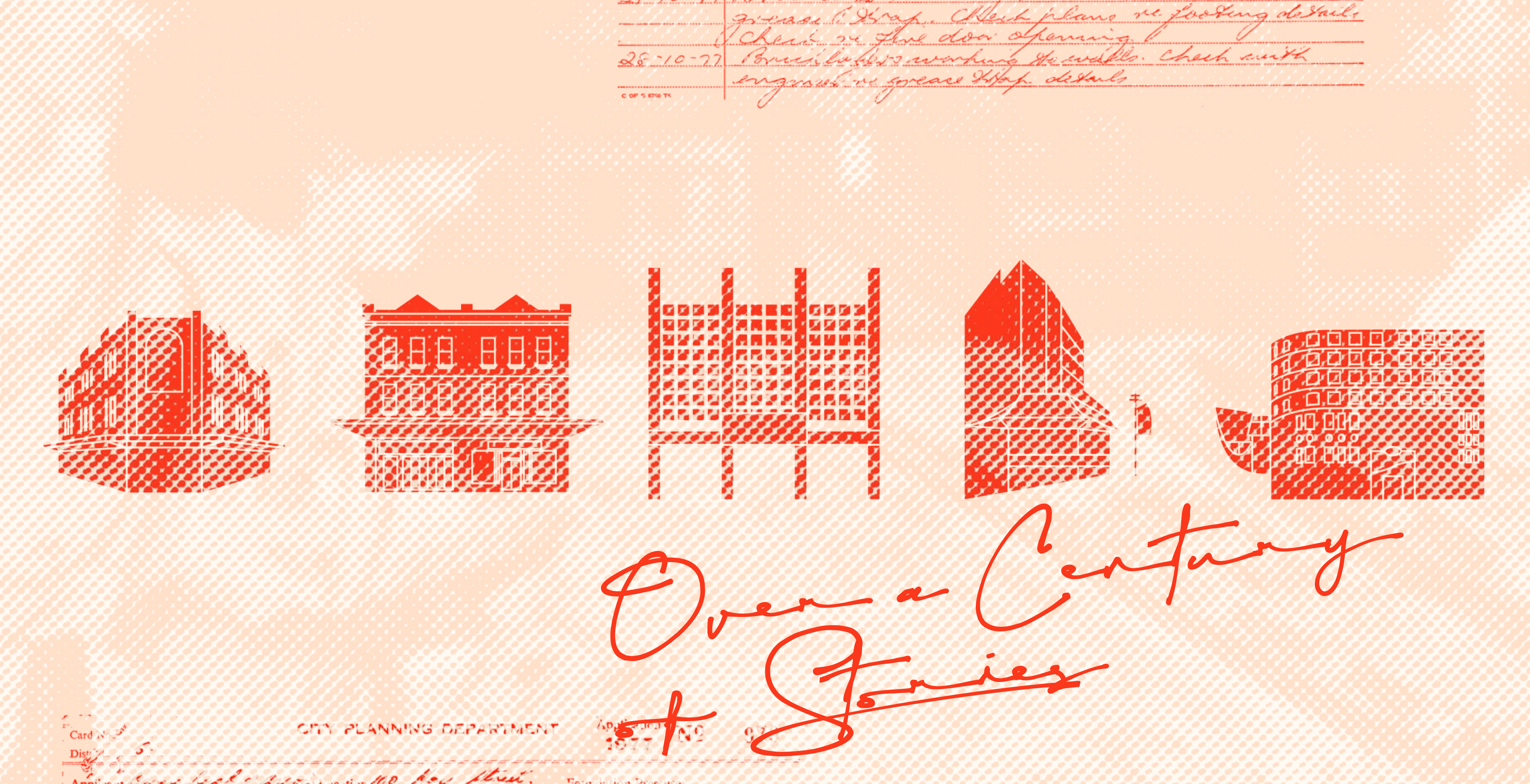
Over a Century of Stories


Role
Research & Design (Individual Project)
Timeline
10 weeks (Jun - Aug 2022)
CHINATOWN HAS BEEN NEGLECTED.
WHAT CAN WE DO TO BRING ITS HISTORY AND STORIES BACK TO LIFE?







INTRODUCTION
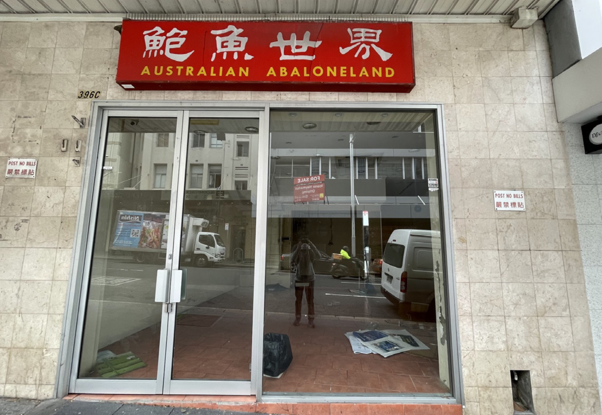
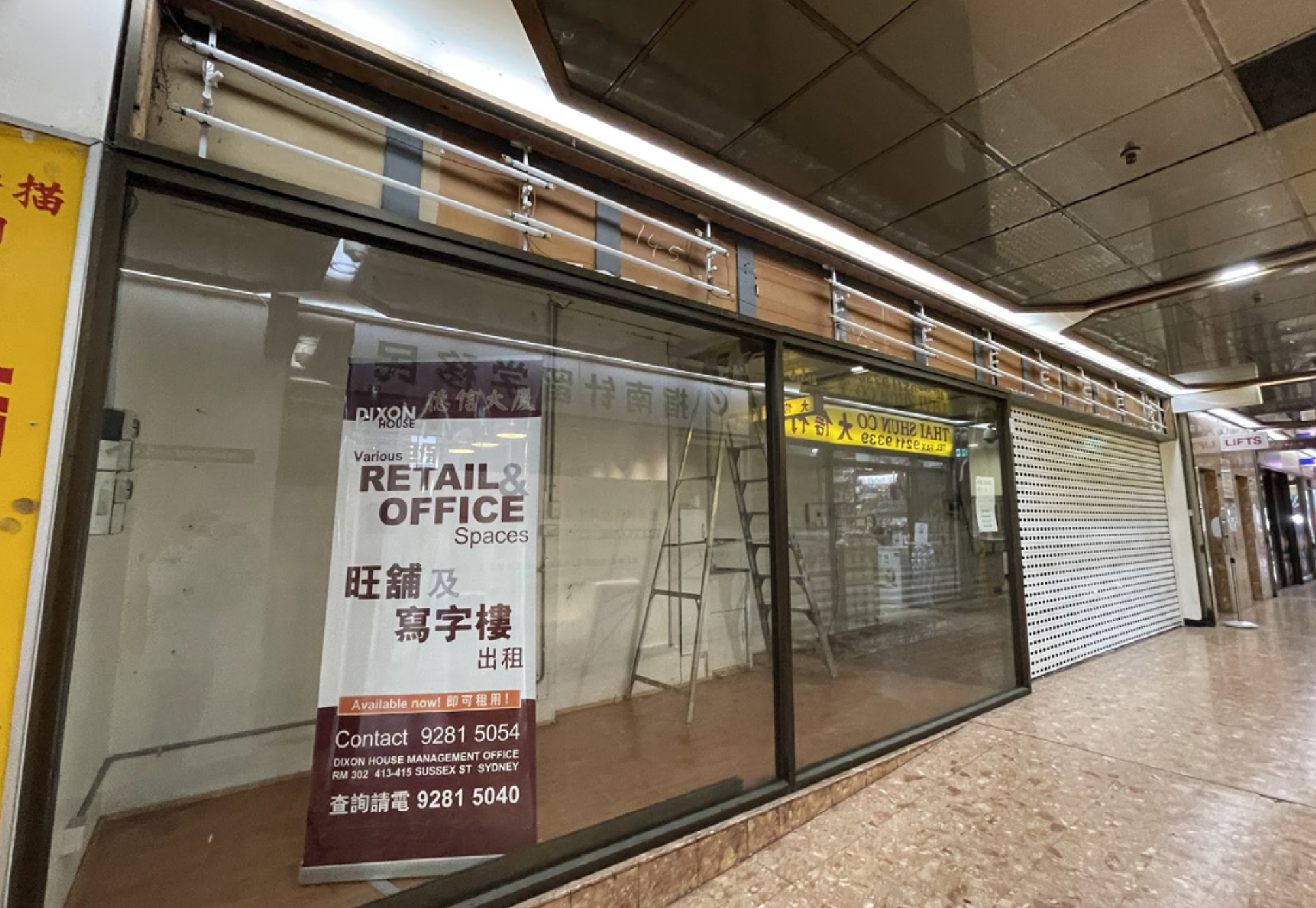
Located at the southern end of the CBD, Chinatown has been eclipsed by the developments of Darling Square and Darling Quarter. Not quite close enough to Central, nor Town Hall, nor Darling Harbour, it belongs in an almost liminal space that feels disconnected from the rest of Sydney. But below its decaying surface, Chinatown conceals a multitude of stories, built up from its over 100 years of history. From its establishment as a timber storage yard, to its pedestrianisation and transformation in the 1980s, Chinatown reflects the change in Australian society.
Over a Century of Stories presents a vivid journey, highlighting stories from across Chinatown’s rich tapestry of history. From restaurateur Stanley Yee’s famous Emperor’s Garden Restaurant, to the lesser known former Esso service station at the northern end of Dixon Street, Over a Century of Stories shines a light on the people and buildings that made Chinatown.
A BRIEF HISTORY
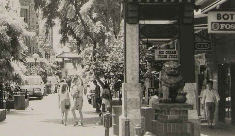
Originally established as a timber storage yard, the relocation of a fruit and vegetable market to Haymarket in the 1920s saw the first emergence of Sydney’s Chinatown. Under the White Australia Policy, Chinese people were required to work as merchants or farmers before becoming citizens, hence many congregated around the market. This also attracted other Chinese people to establish shops and lodging houses in Dixon Street to cater for the Chinese farmers who came to the city to sell their produce. Eventually, more shops and restaurants were opened to meet their needs.
When the market relocated to Flemington in 1968, Chinatown experienced a decline which continued through the early 1970s as an increasing number of residents relocated to the suburbs. In the 1980s, Dixon Street was pedestrianised and decorated with traditional cultural symbols. Over time, Chinatown has transformed from an ethnic enclave to a cosmopolitan hub, with a wider Asian population and diversification of shops and restaurants.
VISUAL RESEARCH
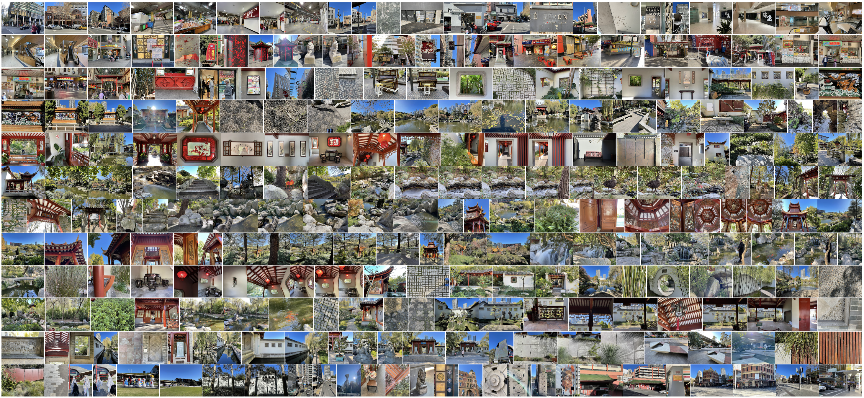
Across repeated visits to Chinatown, I took over 400 photos and was able to identify and establish some key traits that characterise the area.
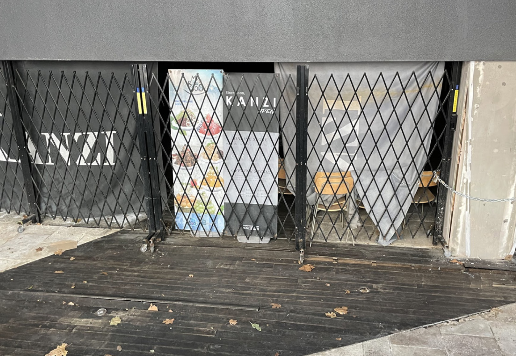
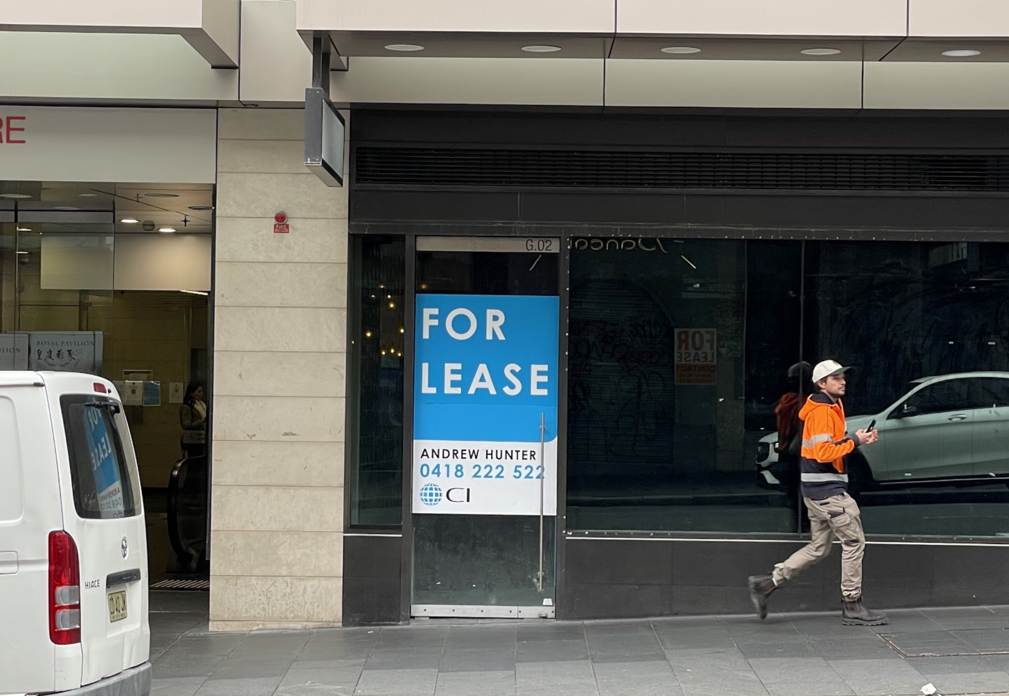
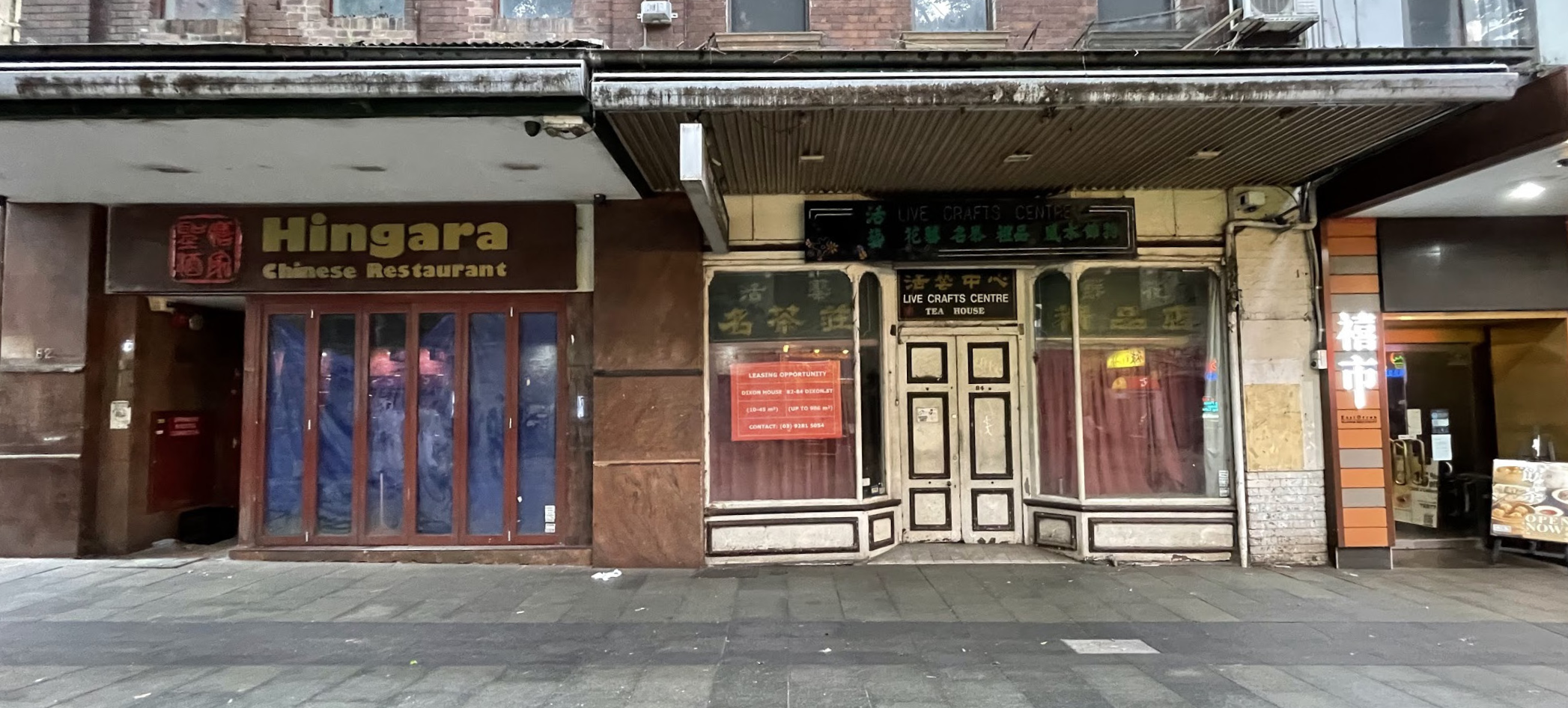
VACANT SHOPS & BUILDINGS
A key attribute throughout the area was the large number of vacant or seemingly abandoned shops, which gave the area an uncomfortable atmosphere.

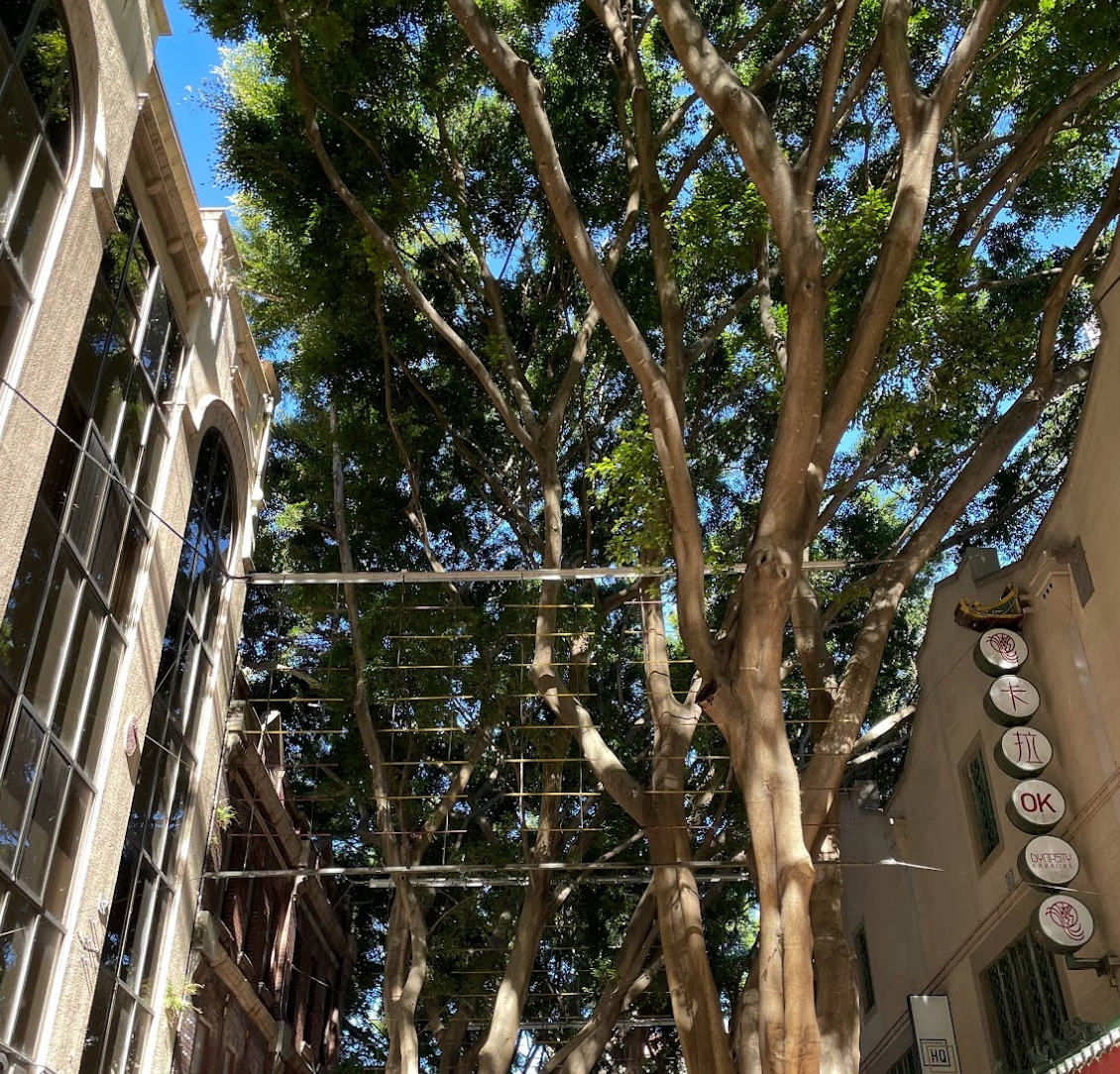
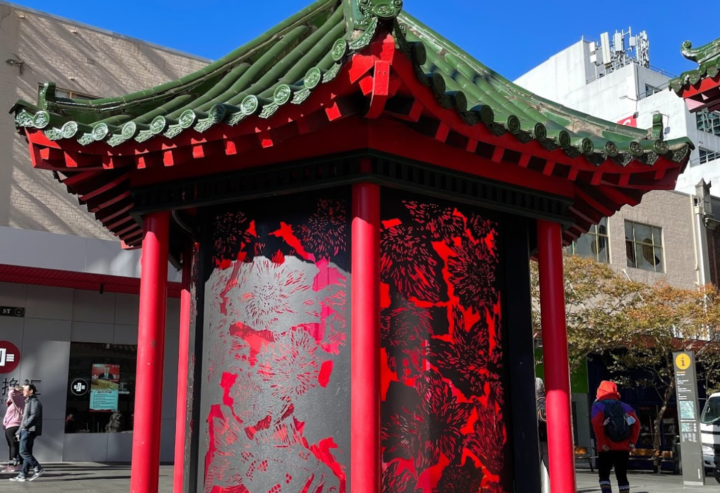
ARCHITECTURE & ENVIRONMENT
A mix of modern and traditional Chinese architectural styles could be found throughout the area, with lots of trees and greenery, particularly around Dixon Street and the Chinese Garden of Friendship.




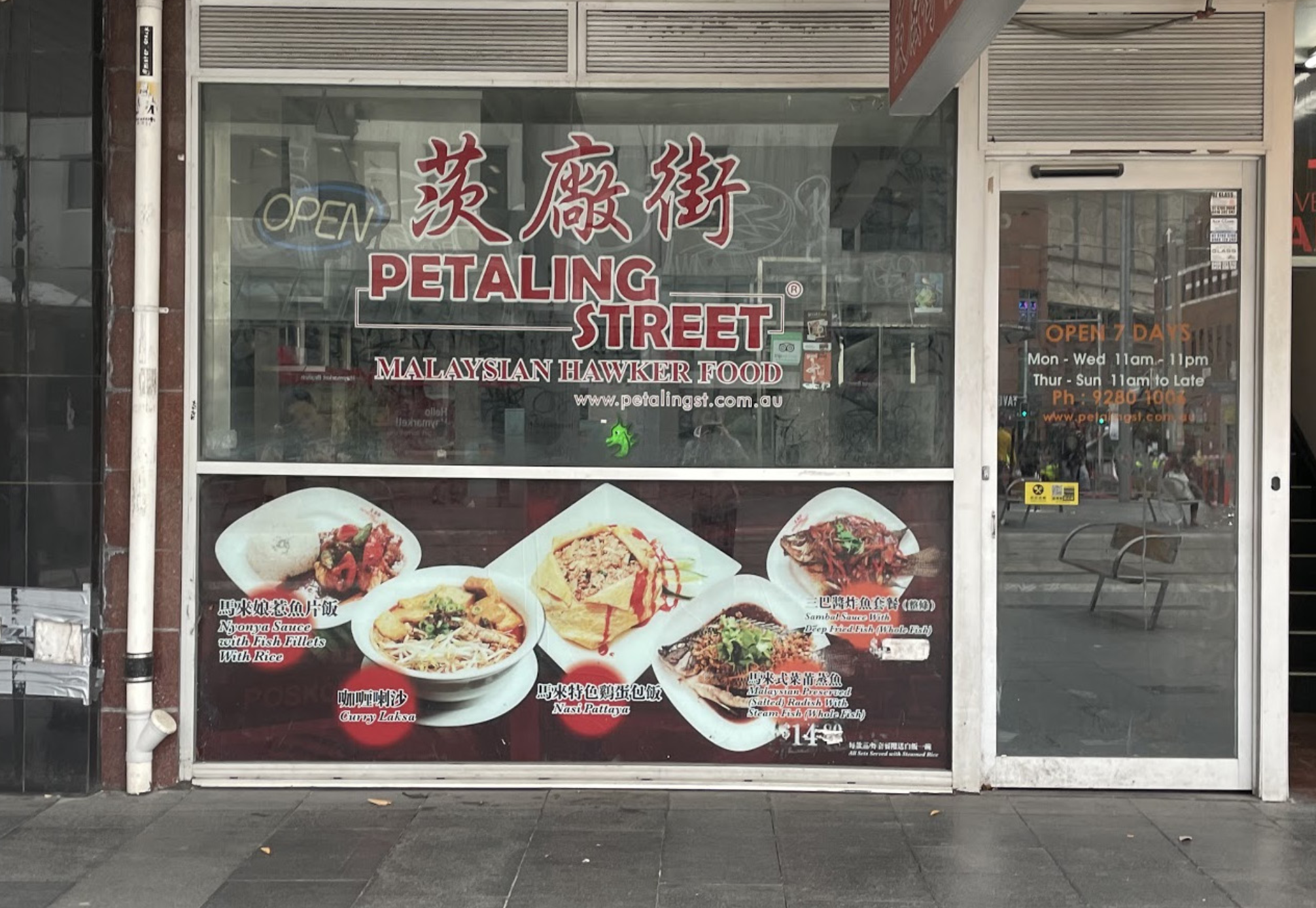
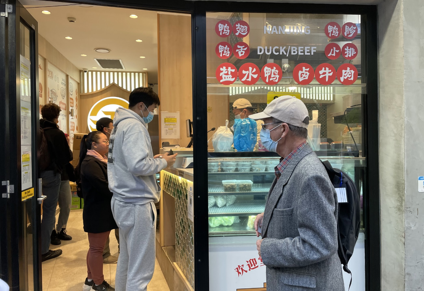
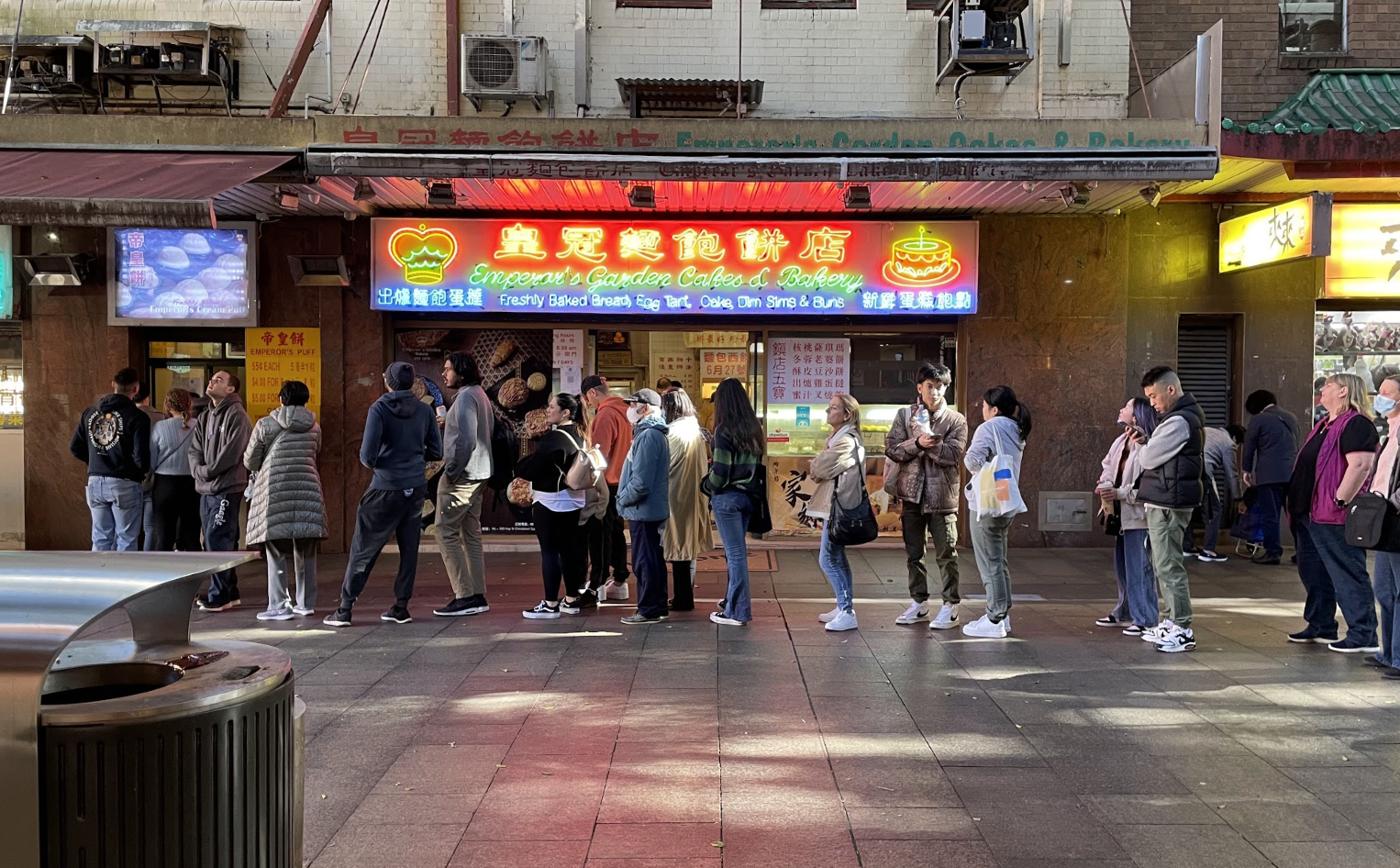
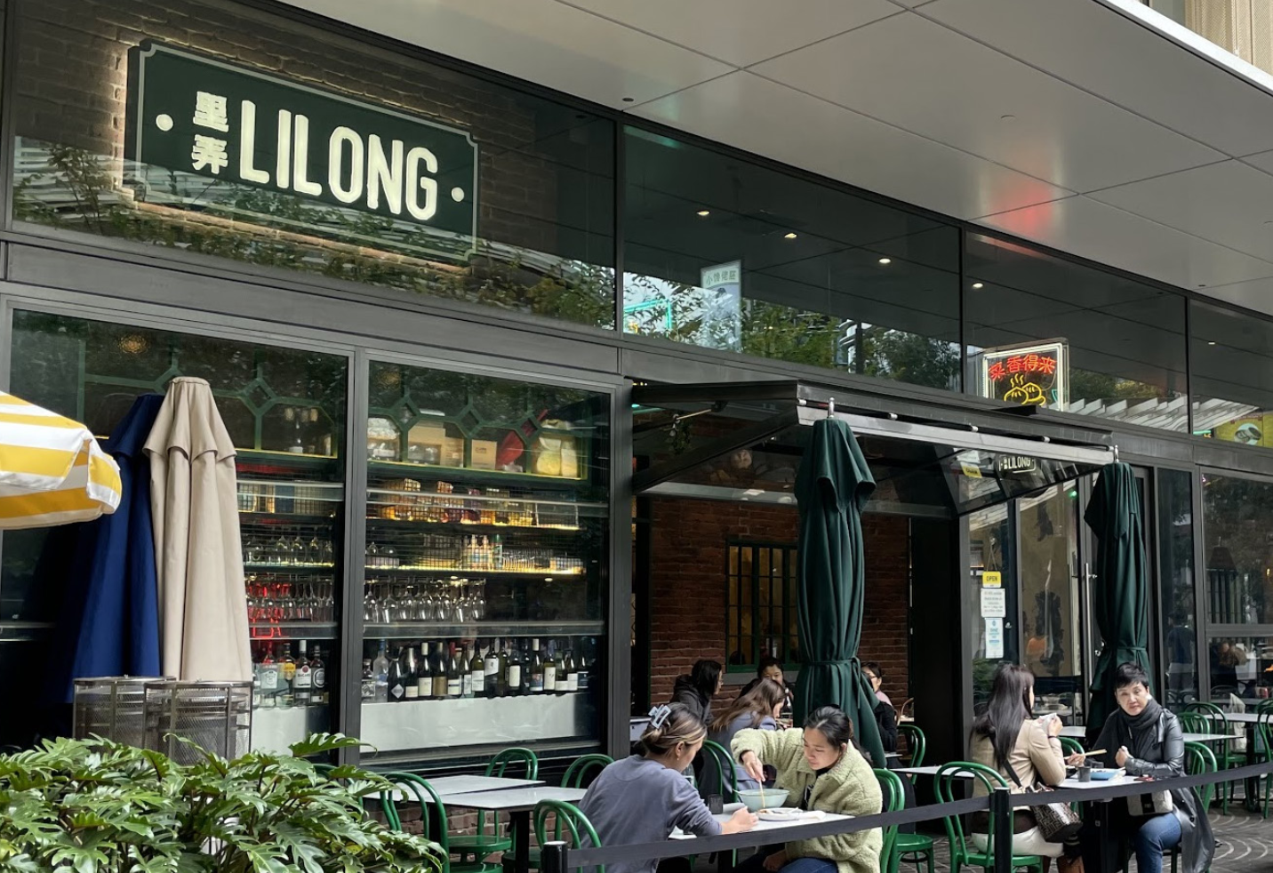
FOOD & PEOPLE
Food is key part of Chinatown. Different styles of Chinese food are readily available, with more cuisines available closer to Darling Square. Mostly ordinary people can be seen walking around, with a lack of tourists due to COVID-19.


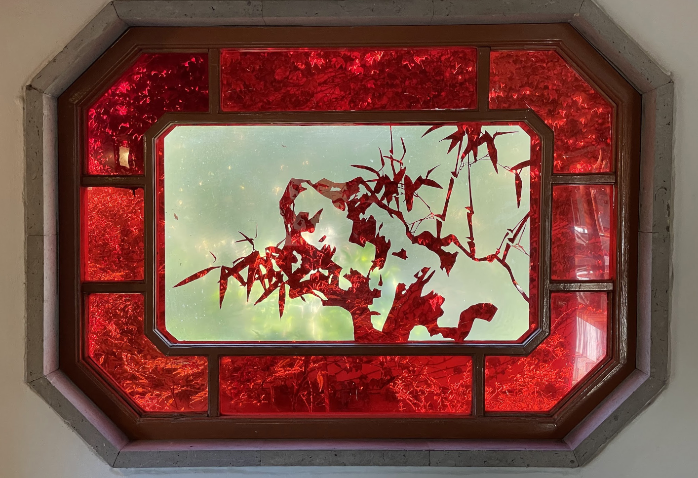
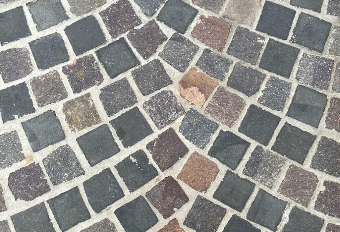
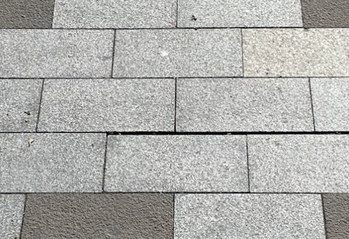
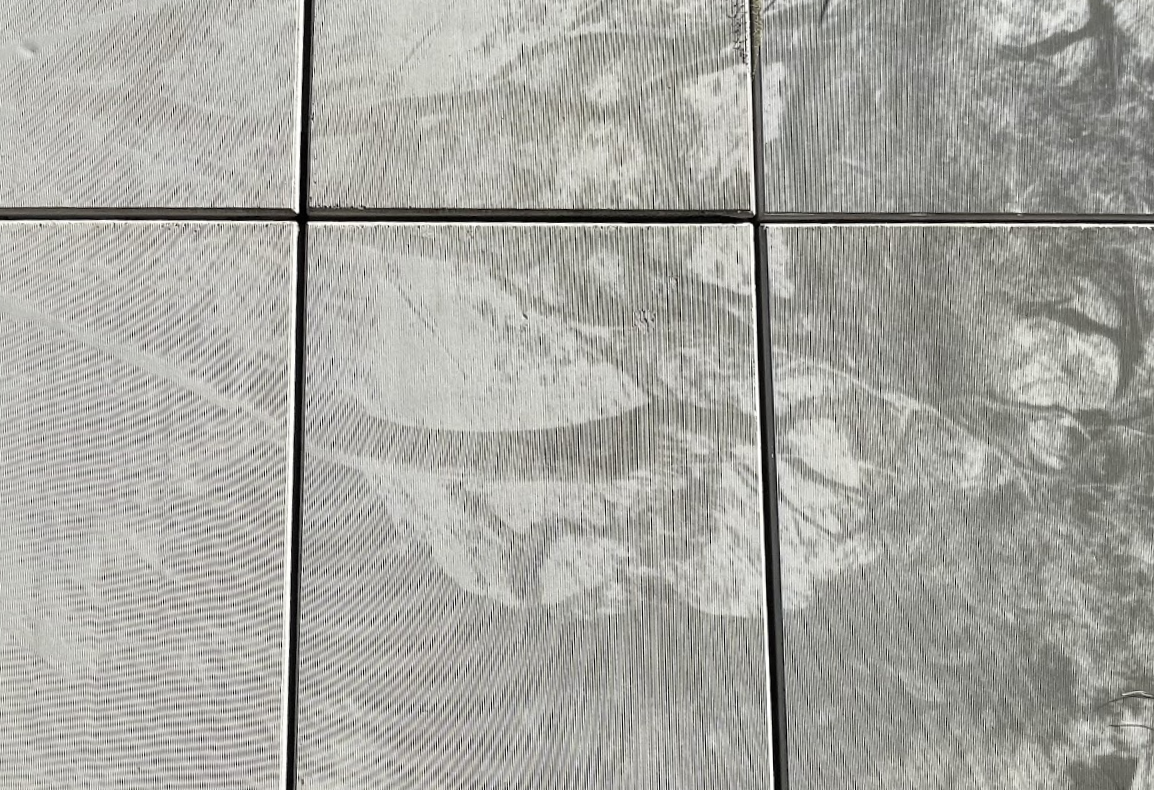
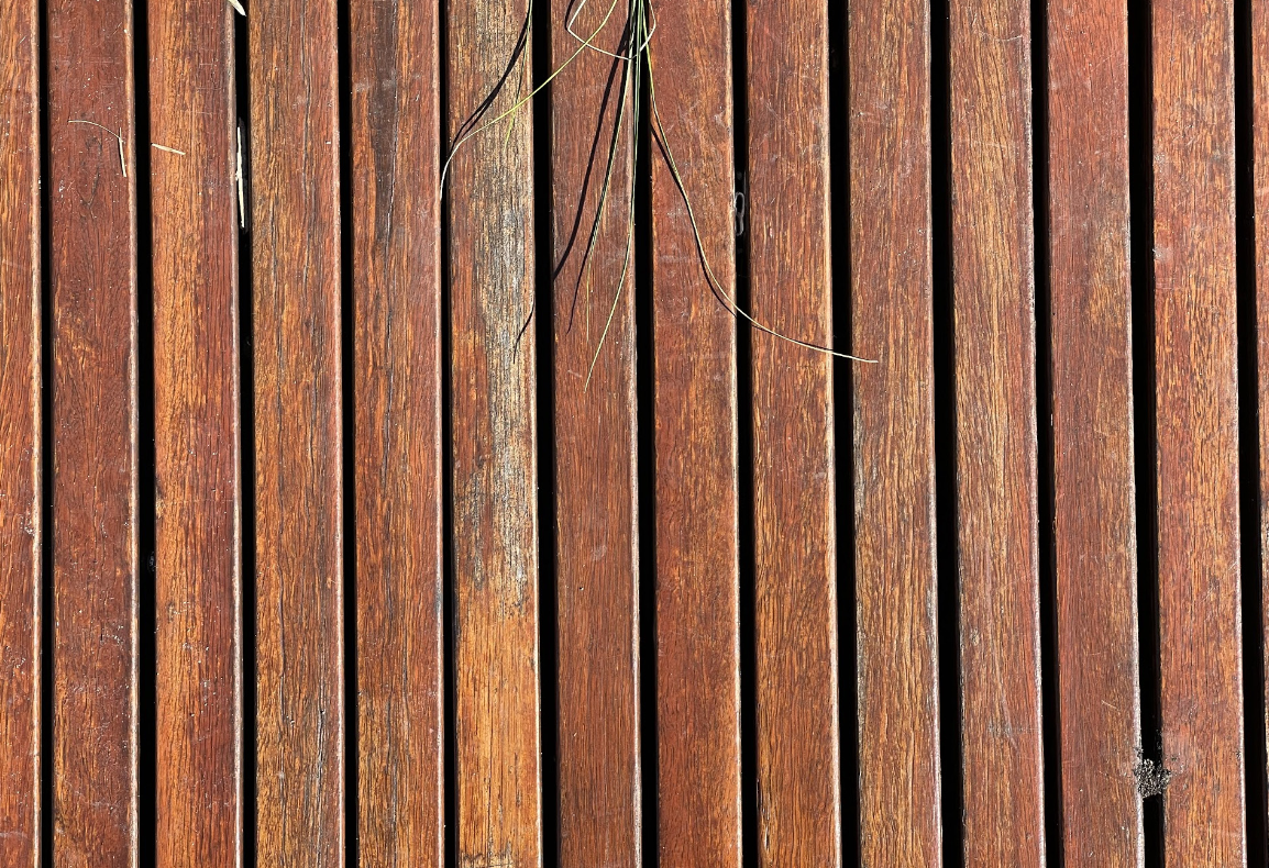
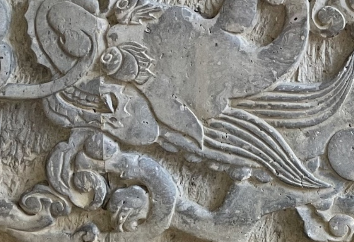
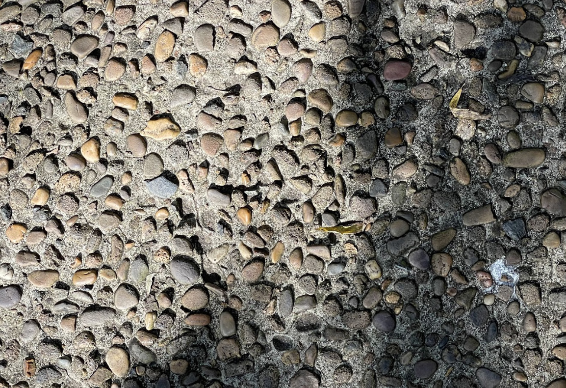
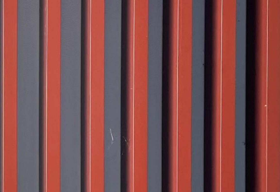
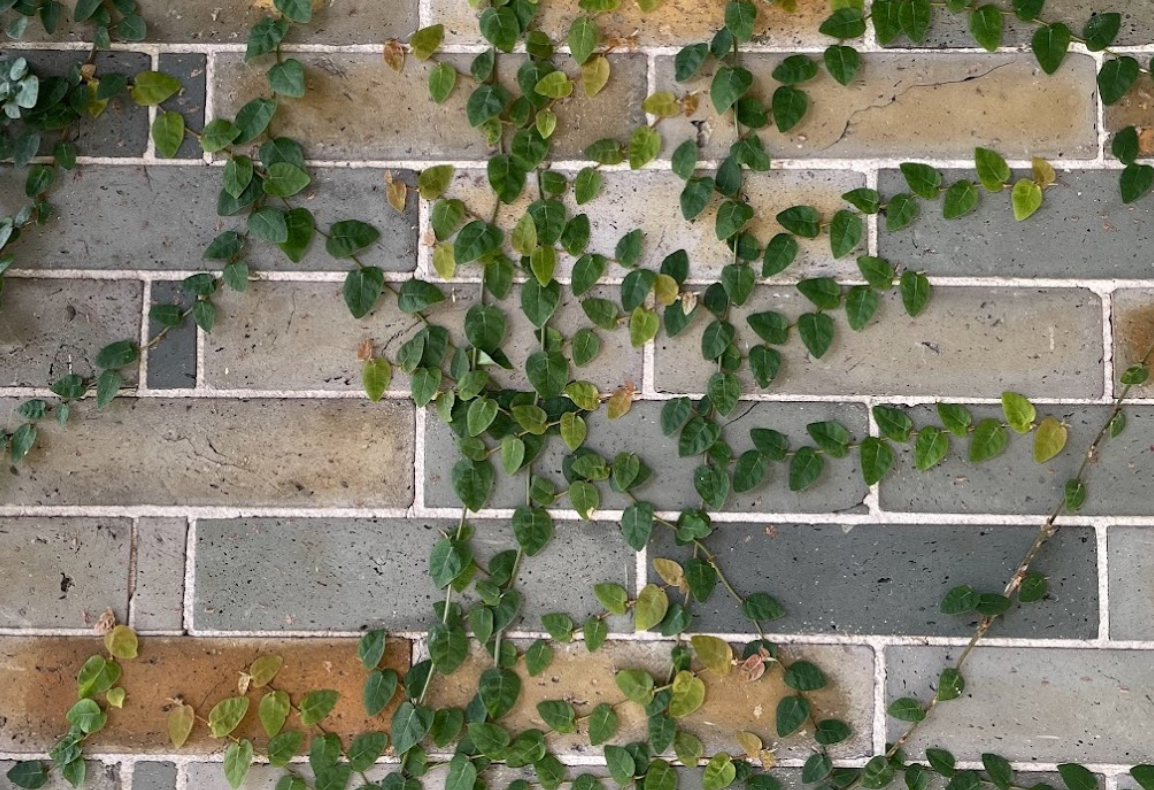
TEXTURES
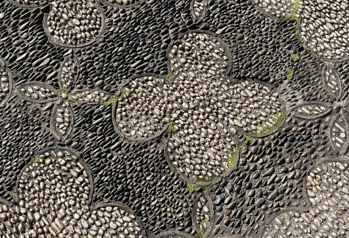
There are a variety of textural elements around Chinatown, ranging from floor tiles, brickwork and wall cladding. Most of the Chinese style textures come from inside the Garden of Friendship, while newer areas such as Darling Square have generic grey/brown bricks and tiles that can be found in other areas of Sydney.





USER RESEARCH
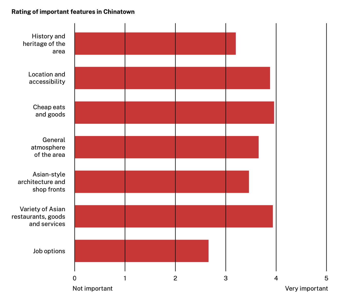
Informal user research was undertaken both online and physically by asking a number of respondents for their thoughts regarding Chinatown. The specific questioning was left open ended to elicit a wider range of responses.
A key theme that emerged was the importance of food as a motivation for visiting Chinatown. Similarly, the historical significance of Chinatown did not feature in any of the responses.
“There’s not a lot of bars in the area.”
Media producer – Male, 24
“I find it confusing to navigate.”
Marketing coordinator – Female, 20s
“I like egg tarts...
Sometimes [I go to] Market
City for Timezone...”
Student – Male, 20
“It just feels dodgy... I walk through it to get to other places...”
Student – Male, 21
“The place is interesting,
but not somewhere I
want to stay for a while.
Food is good, but after
that, I’m back to UTS.”
Student – Male, 20
“[My husband] and I
sometimes go to a
restaurant on Sussex
Street.”
Business owner – Female, 39
MOVEMENT FLOWS
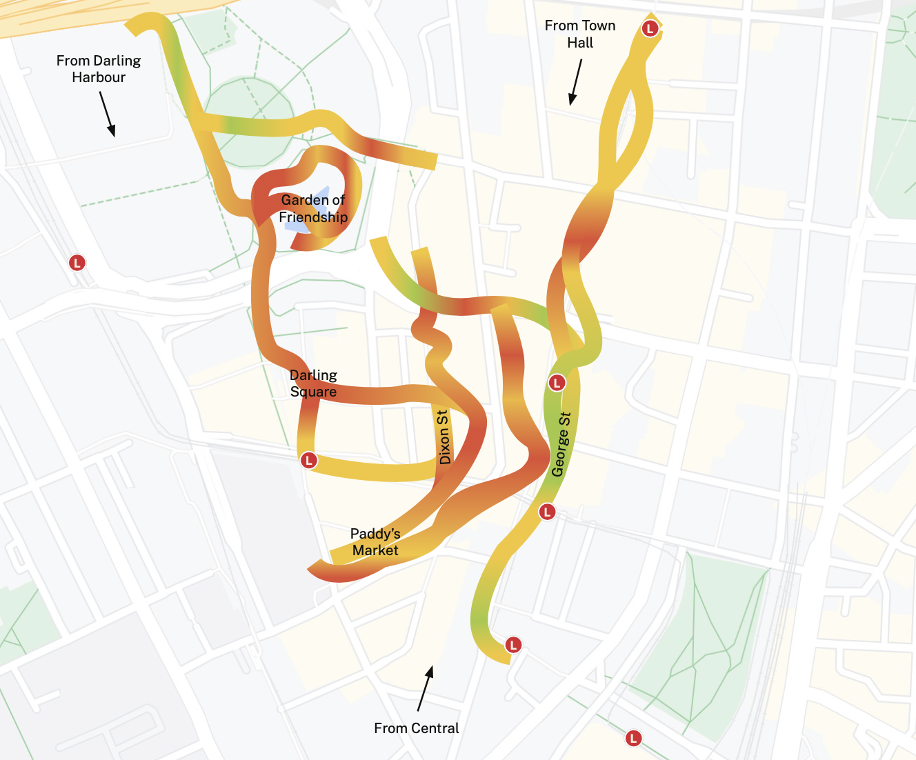
The highlighted paths show the general direction of how people get to Chinatown, travelling from Town Hall, Central and Darling Harbour.
A green colour represents a faster walking speed and red/orange represents a slower walking speed, which corelates to the amount of people within the area and where people gather. As shown on the map, people generally cluster around the main Dixon Street thoroughfare, Darling Square and the Garden of Friendship.
AUDIENCE
According to Destination NSW, there were 2.7 million visitors to Chinatown in 2019, an increase of 1.8% from the previous year, with the majority of visitors coming on a holiday from mainland China. However, the impacts of COVID-19 have meant that tourist numbers have not recovered.
Instead, the majority of visitors to Chinatown are now local Sydney residents, who mainly visit for the food. It is therefore important that the design solution targets this audience and their connections to the area.
DESIGN
Following the research process, a central narrative was developed: “to improve the appeal of Chinatown to a new generation of visitors, using an interactive experience that connects personal and contemporary stories with vignettes of history”.
Three design directions were developed to explore this narrative, which were further iterated upon to reach the final design.

CONCEPT 1
STORIES OF BELONGING
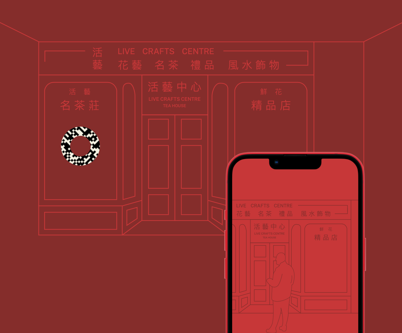
My first concept combined the ideas of a walking trail with an augmented reality app. By scanning specially designed codes located at key landmarks such as 84 Dixon Street, the app would launch an interactive experience that educates users about the cultural significance of that location, told through key historical voices. In addition, users can share their own Chinatown stories onto the app, creating a collaborative and participatory space that continually reflects a growing sense of belonging.
CONCEPT 2
YOUR VOICE. OUR STORY.
To further enhance the narrative and introduce elements of participatory design, the second concept involved using community-led responses to drive the campaign. Under this concept, the public could write messages on cards located at key attractions within Chinatown, with comments responding to the prompts on the cards. This draws upon the idea of Chinatown as a traditional gathering place and place of diversity. The handwritten messages could then be scanned and used on promotional materials.

CONCEPT 3
ALWAYS MORE TO SEE
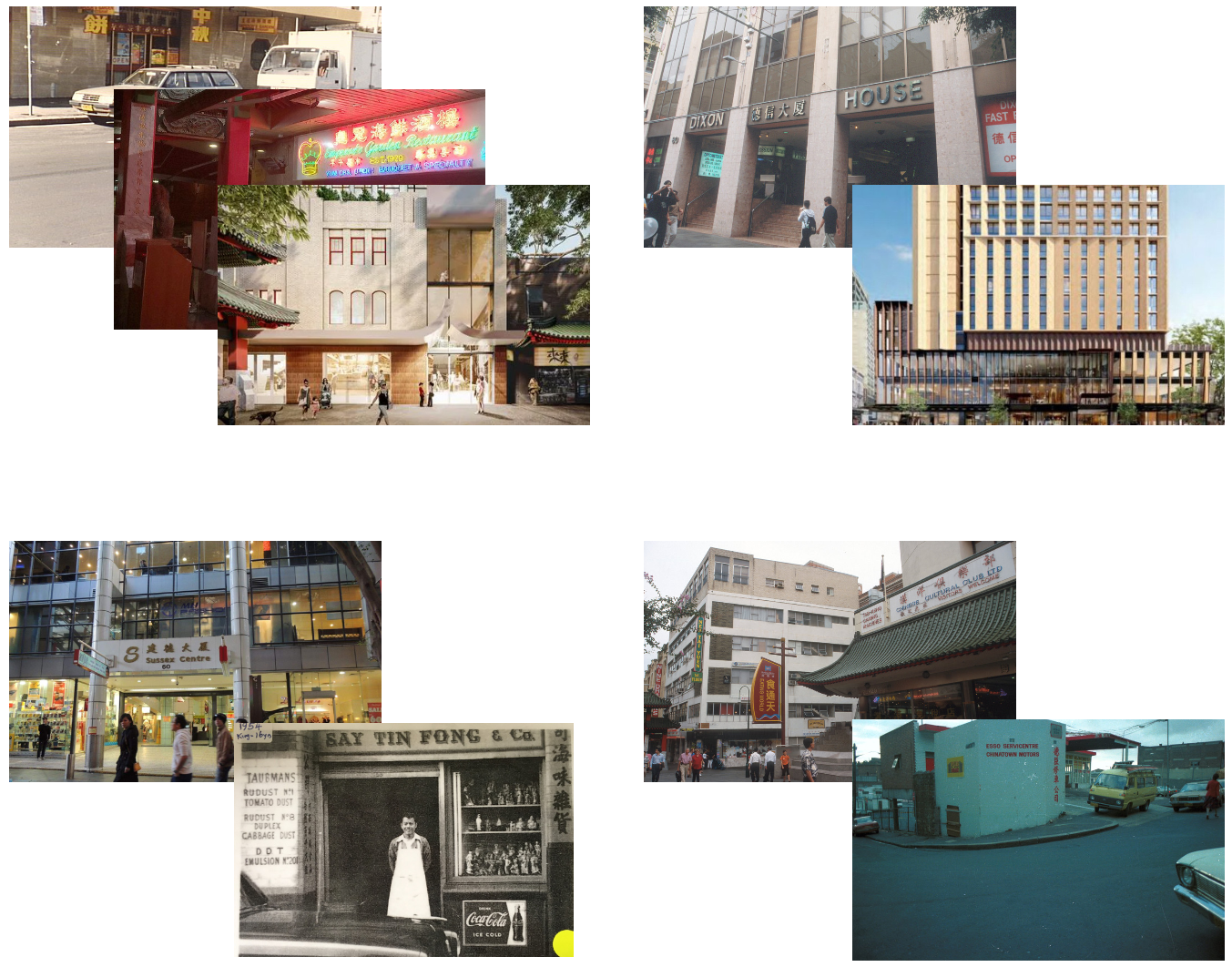
Further iterating upon the previous concepts, the third direction involves the physical facades of buildings that are for lease or about to be redeveloped. It would show the history and uniqueness of that building in a graphical way, for example as a projection or printed on hoarding.

This concept was particularly notable due to the high number of locations within Chinatown that are facing redevelopment. Combined with the depth of historical research and archival photographs available, it would be able to present the area’s history and stories in an engaging way.
CONCEPT 4
OVER A CENTURY OF STORIES
Drawing upon all previous iterations, the final concept was called “Over a Century of Stories”, reflecting Chinatown’s rich past that many are unaware of.
Shown below are three drafts of the design, along with the final hero image.


IDENTITY
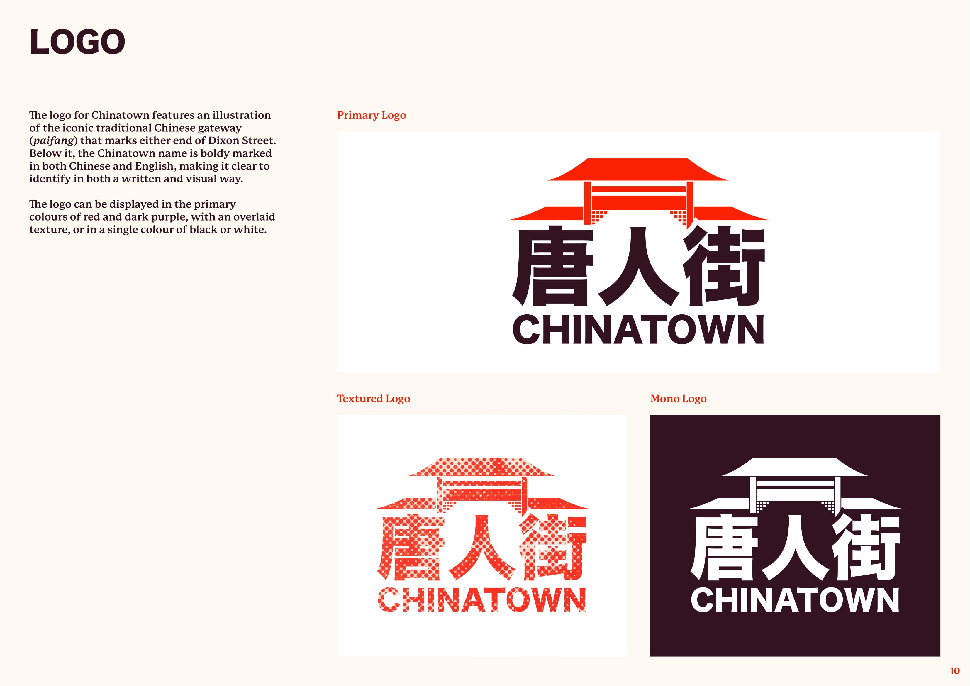
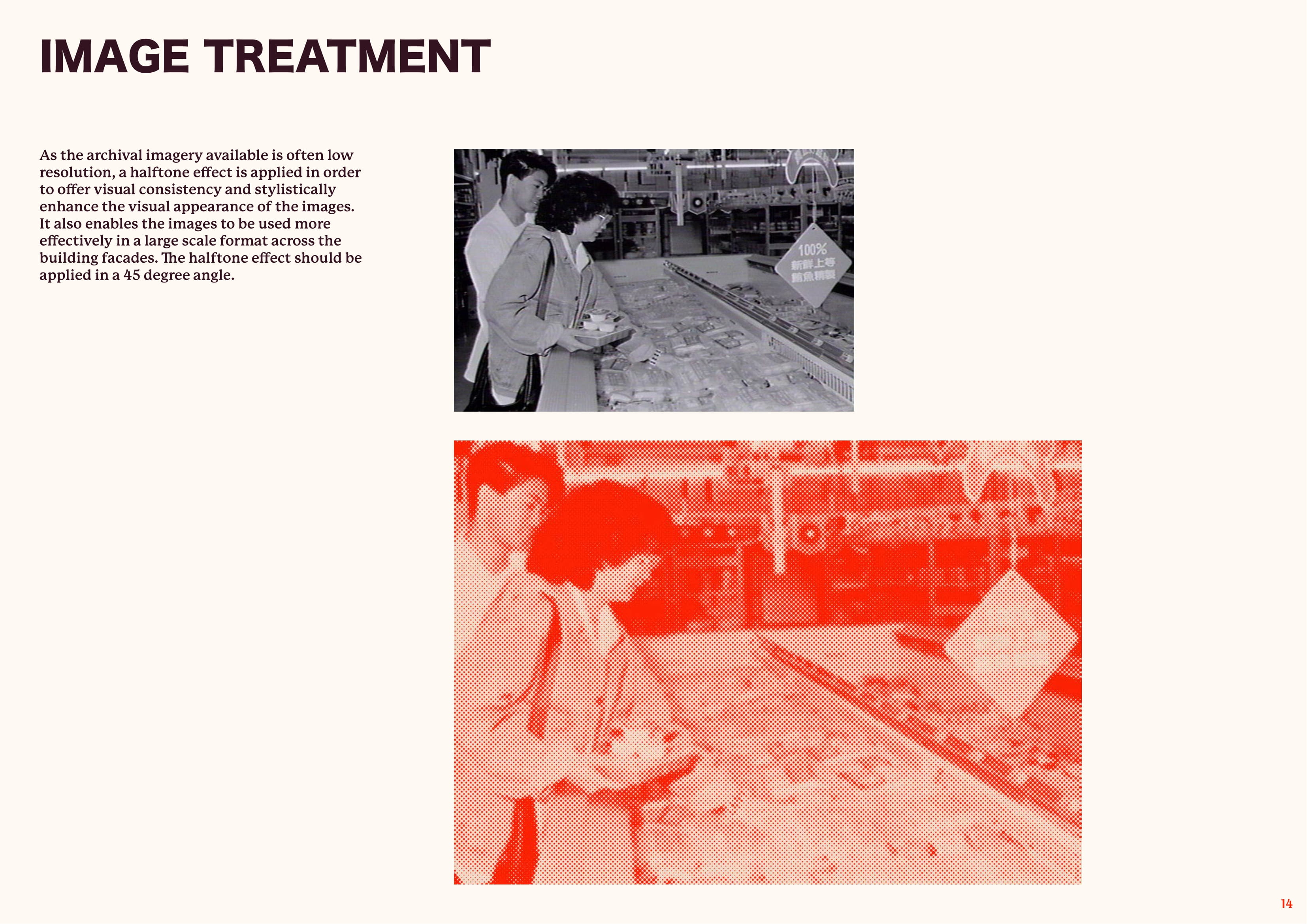
Central to the graphic identity is the colour red, symbolising luck and fortune in Chinese culture. This is complemented by a halftone effect that is applied across historical archival imagery, providing a unifying factor whilst also serving a practical purpose of enhancing the image quality. These designs will be printed on high quality building wrap, that features a non-woven moisture-barrier material that is also flame, tear, and UV resistant. The wrap will not only protect the heritage buildings from damage, but will offer an eye-catching graphic that lures visitors back to the area.
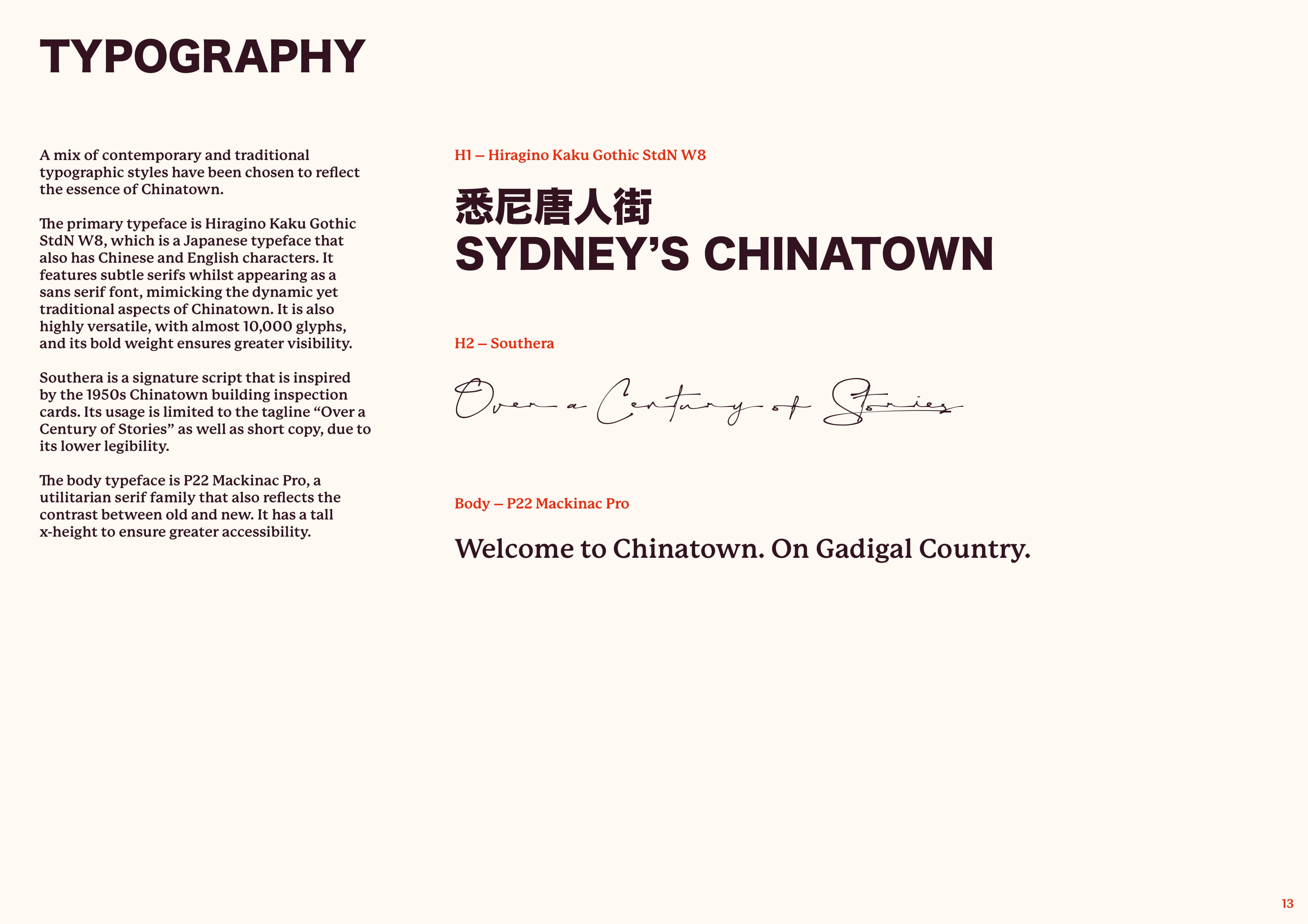
Three unique typefaces have also been chosen, with Hiragino Kaku Gothic StdN W8 providing a highly visible and versatile choice for headings. It features both Chinese and English characters and has subtle flaired serifs whilst appearing as a sans serif font, mimicking the dynamic yet traditional aspects of Chinatown. Southera will be used for shorter copy, with its signature style script inspired by the handwriting found on 1950s Chinatown building inspection cards. Finally, P22 Mackinac Pro will be used for body copy, a modern serif family that has a tall x-height to ensure greater accessibility for wayfinding.

GRAPHIC INTERVENTIONS
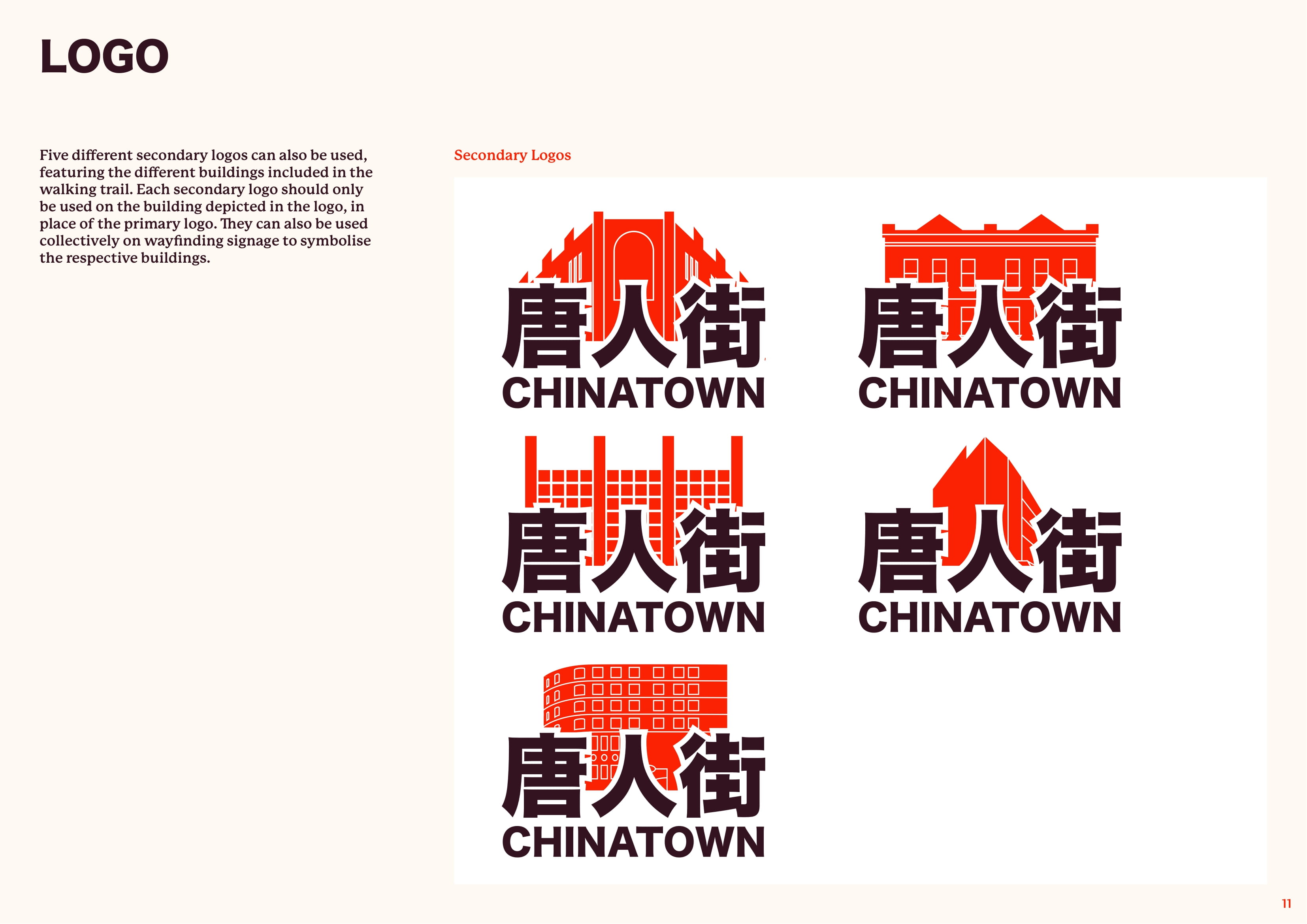
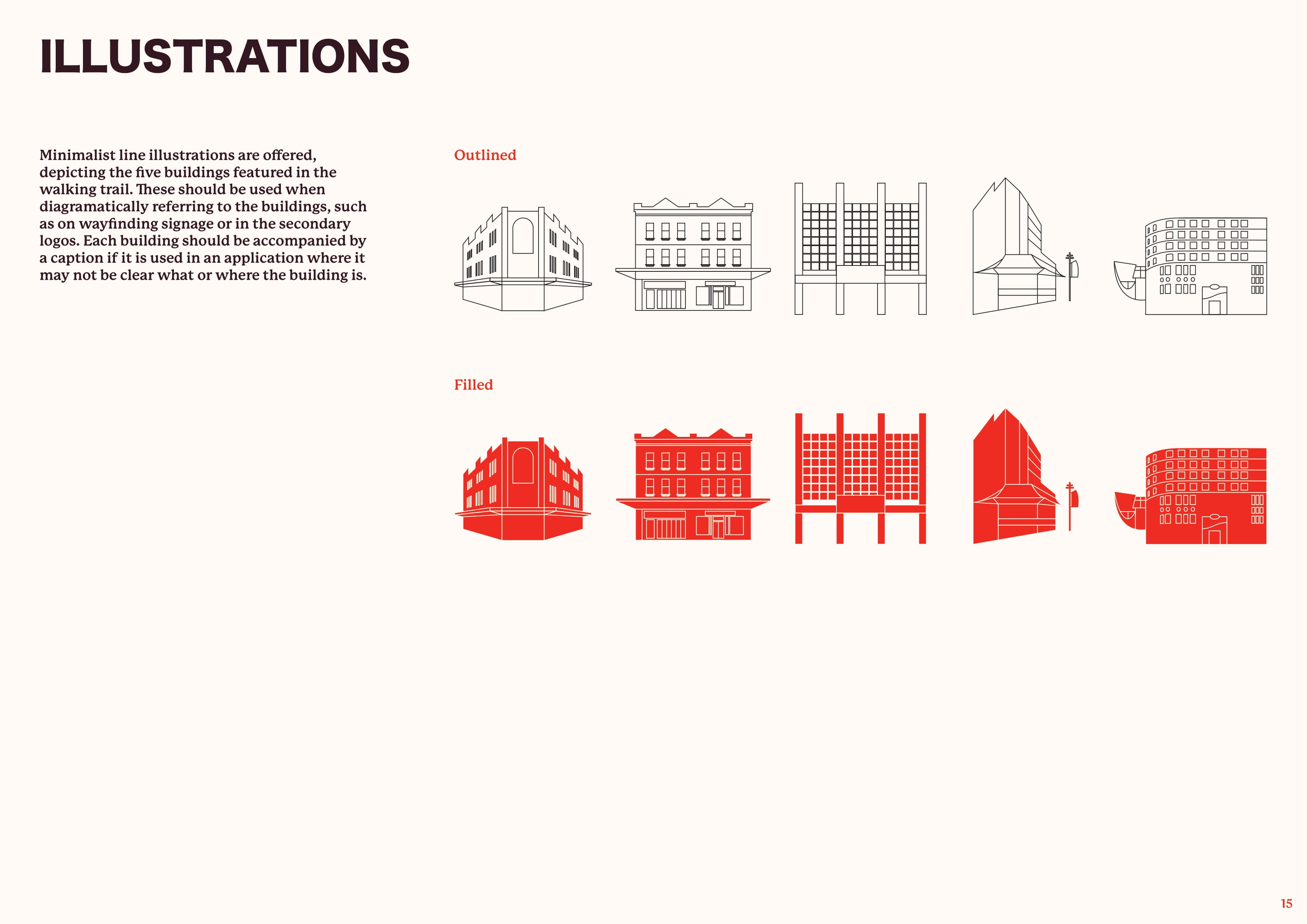
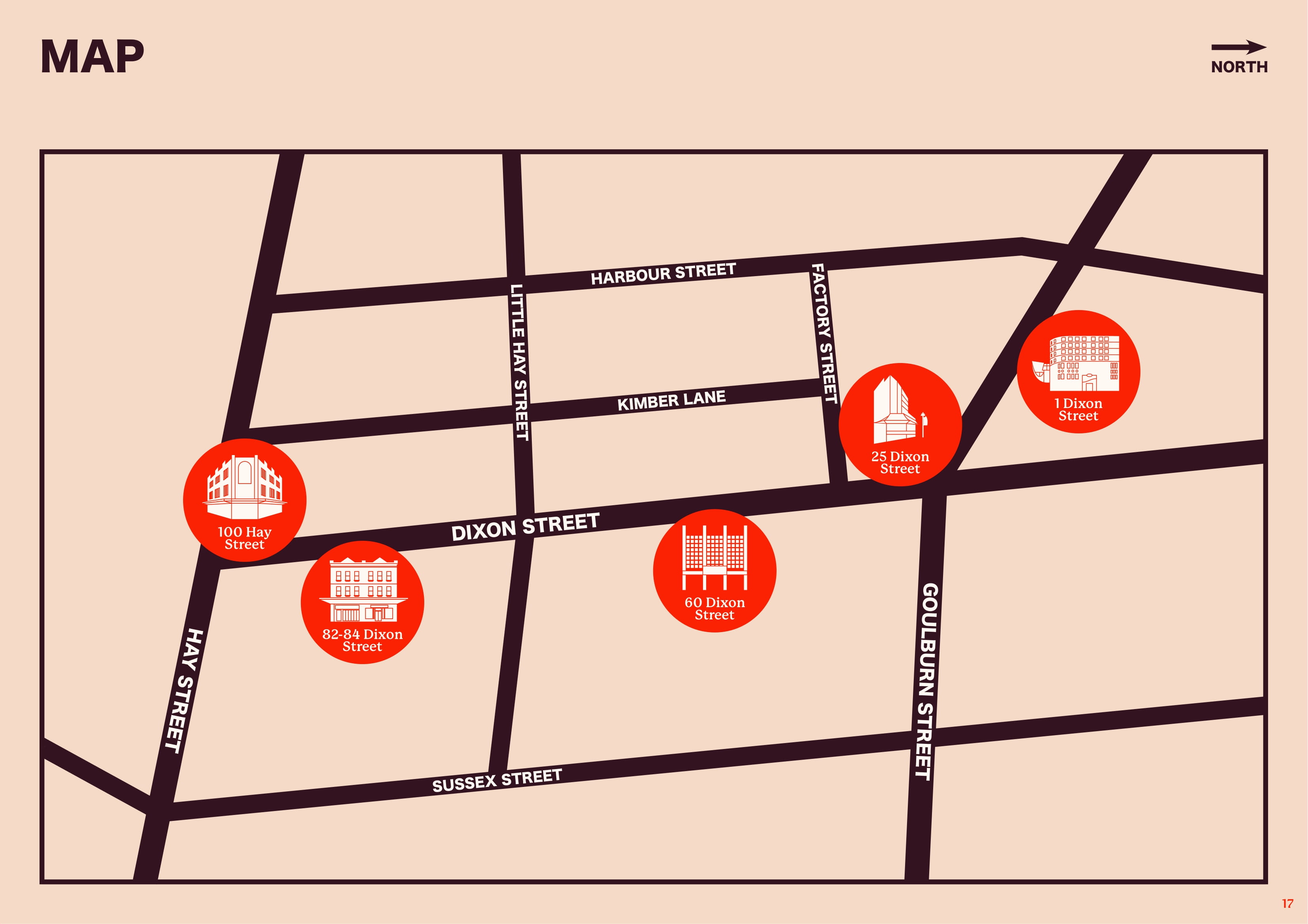
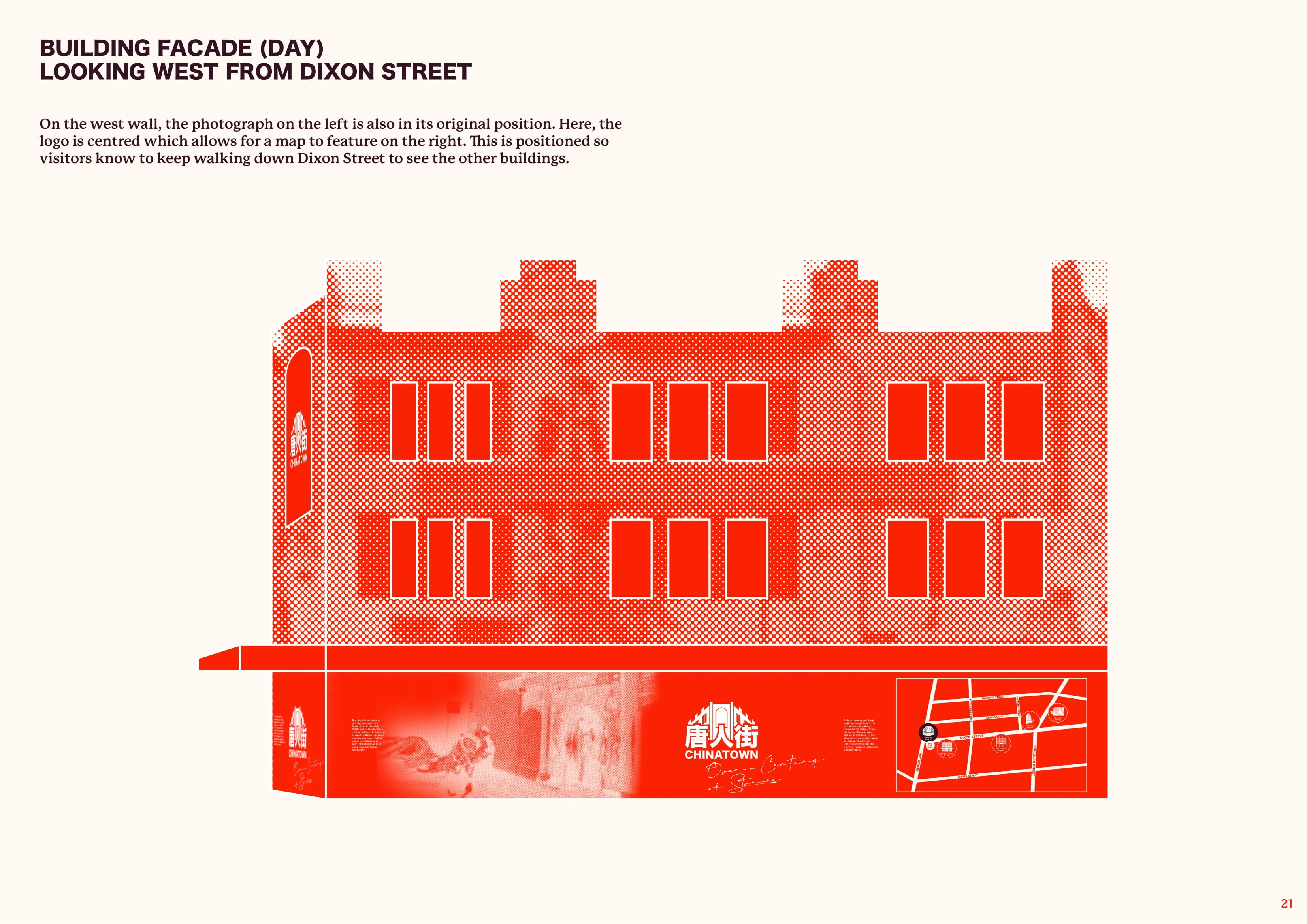
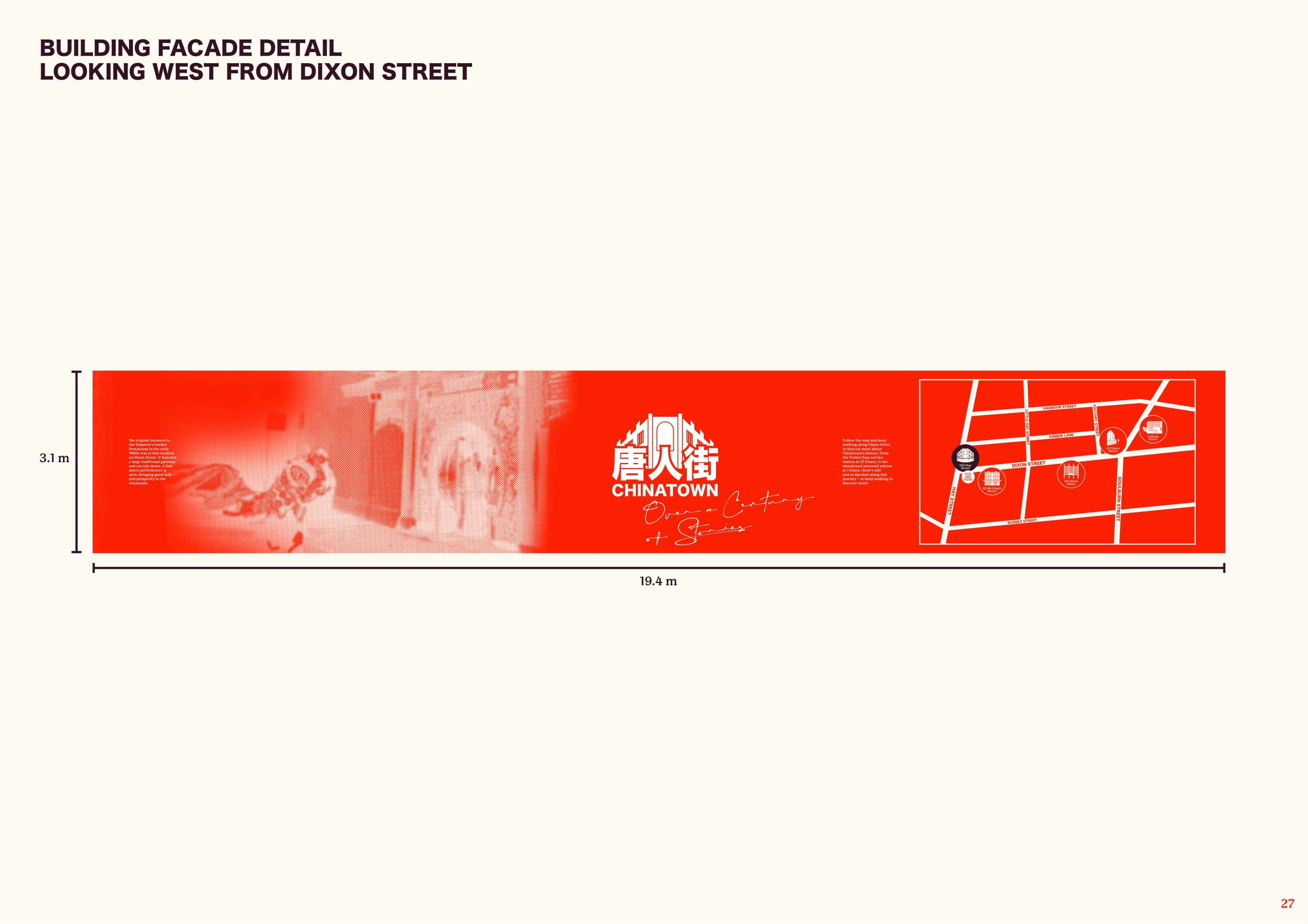
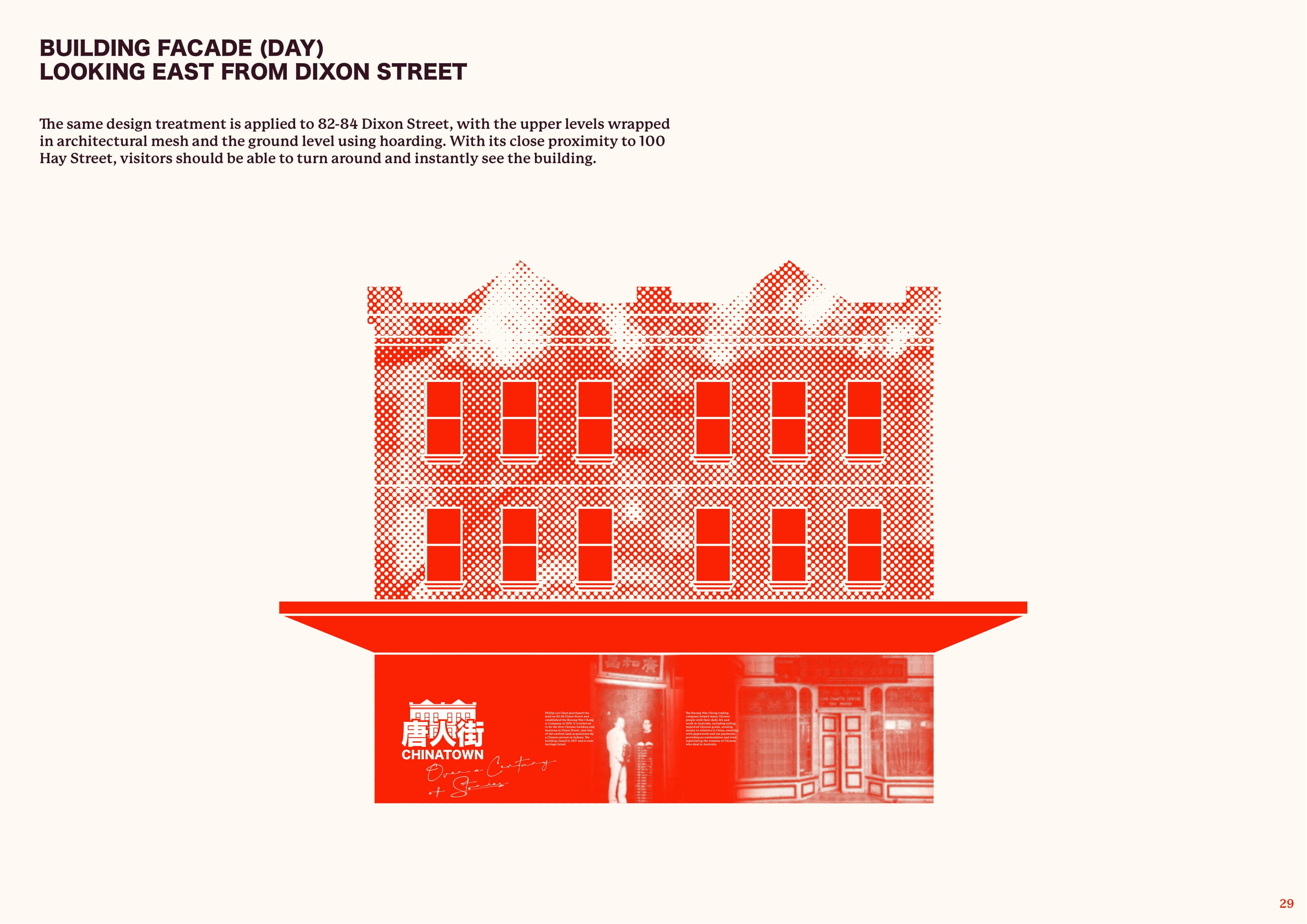
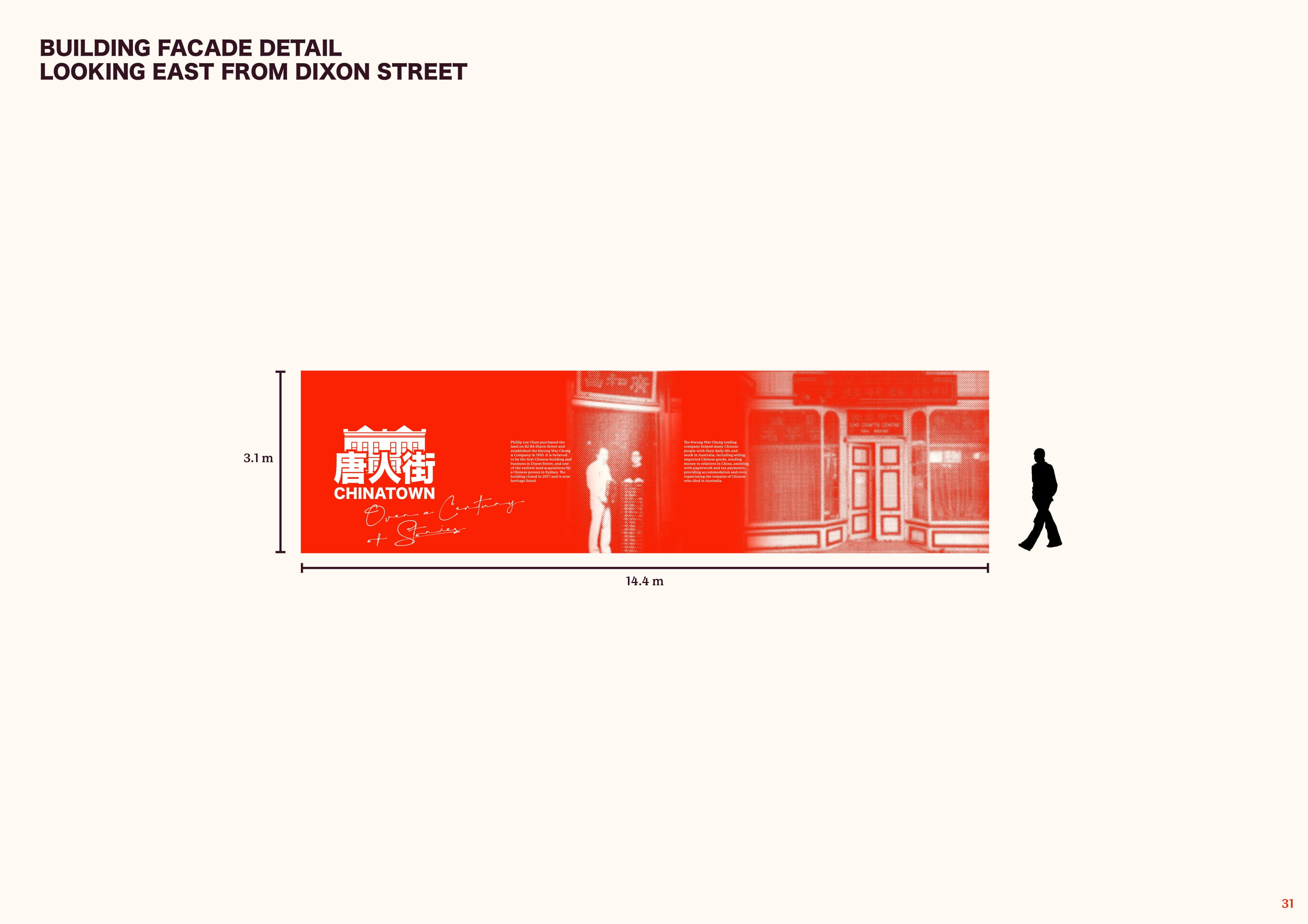
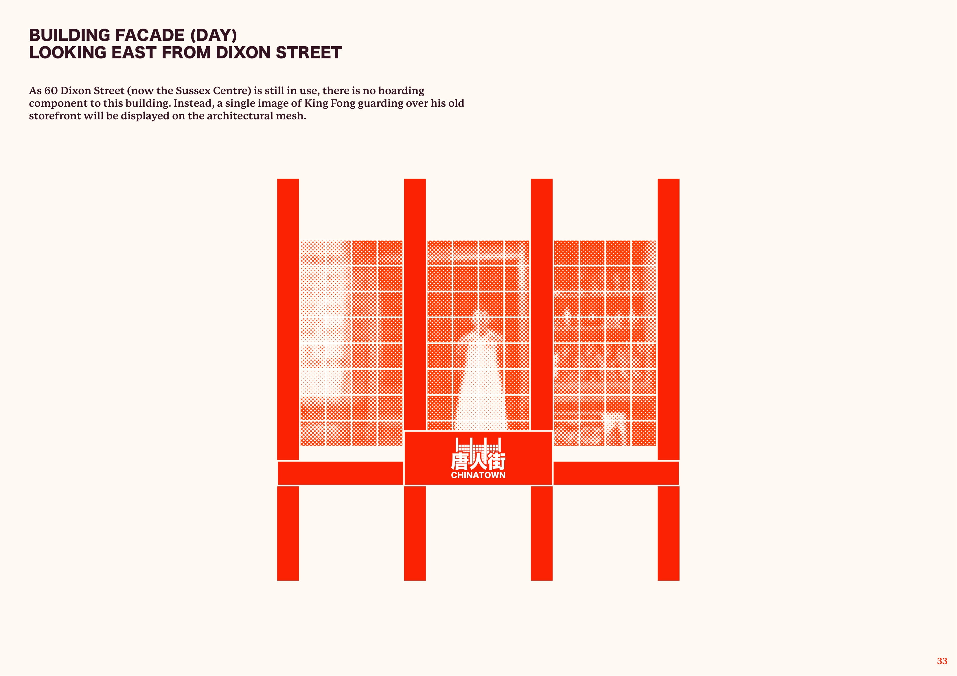
Five sites have been chosen as part of this project – each with a unique story to tell. With the redevelopments of 100 Hay Street and 82-84 Dixon Street, the entire facade of these buildings will be used as the canvas to present a provoking yet contemplative look at Chinatown’s stories. Along with three other important buildings that together form a short walking trail, visitors will be immersed in history and gain a better understanding of what makes Chinatown what it is today.
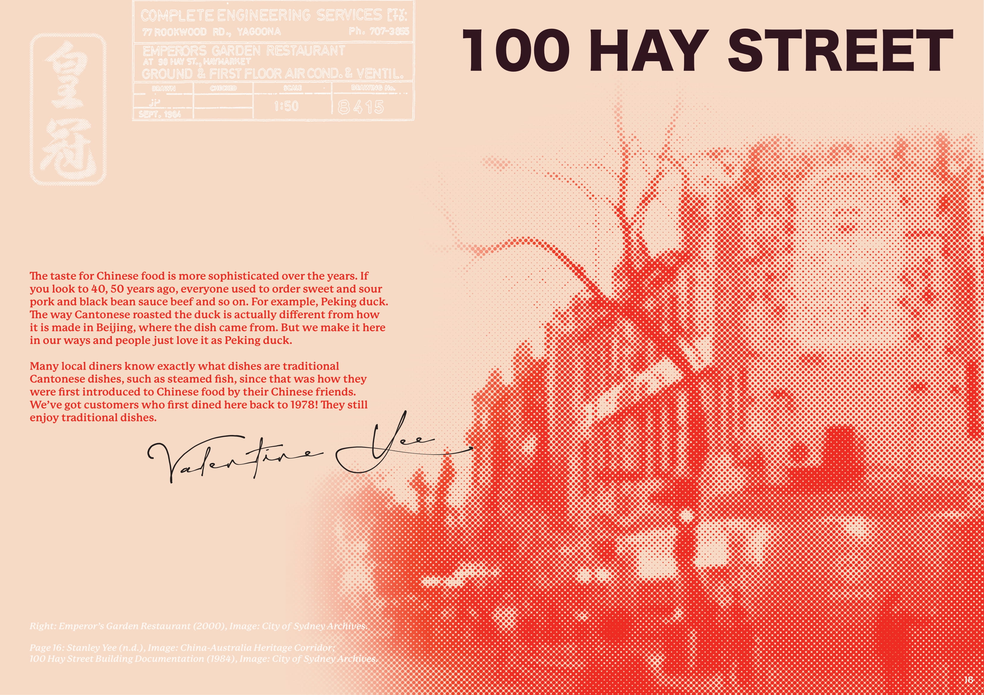
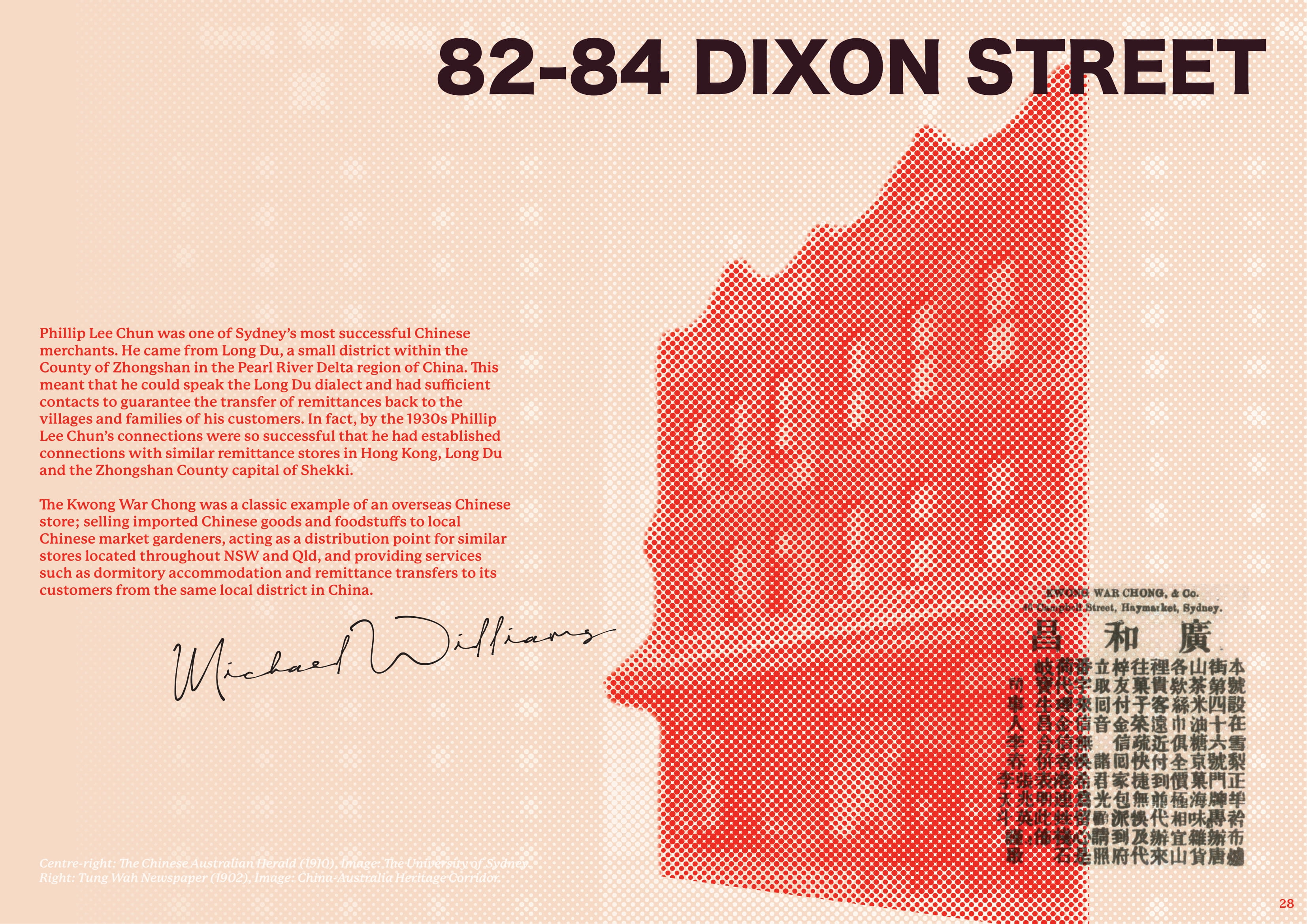
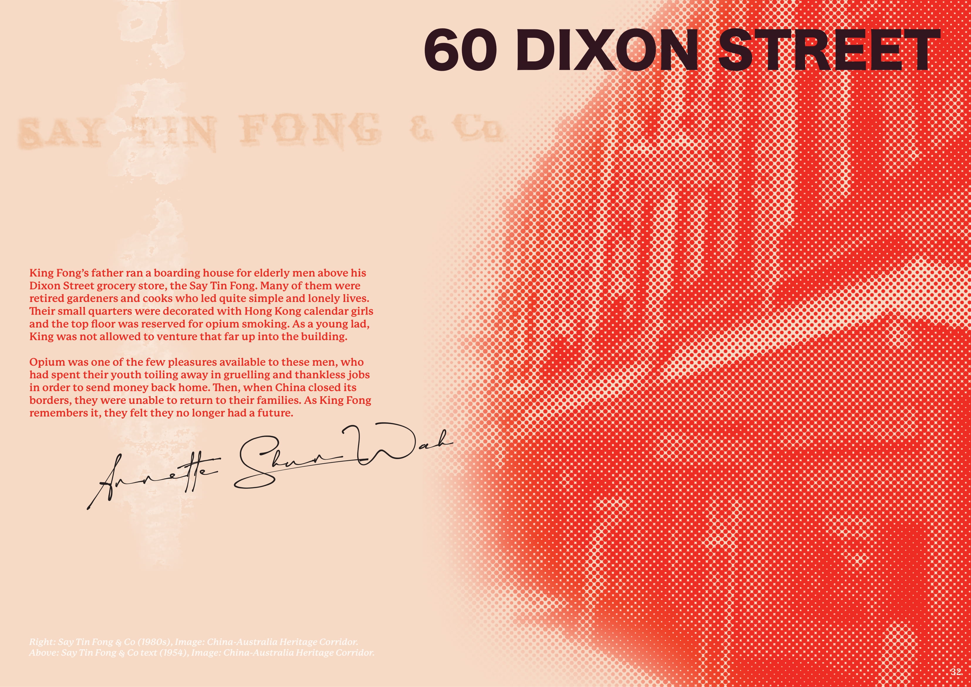

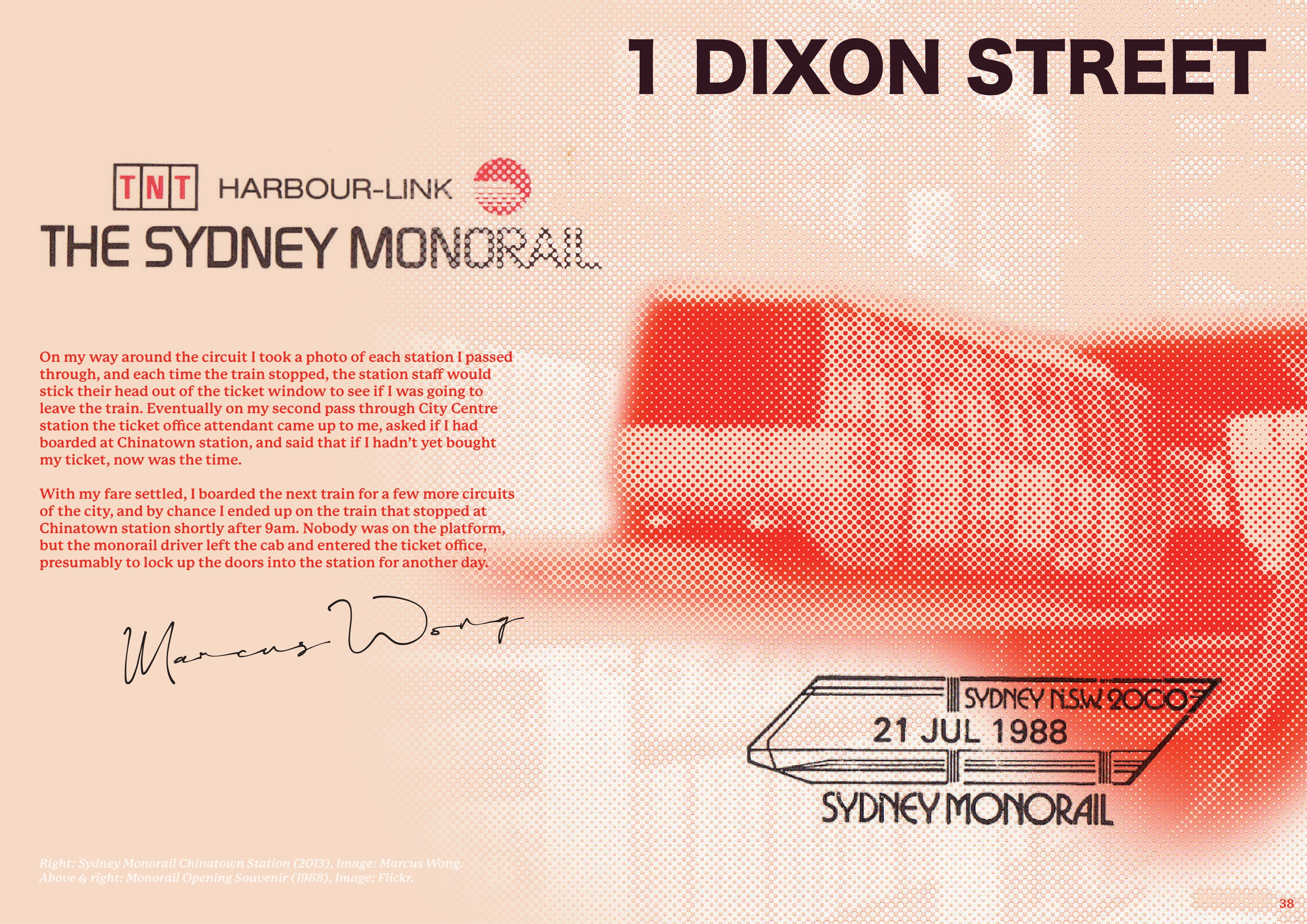
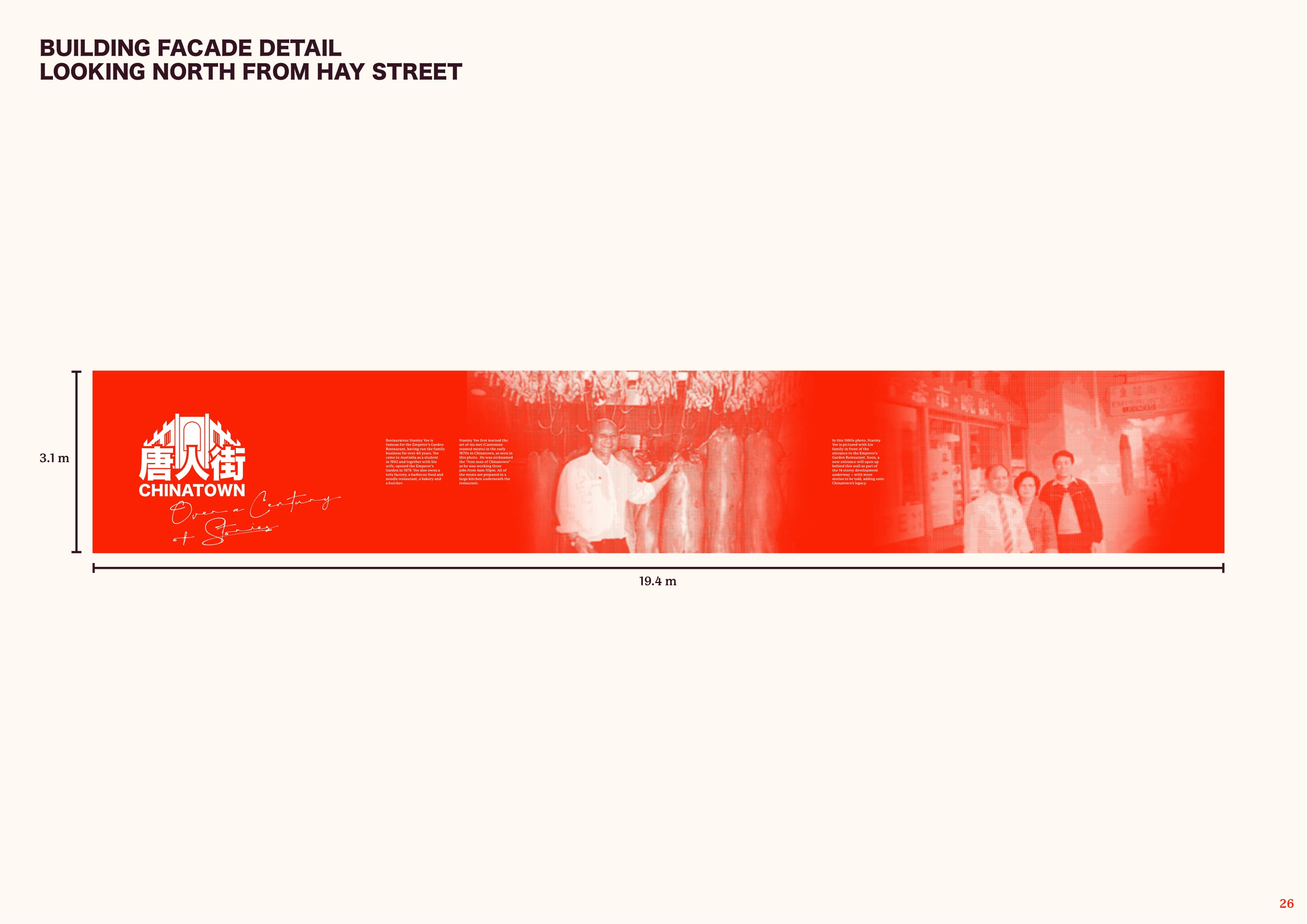
The graphic interventions across the five buildings will feature historical imagery unique to those locations, with some of the photos having been taken in the same location decades ago. This will be complemented by short stories that capture memories of what happened in those buildings long ago, similar to the excerpts shown above.
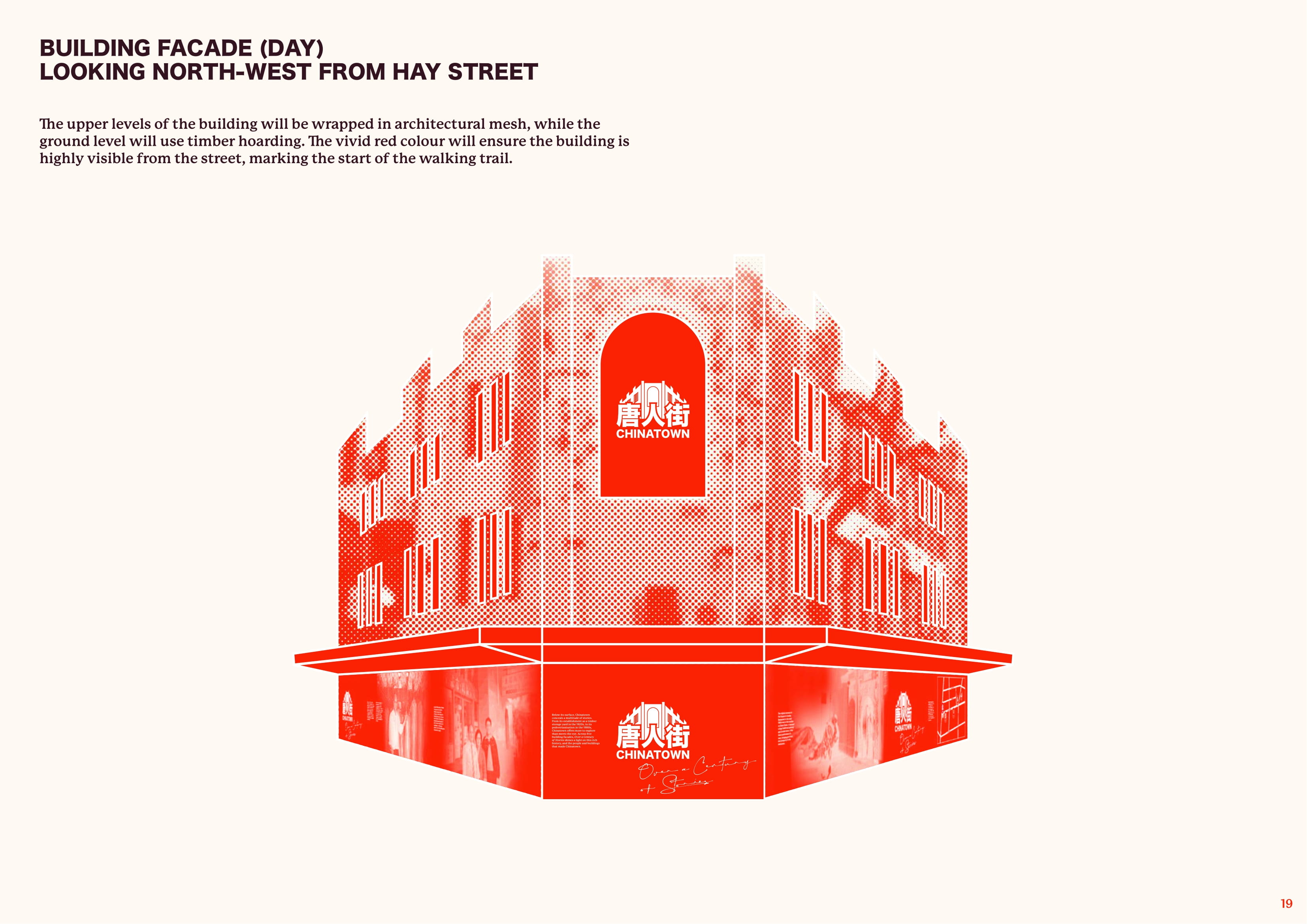
The upper levels of the buildings will be wrapped in architectural mesh, while the ground level will use timber hoarding. The vivid red colour will ensure the building is highly visible from the street, marking the route of the walking trail. The large scale of the installation will ensure it can provoke interest and be seen from across the area.
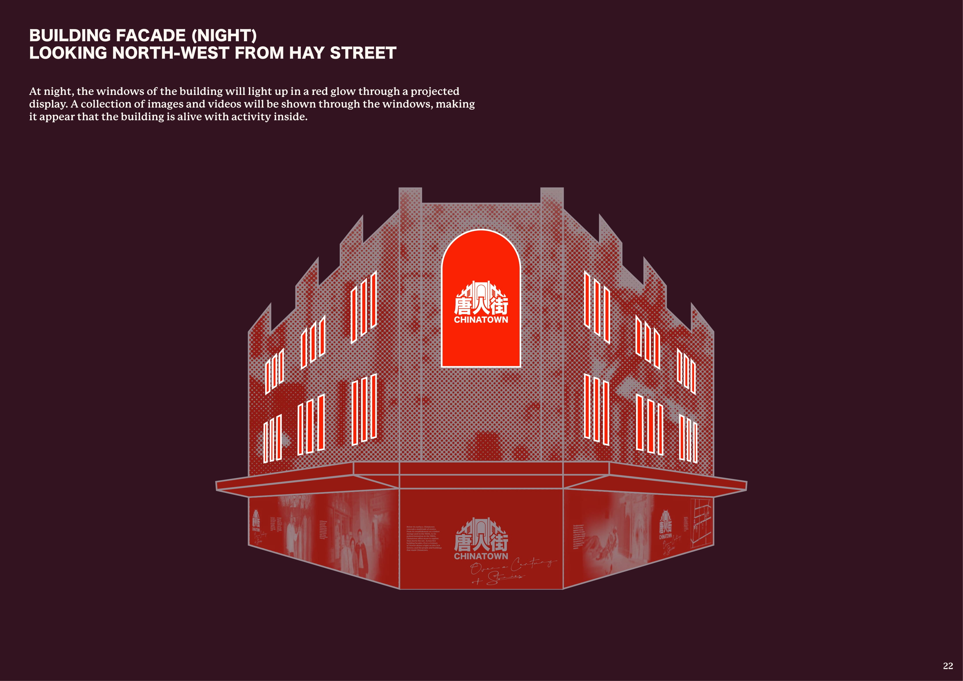
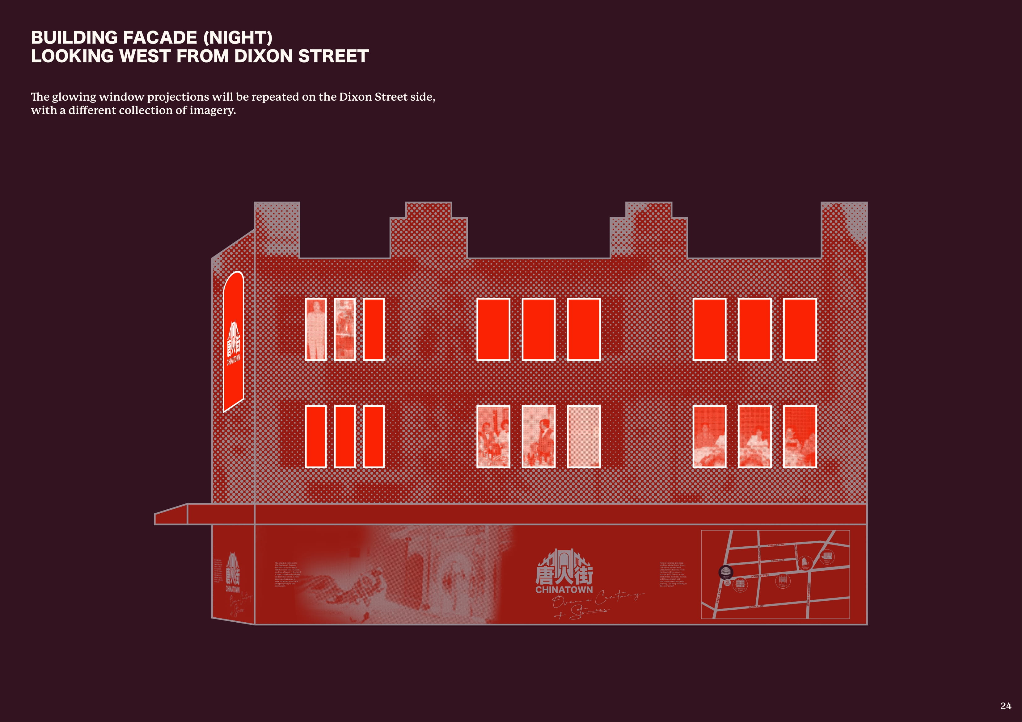
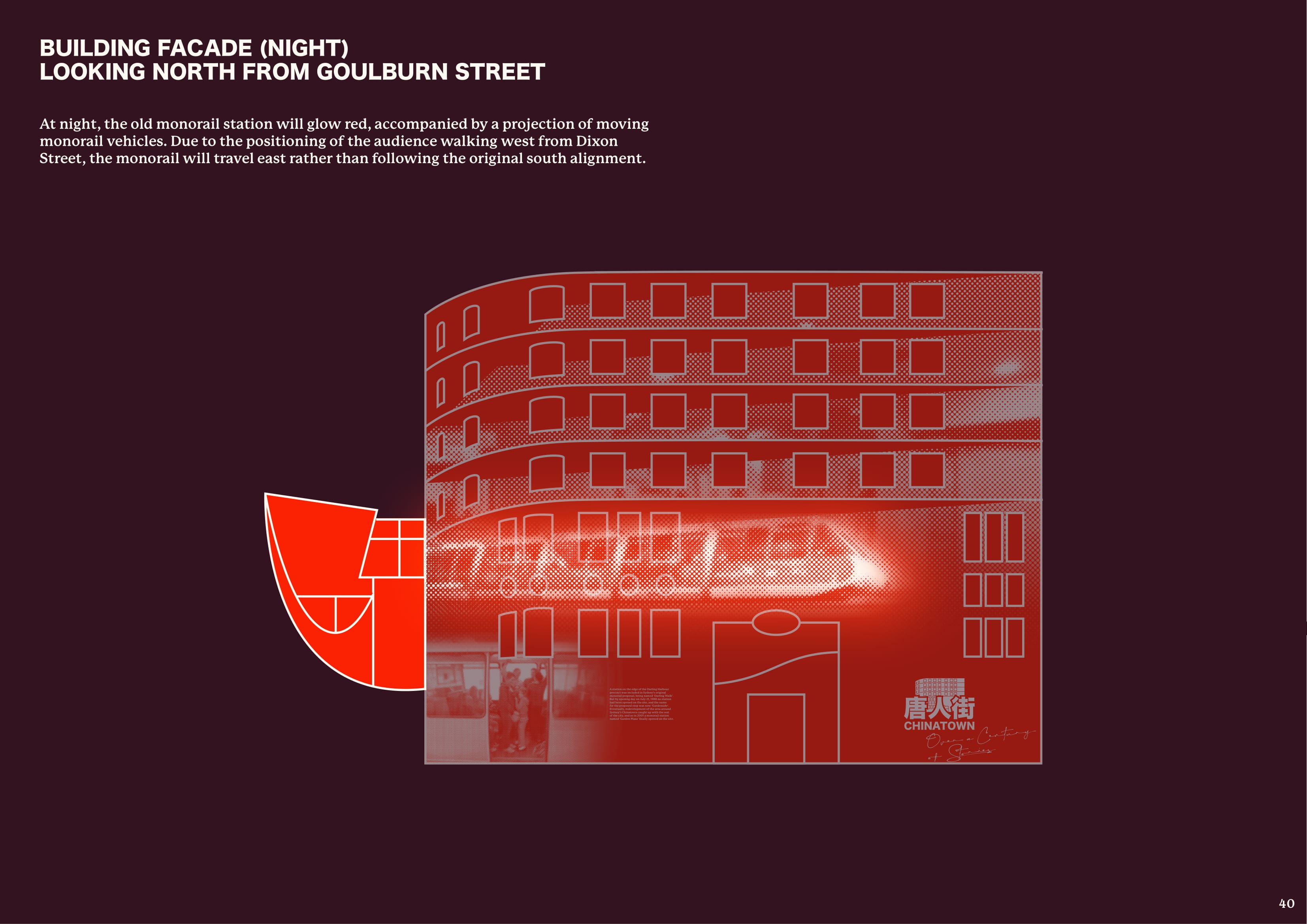
At night, the windows of the buildings will light up in a red glow through a projected display. A collection of images and videos will be shown through the windows, making it appear that the building is alive with activity inside. The projections will change periodically, lighting up different window combinations at a time. As a result, the red glow will always be visible from the street.




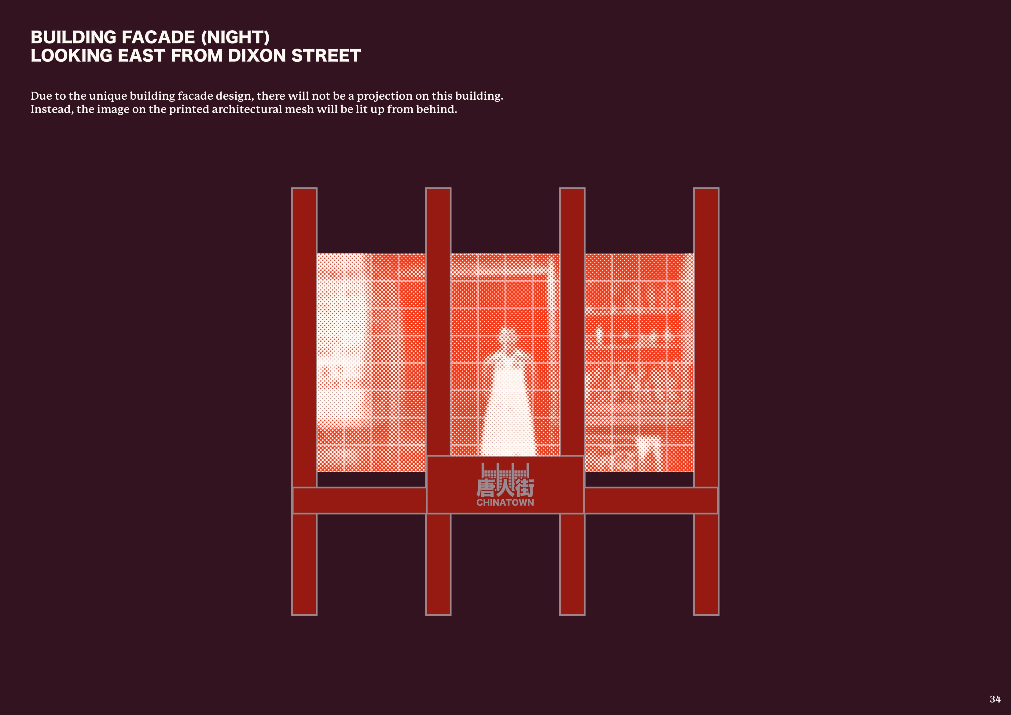
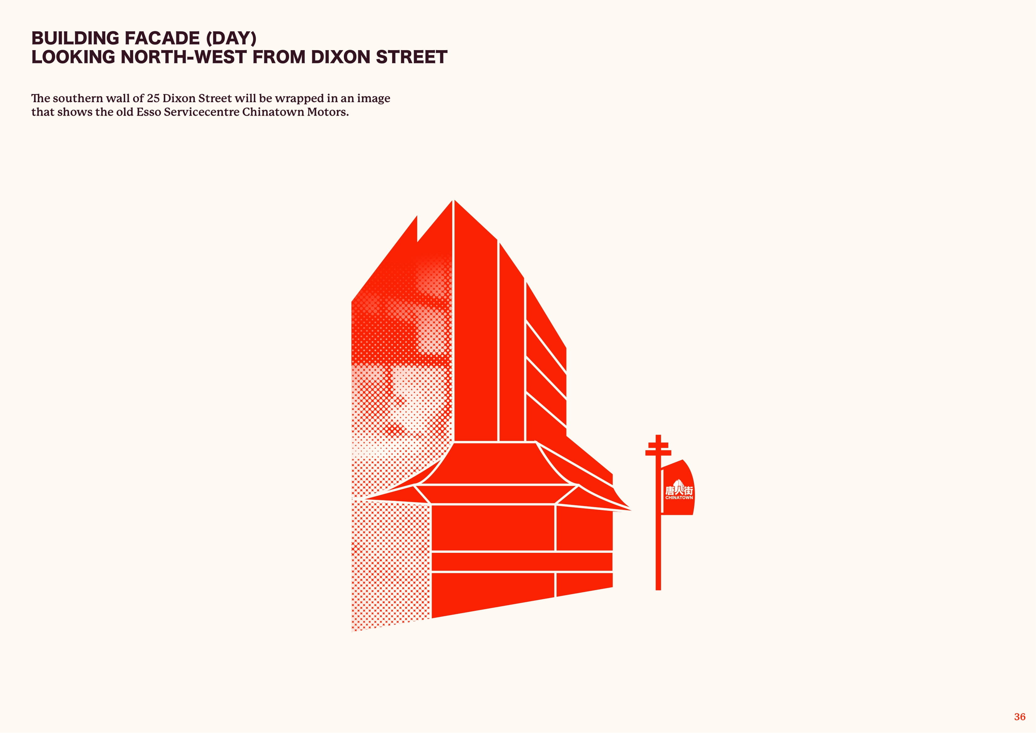
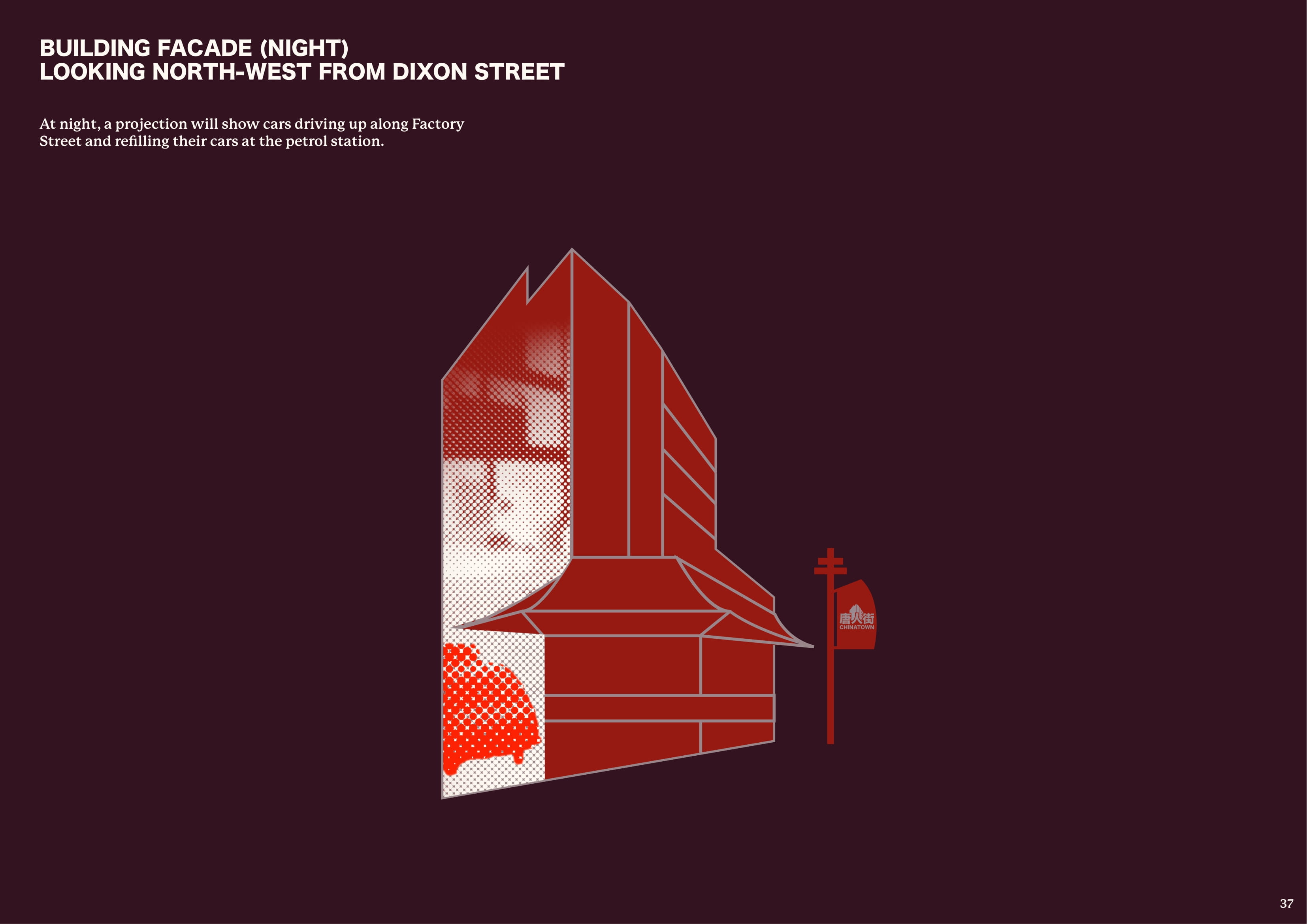
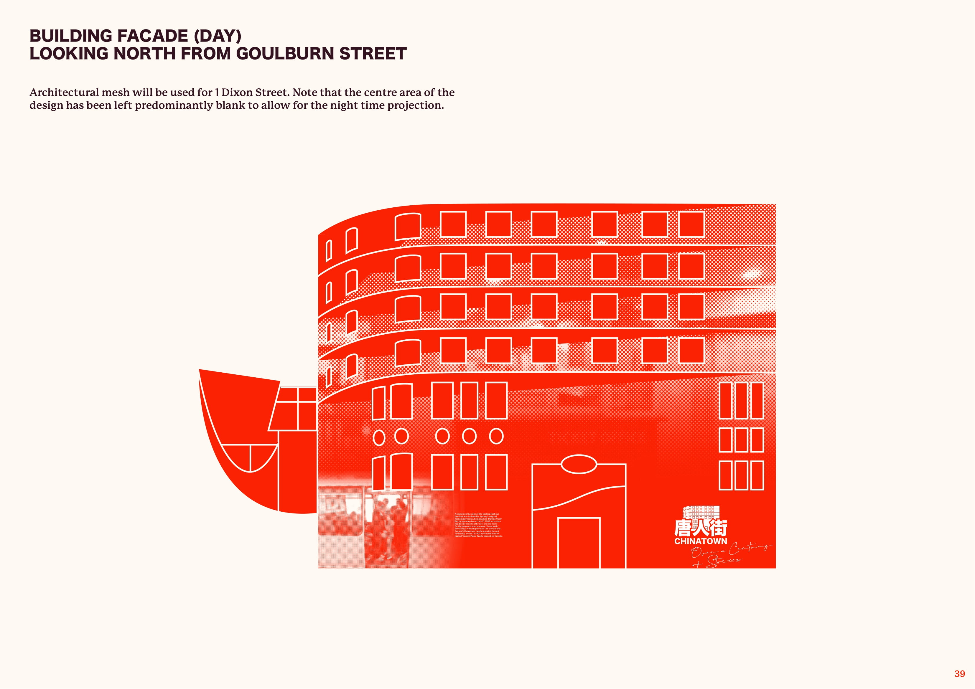
MOCKUPS
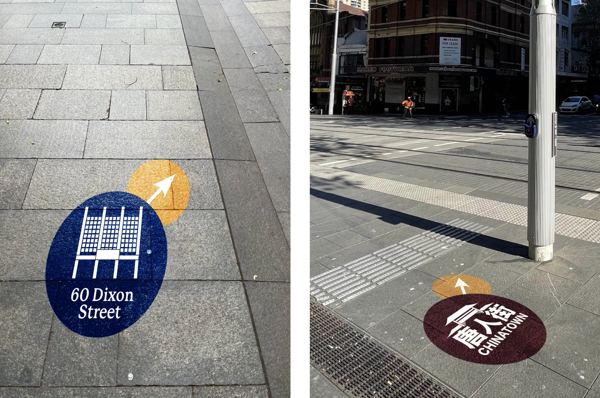
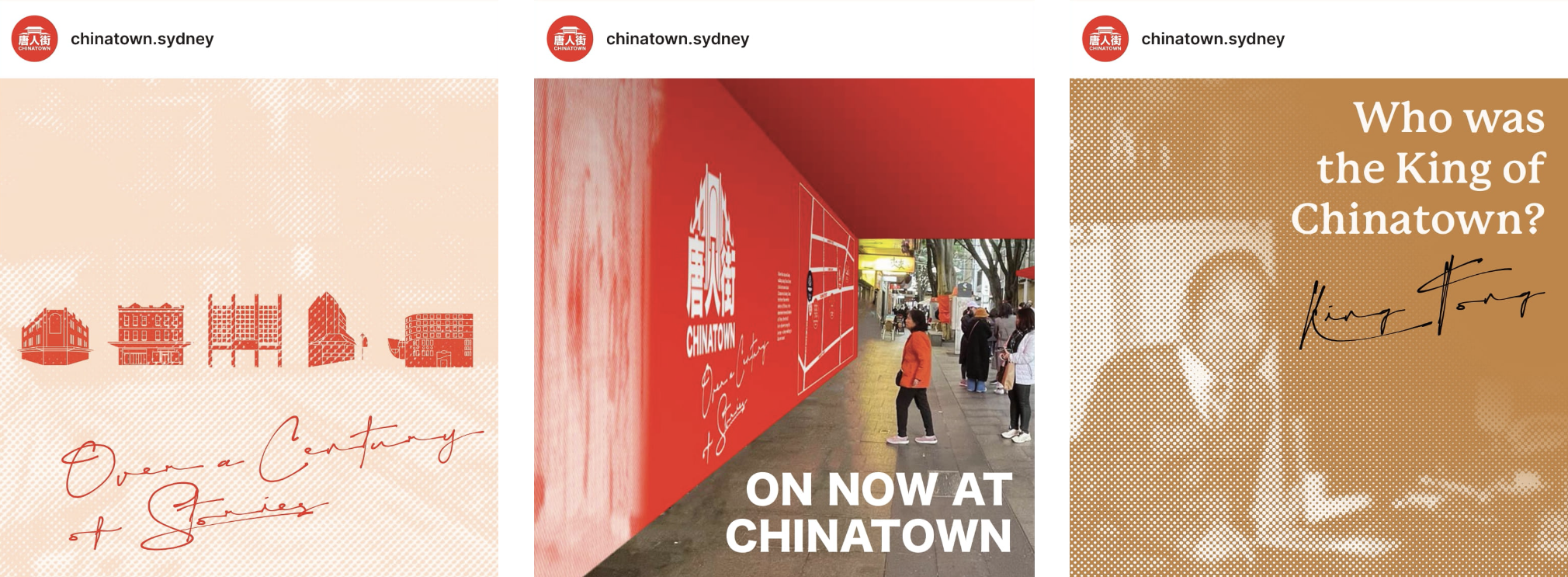
A closer look at the graphic interventions applied to the buildings from different perspectives, as well as a selection of wayfinding material and digital components.




CONCLUSION
This project was definitely a memorable one, and it has been interesting to reflect back on the design process. For much of the project, I was unsure of what to do. I came across so many examples of people feeling a sense of belonging towards Chinatown, and yet myself and my peers did not have such a connection. I realised that it was impossible to force a sense of belonging, and all I could do was raise awareness of these historical stories towards contemporary audiences.
Once this hurdle was overcome, the design process was much easier. All parts of the journey led to the final outcome, from the historical research, to earlier line drawings and texture explorations. It was pleasing to see the all of these elements come together.
It is clear that Chinatown is always evolving, with plenty of stories to tell. Over a Century of Stories hopes to illuminate just some of these, provoking valuable conversations and reigniting a shared love for Chinatown.
Note: All historical images are from the City of Sydney Archives and the State Library of NSW. All other photos were taken by myself.

