Library
Role
Lead designer
Lead designer
Timeline
2015
2015
Skills
Logo design
Branding
Logo design
Branding
Tools
InDesign
Illustrator
InDesign
Illustrator
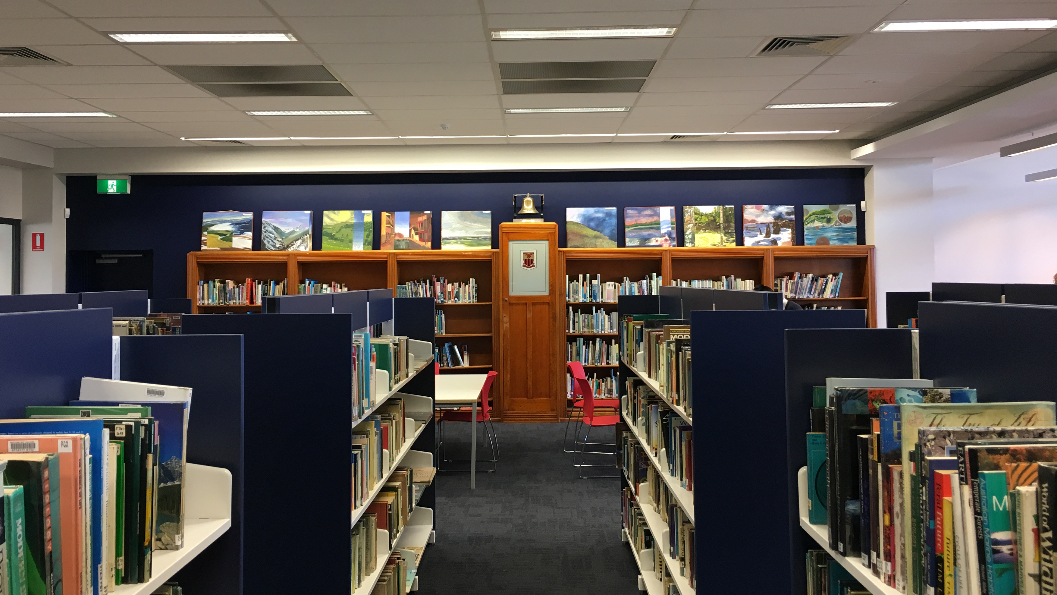
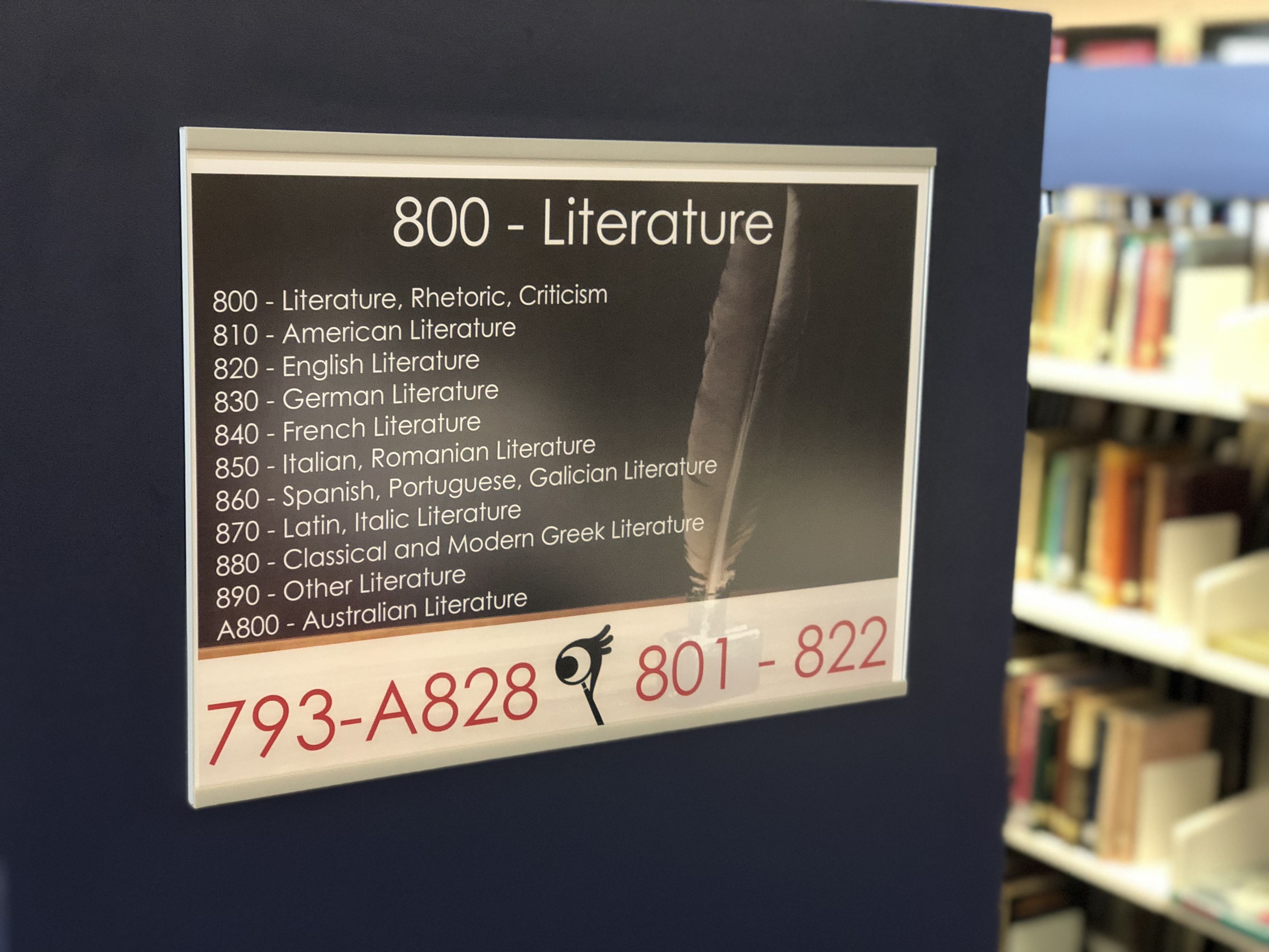
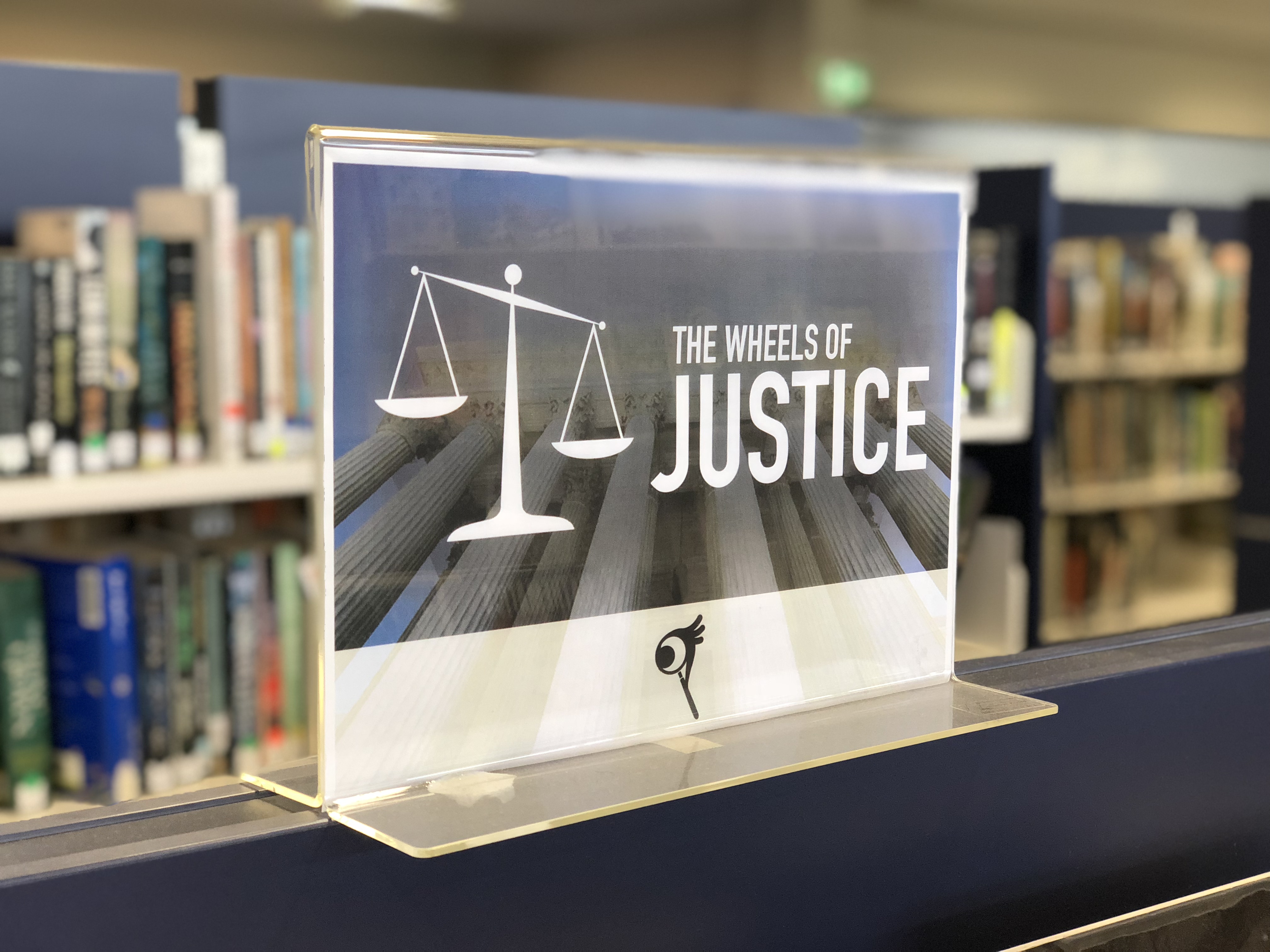
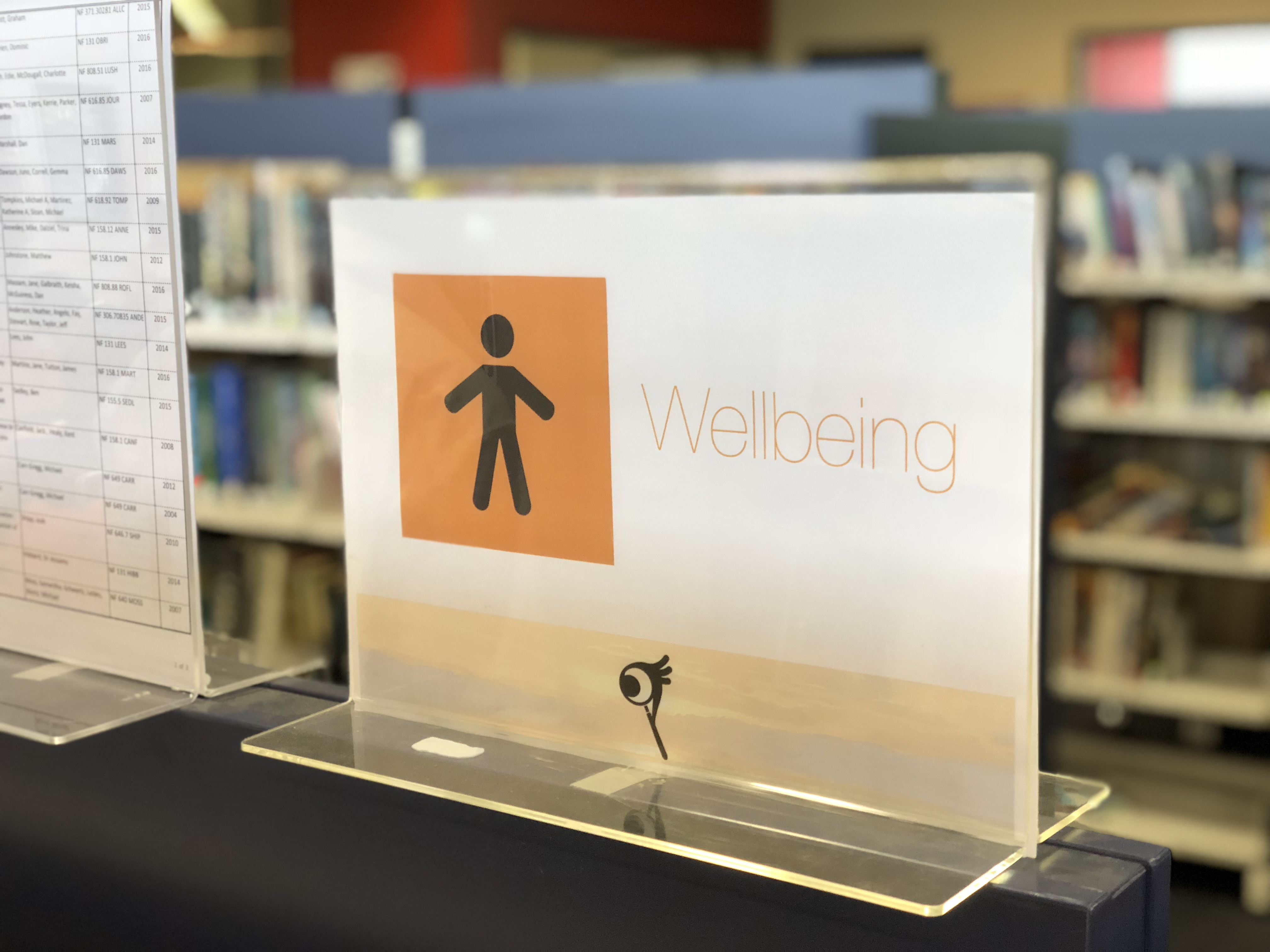
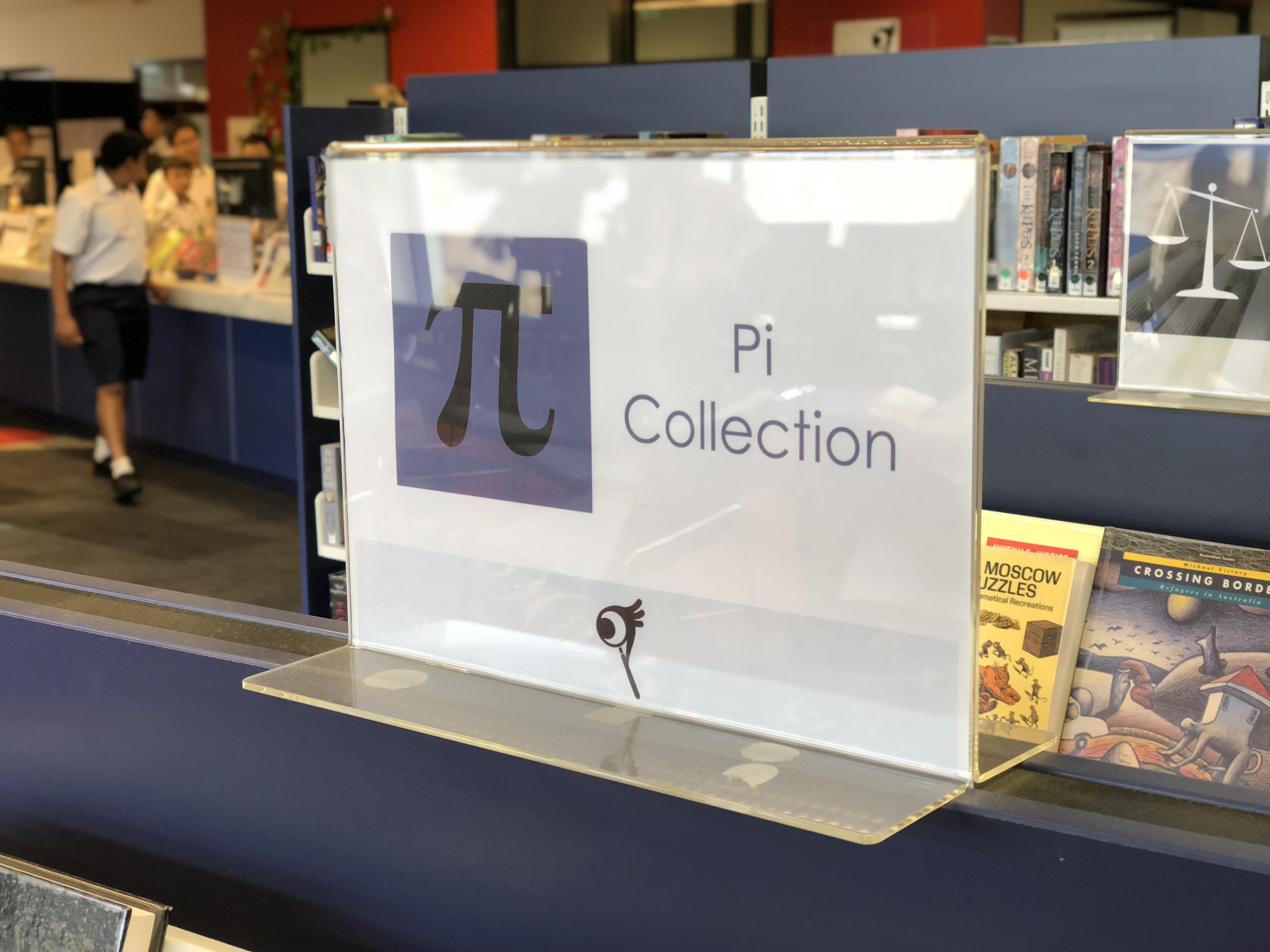
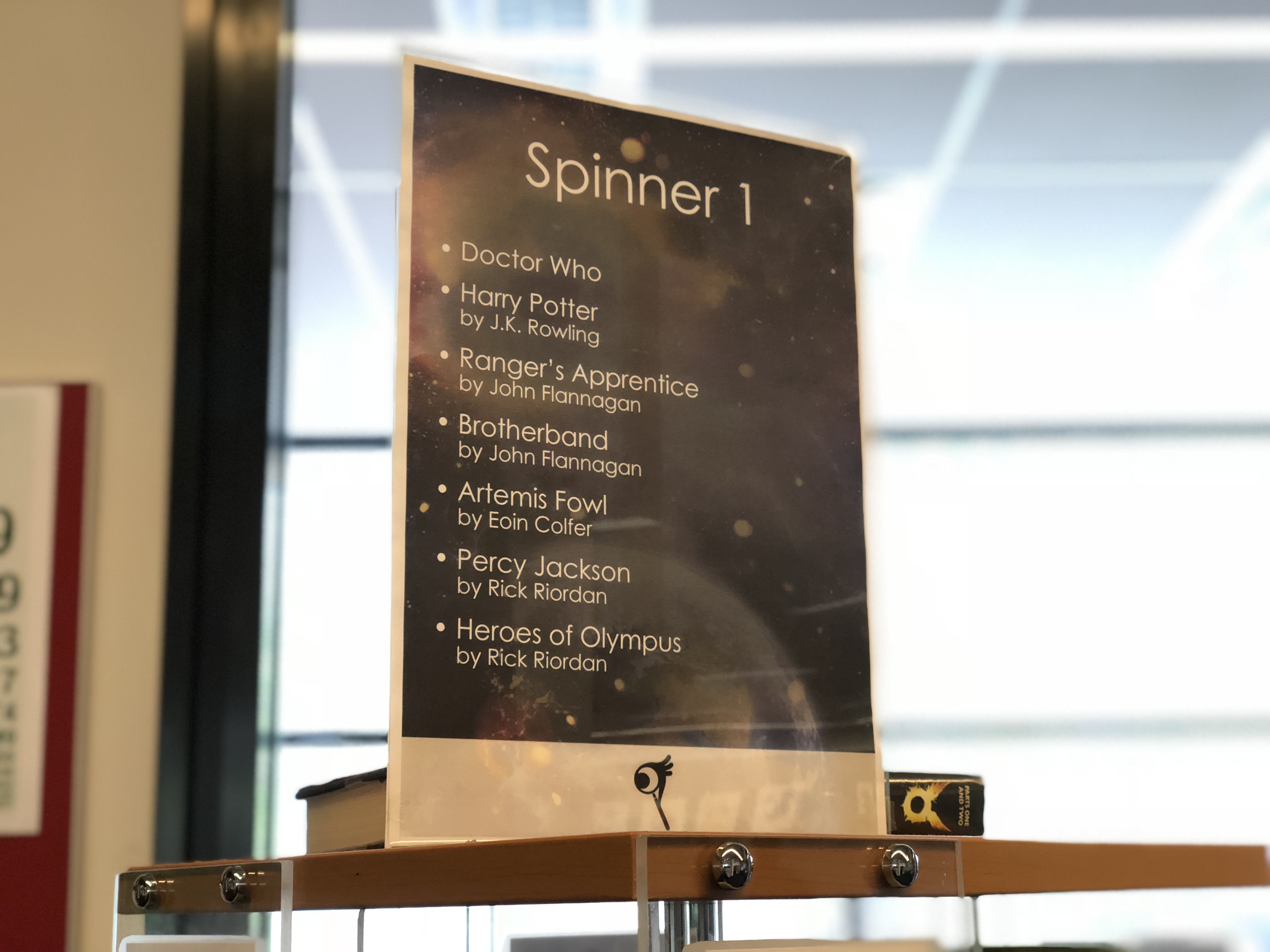
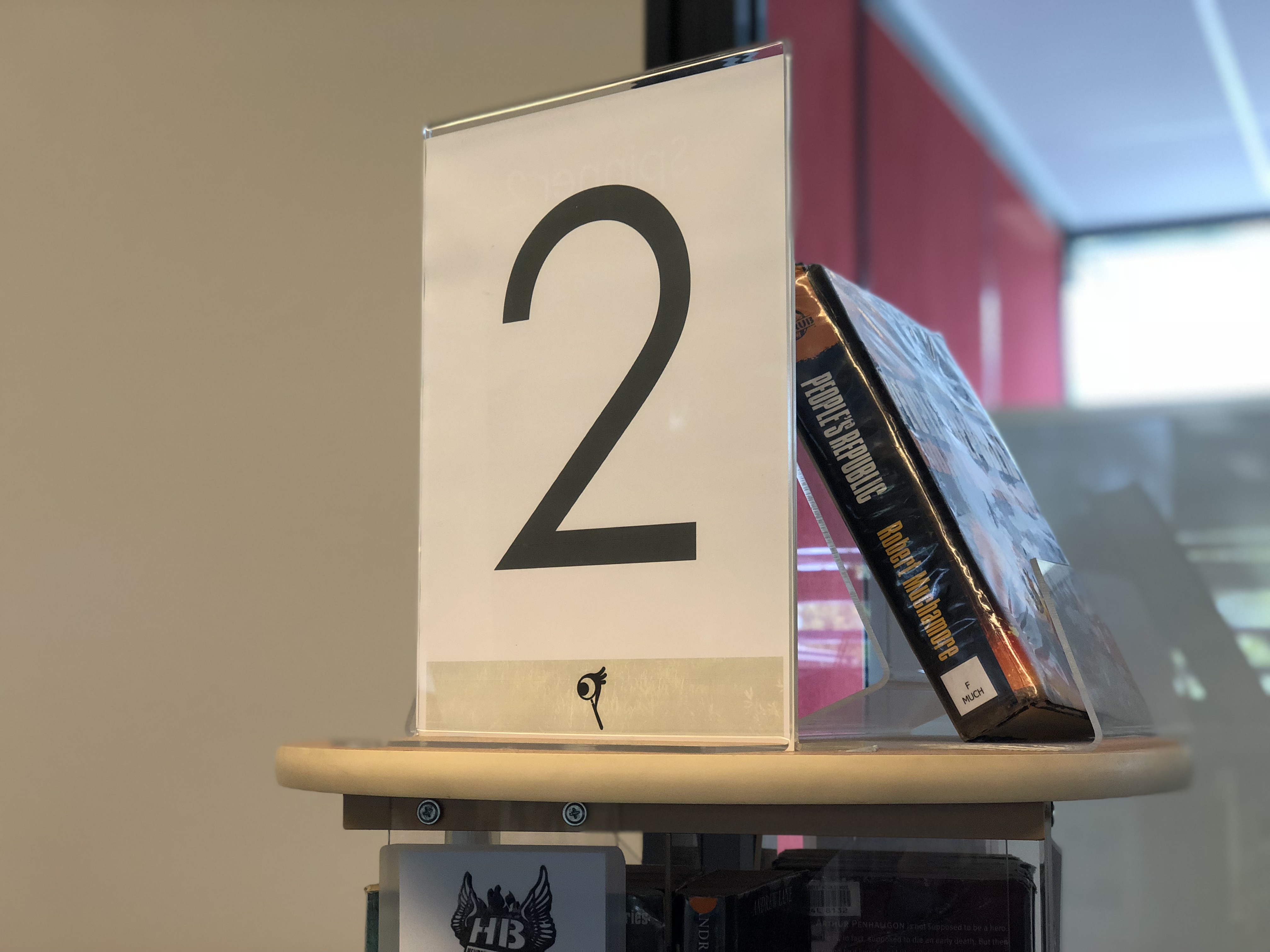
The newly renovated North Sydney Boys High School Library did not have a logo or any signage, so in collaboration with the librarian, I established a new brand based on the new motto of Question. Search. Discover. The new library logo is an amalgamation of a question mark, magnifying glass and eye, conveying the exploratory nature of the library. New signage was placed on shelves and spinners, as well as regular event posters and bookmarks to promote the library's collections.
Design Process
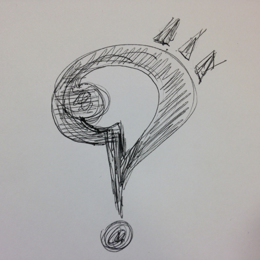
The sketch above shows the original idea that the librarian had. As I was only 14 at the time and new to using the Adobe CC apps, I didn't immediately know how to digitally recreate the sketch. I started creating iterations of the design, beginning with a literal interpretation of an eye and a magnifying glass. This design became more streamlined with each iteration.

We finally decided on the version below, adding the library name next to the icon. I chose to use red Century Gothic as this was a key element in the library's existing signage. The motto and three logo components were also added to better explain the logo.

Once the logo was in use around the library and people became more familiar with it, I simplified it further so that it could be used as the profile picture on the library's new Facebook page. When Facebook changed the profile pictures to become circular instead of square, the new iteration on the right was created. Having the full icon in red also helped it stand out more on people's Facebook feeds.

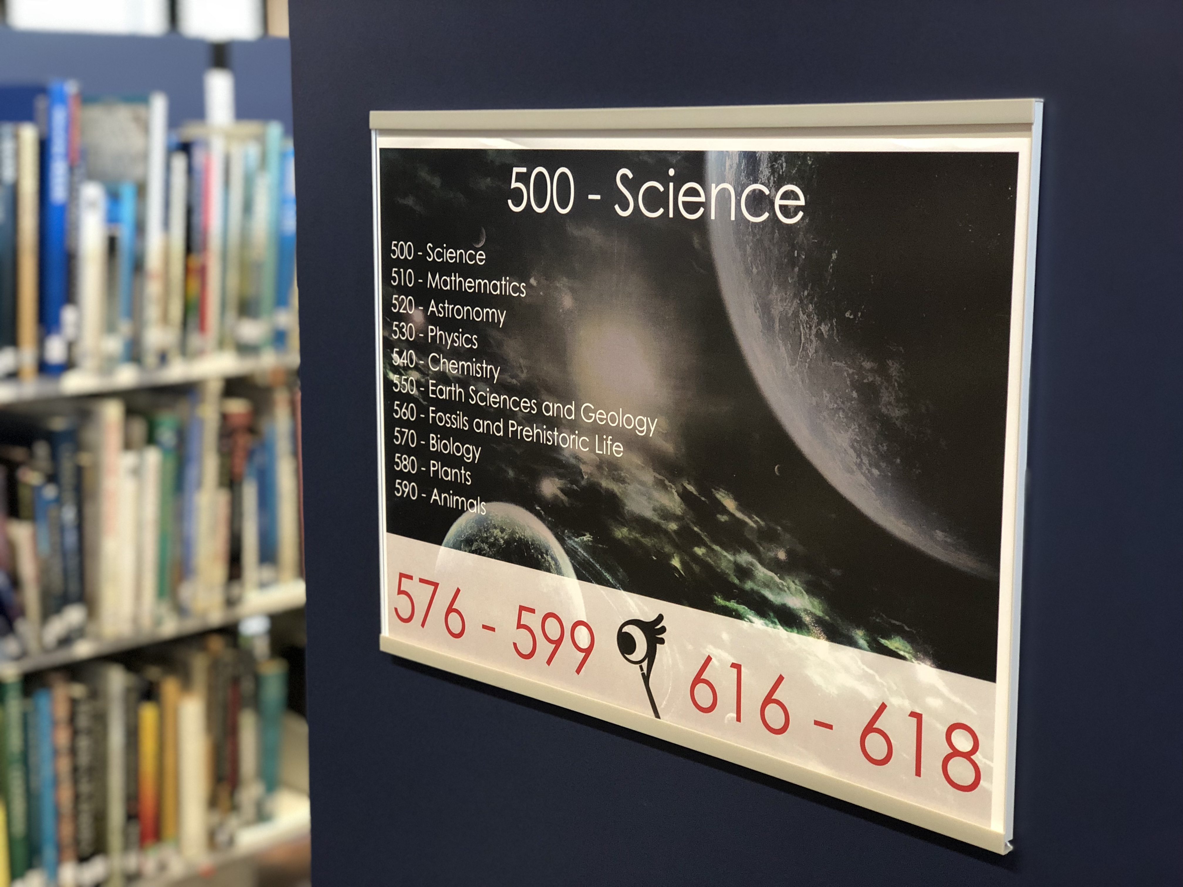
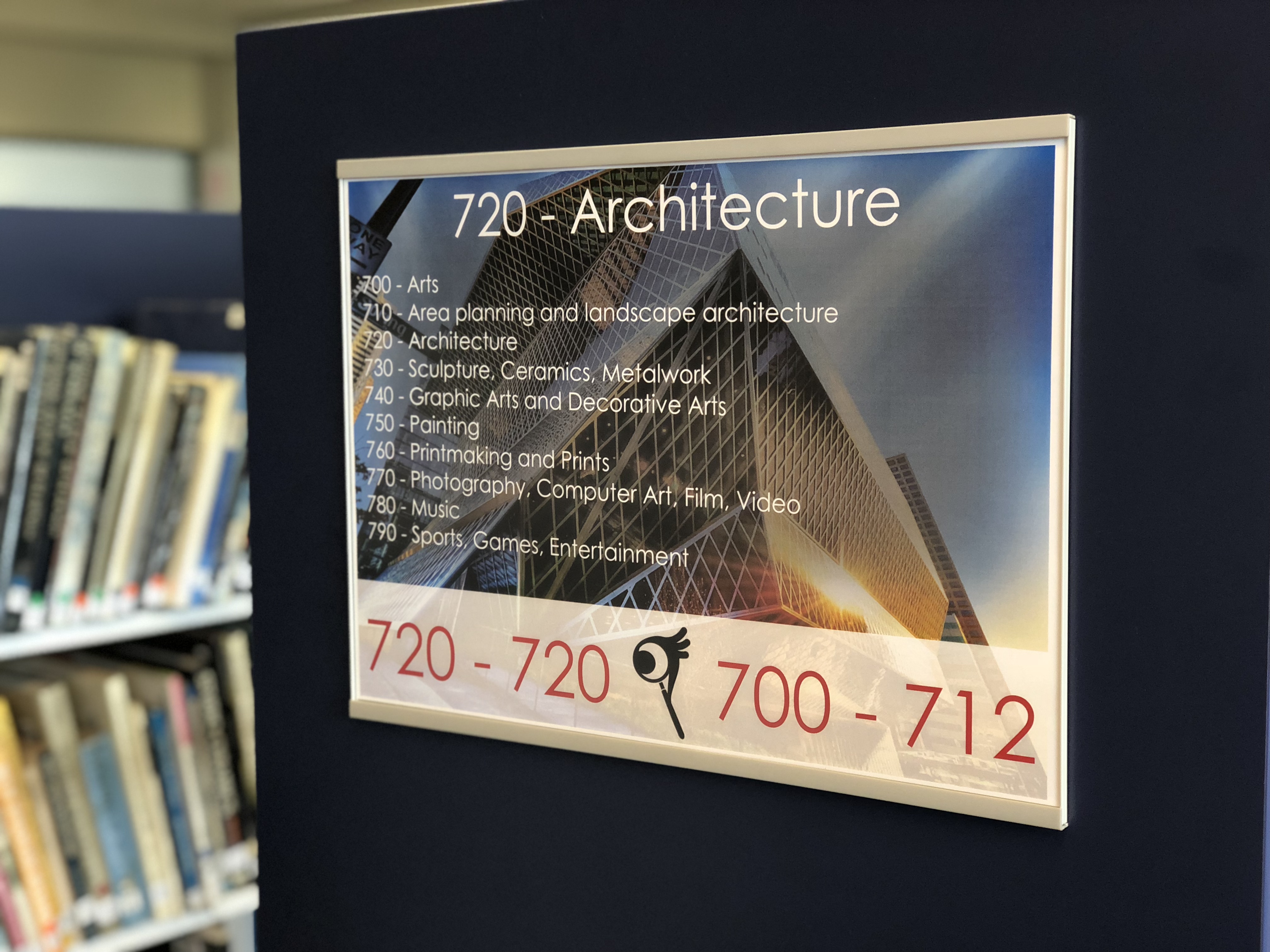
Once the logo had been designed, I also updated the shelving signage around the library. Each book collection also received an icon and colour which was also added to the spines of all the books in that collection to make them easier to identify.
 The 4U Paper
 Guidebooks
 Visions
 UPSTARTS