AirGuide


Role
Research & Design (Graduation Major Project)
Timeline
10 weeks research/ideation + 10 weeks design (Feb - Aug 2023)
“With all the changing regulations, vaccination certificates and digital immigration forms, travellers need better organisational skills than ever.”
Lee Tulloch, travel journalist
INTRODUCTION
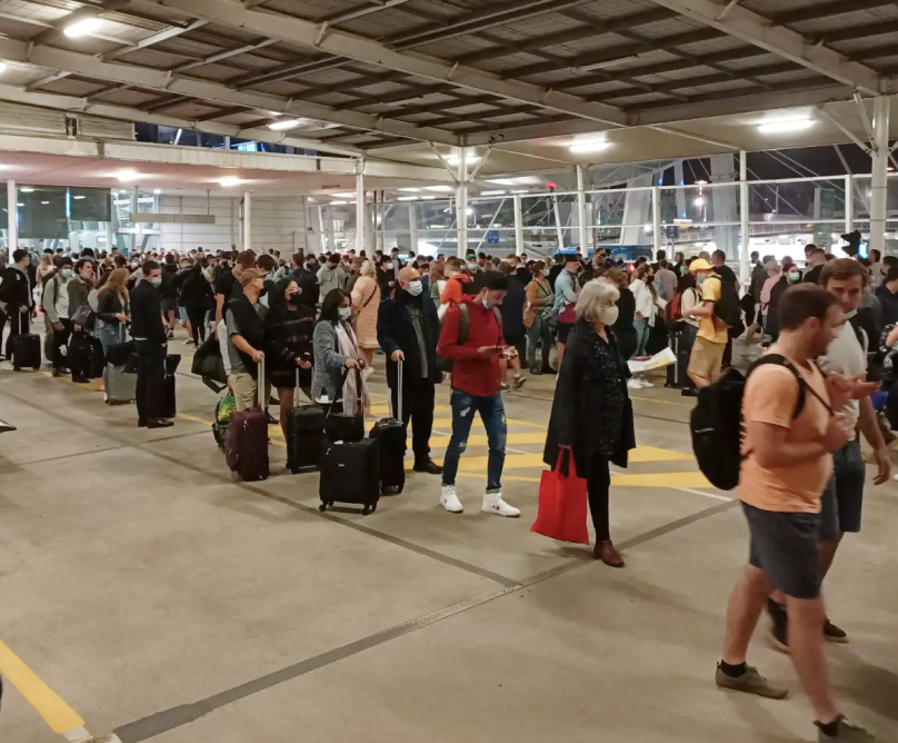
Air travel is a stressful experience, with long queues, confusing signage in other languages, and unexpected delays causing anxiety and frustration, threatening to ruin a long-awaited getaway.
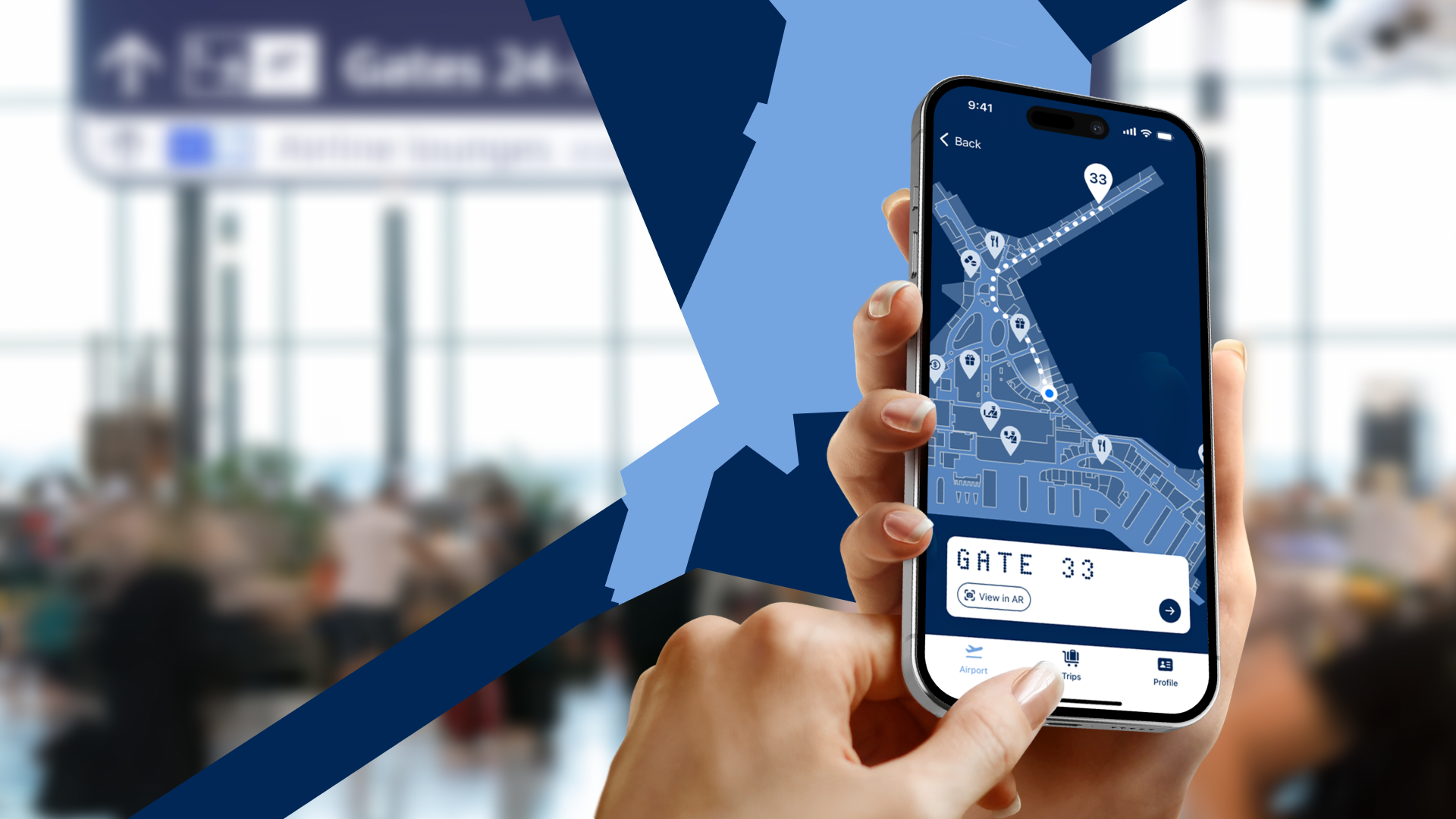
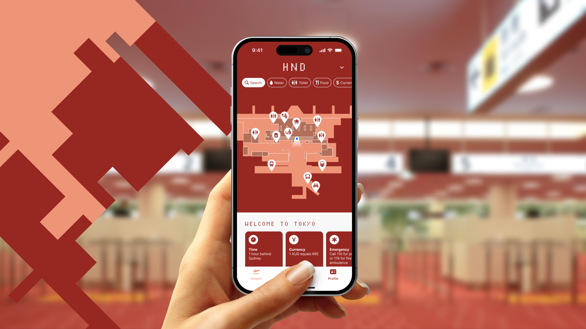
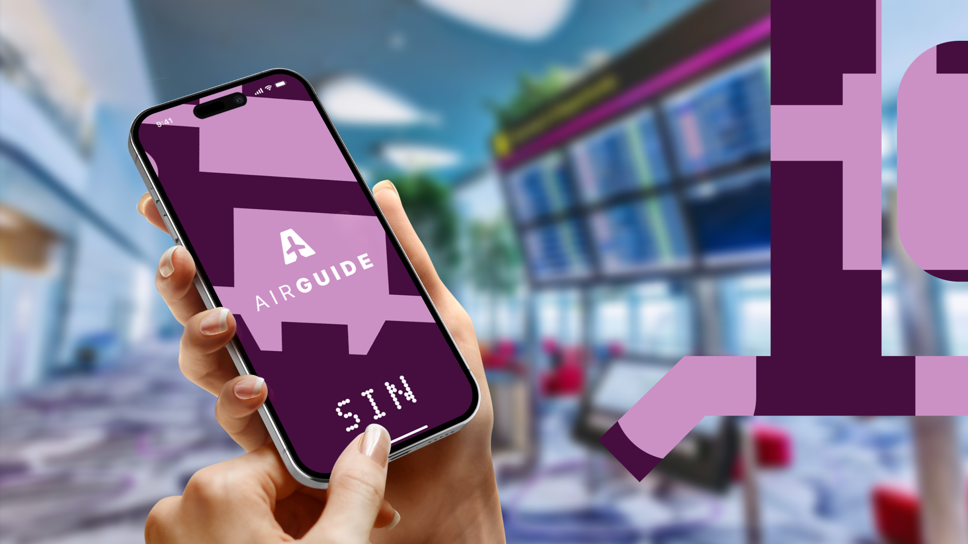
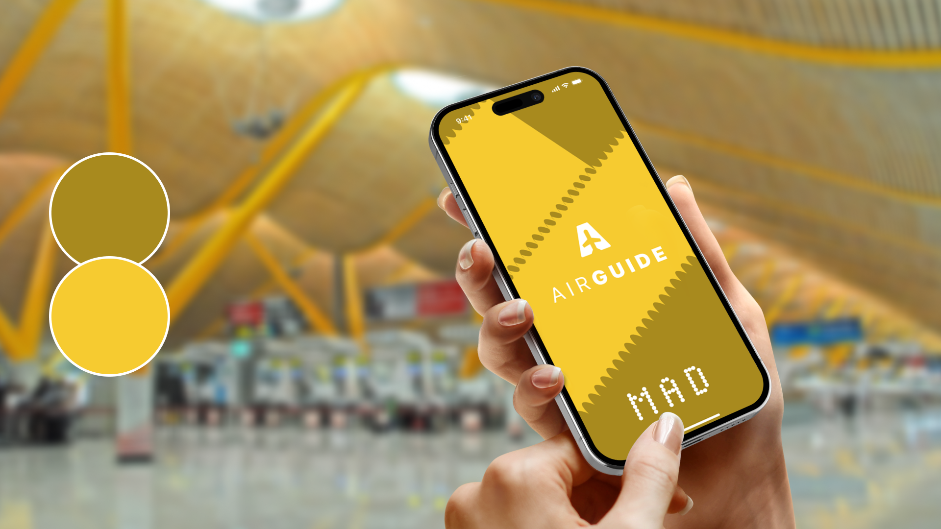
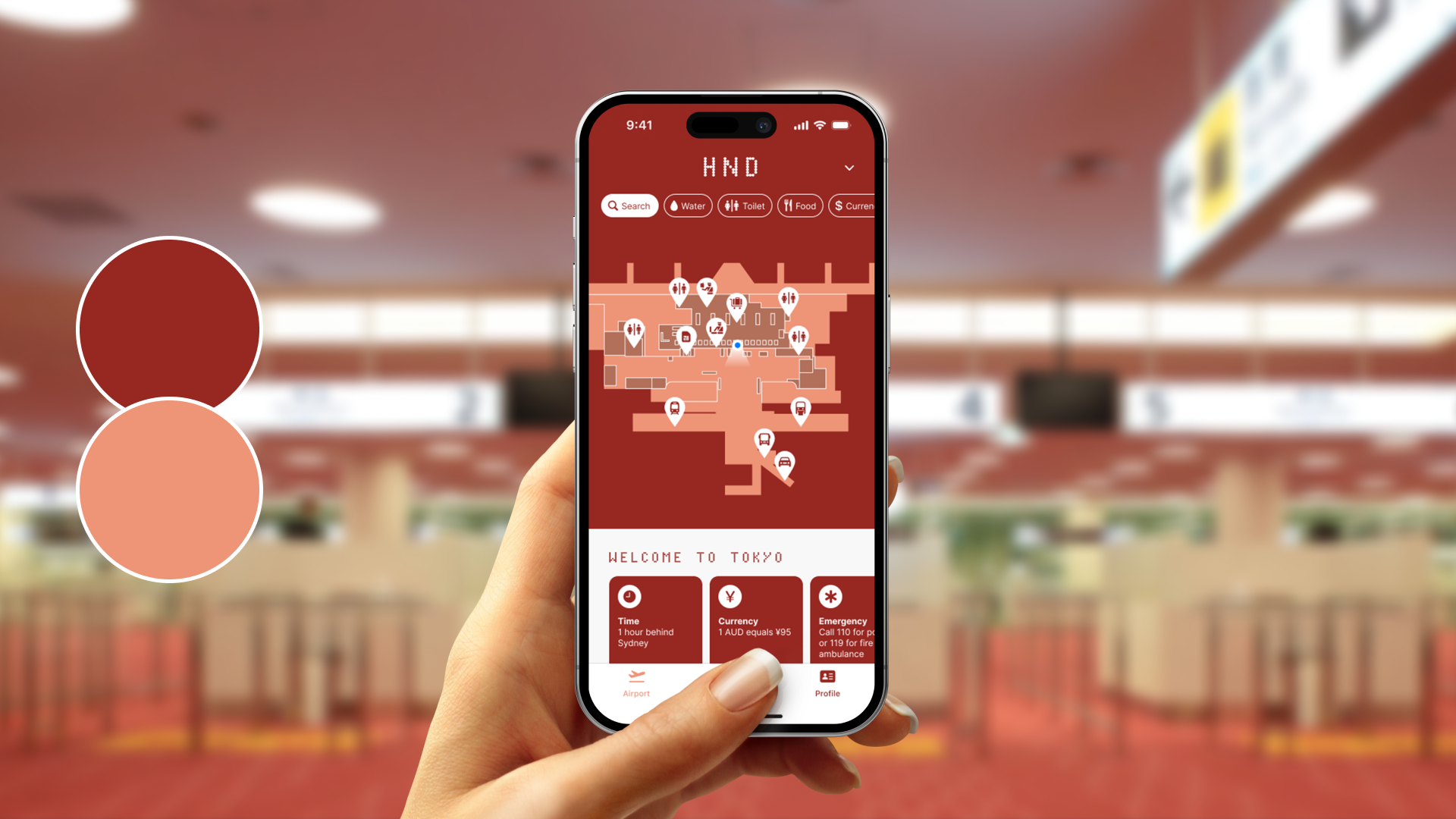
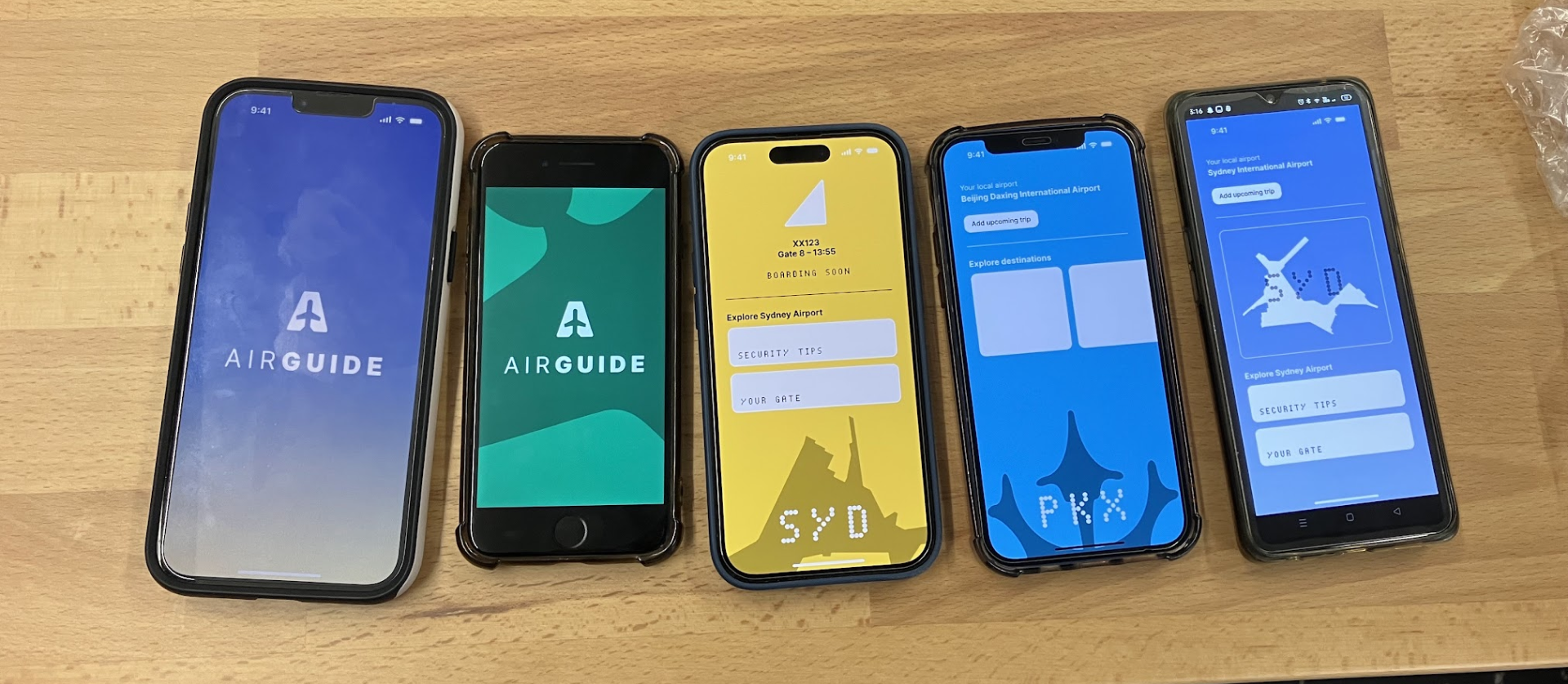
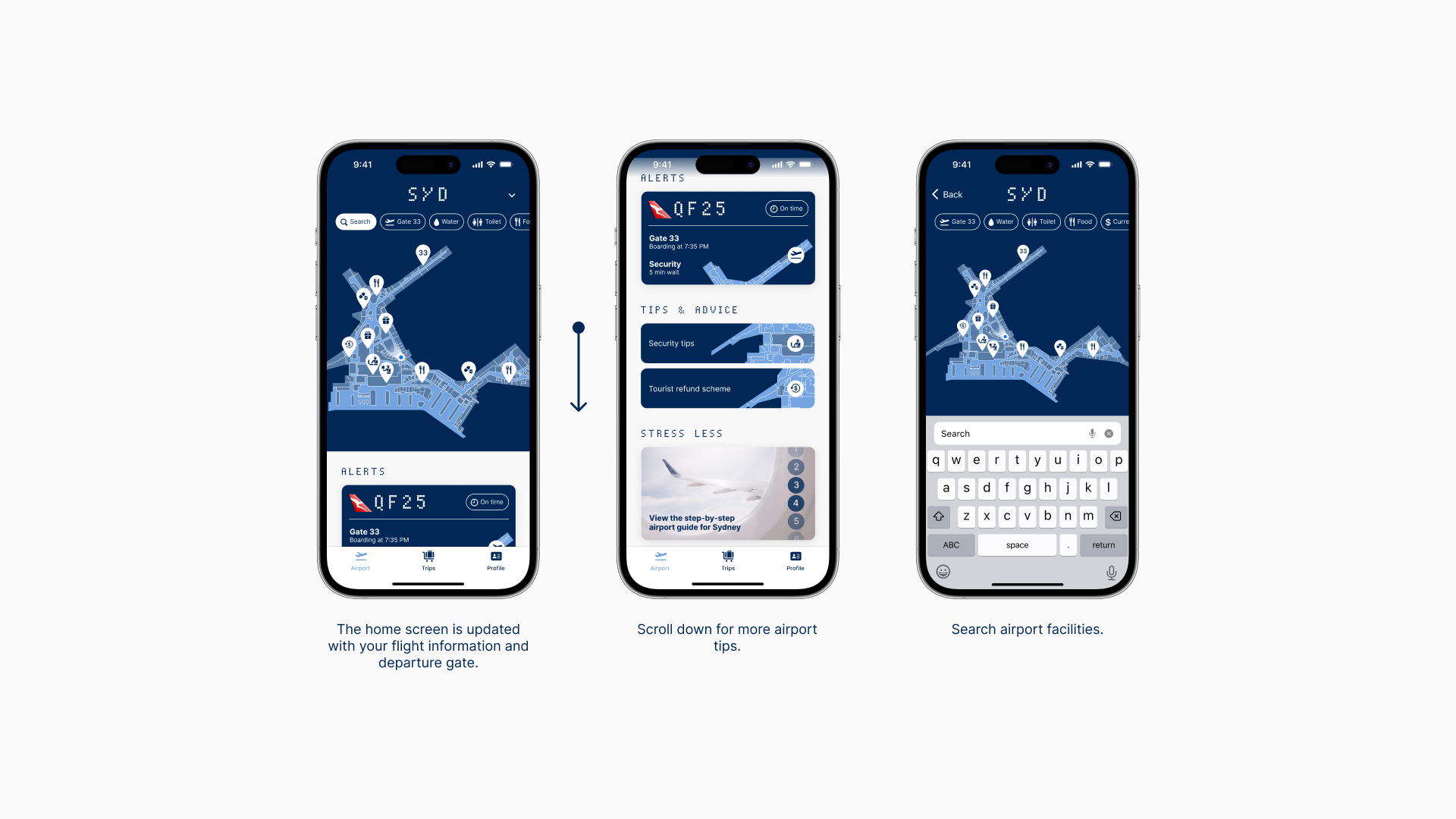
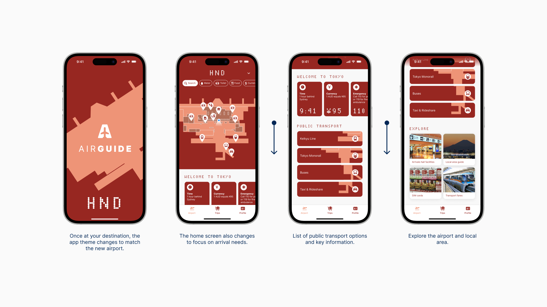
To address these challenges, AirGuide presents a seamless journey by breaking down the complexities of airports into easy-to-follow steps, fully customisable to cater to any accessibility needs. At its core lies a unique visual identity inspired by the distinctive architecture of airports worldwide. Elevating the user experience further, the app’s interface dynamically adapts, mirroring the environmental colours of each airport — think the calming blues of Sydney or the vibrant reds of Berlin.
Say goodbye to airport stress and embrace a seamless journey with AirGuide.
RESEARCH
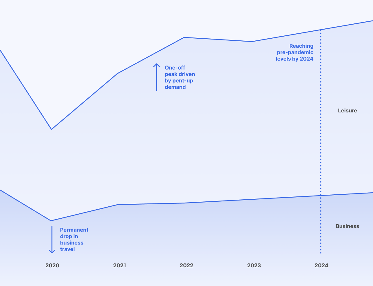
Airports have struggled to respond to the heightened post-COVID demand for travel, compounded by labour strikes and shortages. This has led to stressful airport experiences for travellers and poor customer satisfaction ratings.
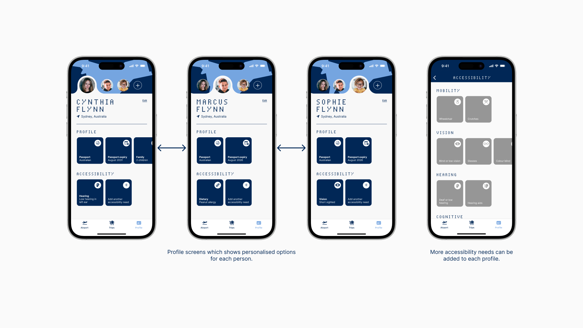
New technologies and procedures have also been implemented over recent years that many travellers may be unfamiliar with, for example facial recognition and QR codes. Travellers who have accessibility needs or those who have privacy concerns may have difficulty going through these new processes.
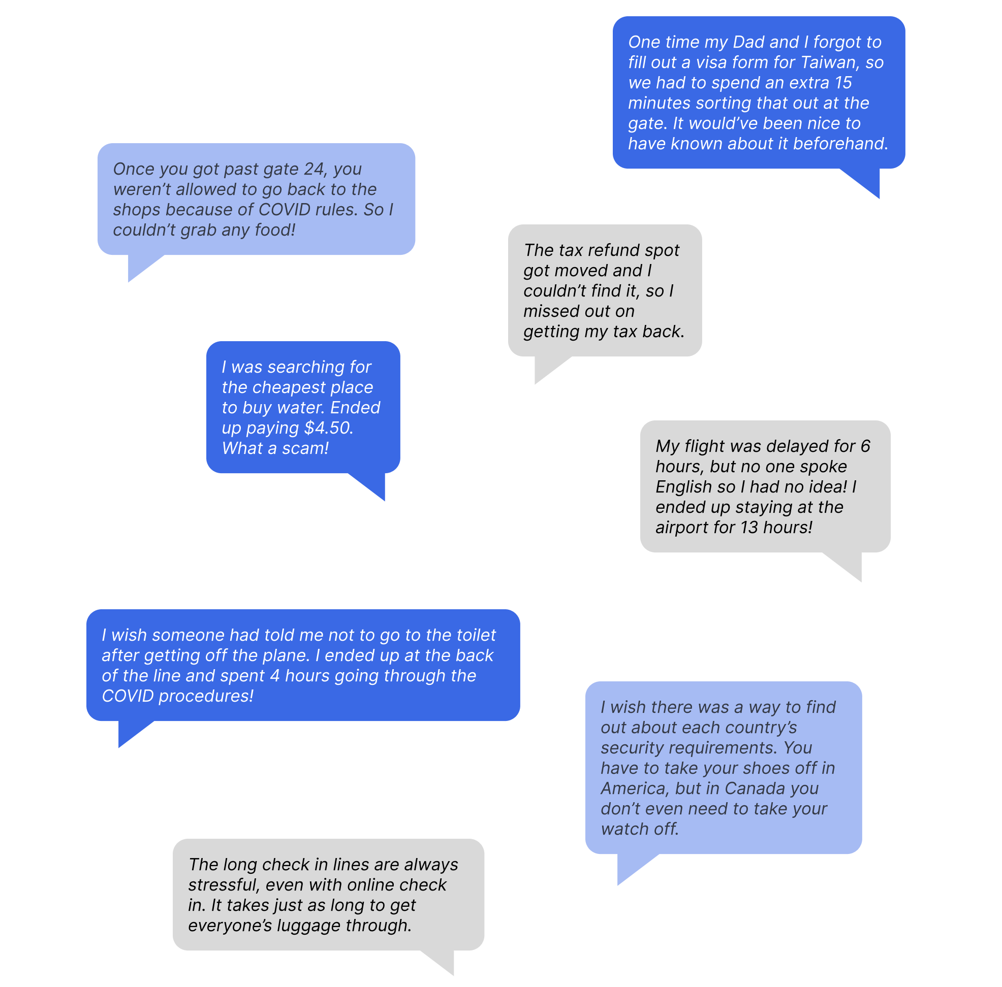
USER RESEARCH
Extensive user research was undertaken to determine the specific areas of focus for the project. Through informal dialogue and user interviews, participants shared their personal stories detailing the challenges and stressful encounters they had experienced at airports.
The challenges faced by users can be categorised into four primary areas: Navigation, Information, Language and Time.
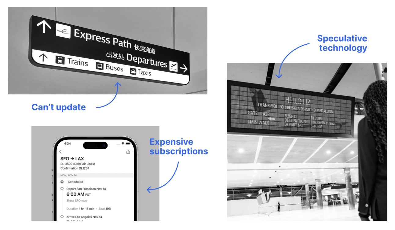
PRECEDENTS
Existing precedents were expensive and could not be easily rolled out widely. For example, the static wayfinding used at Sydney Airport cannot be personally customised, the TripIt app requires an ongoing subscription, and the Delta Parallel Reality Screen relies on speculative technology.
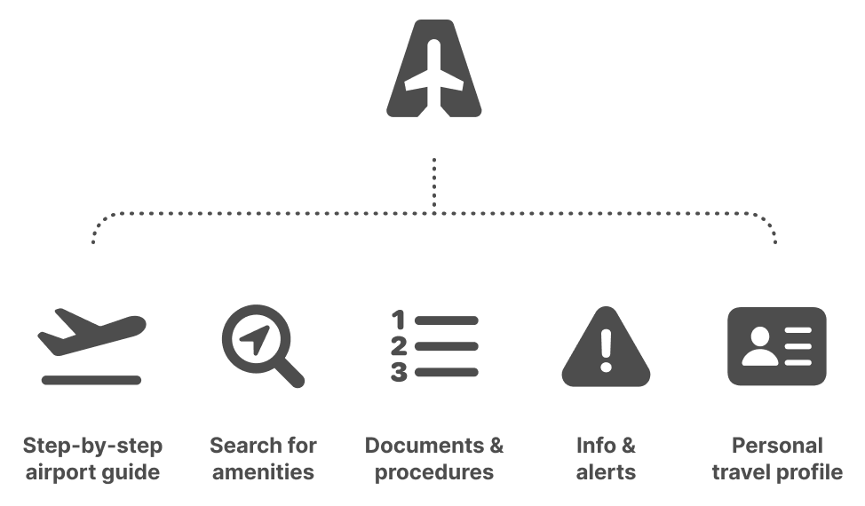
PROJECT SCOPE
Following the initial primary and secondary research, the features within AirGuide were narrowed down in order to ensure it remained focused on the key user pain points.
GRAPHIC DESIGN
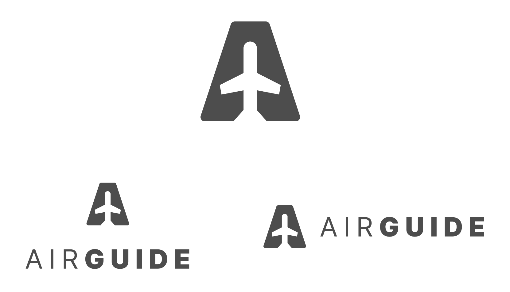
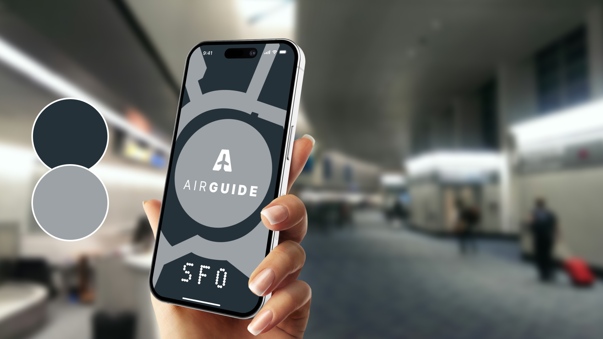
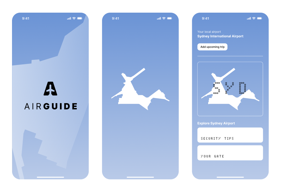
LOGO
The AirGuide logo features a top view silhouette of an aeroplane set against a trapezium shape with rounded edges, alluding to the letter A. There are both vertical and horizontal variants of the logo.
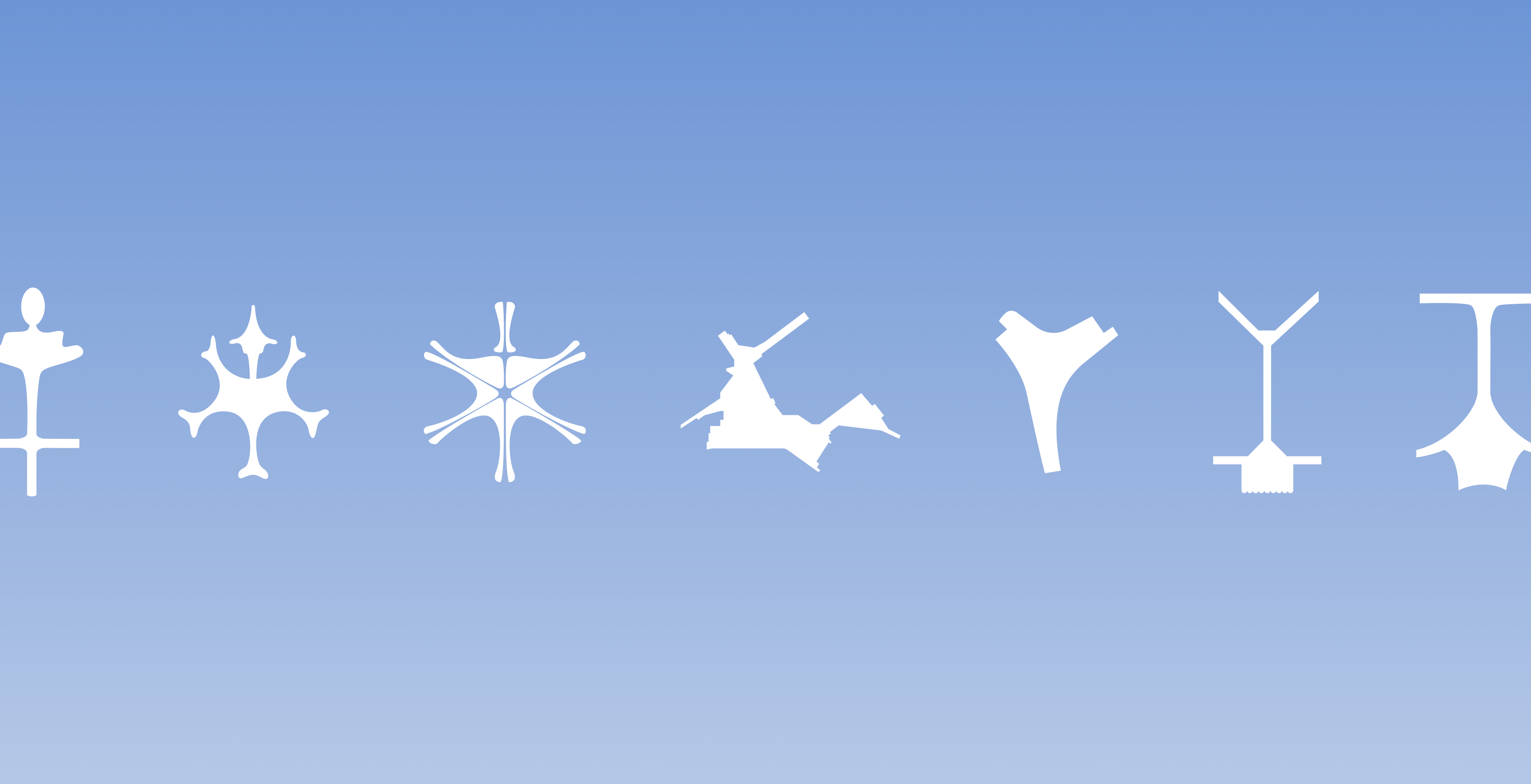
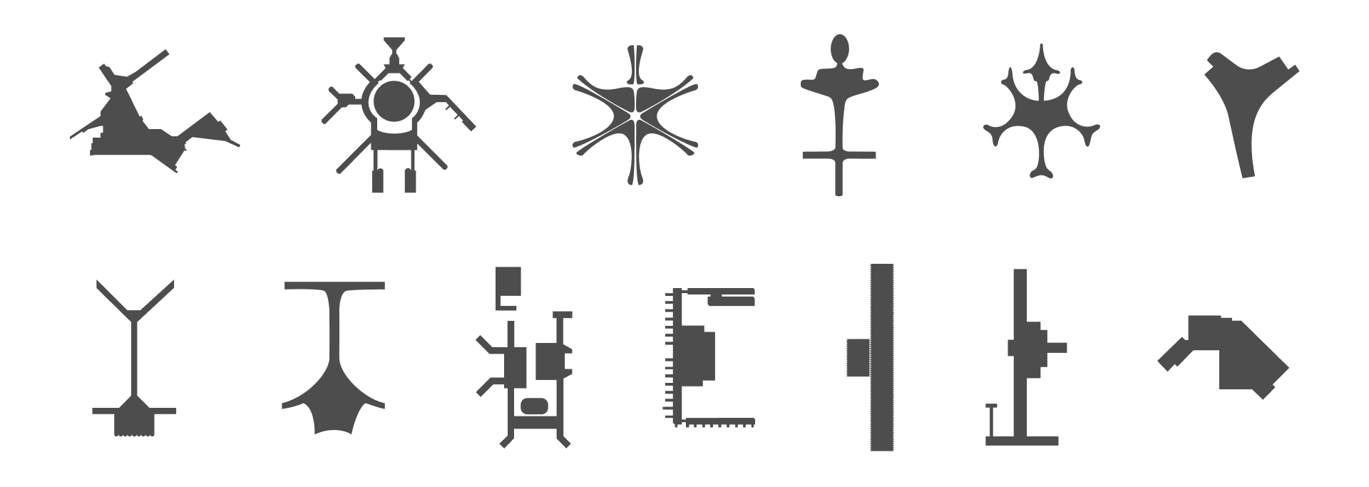
AIRPORT MARKS
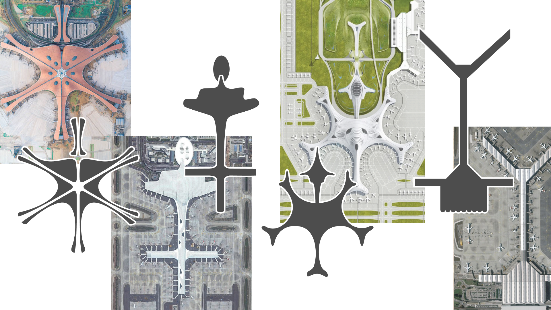
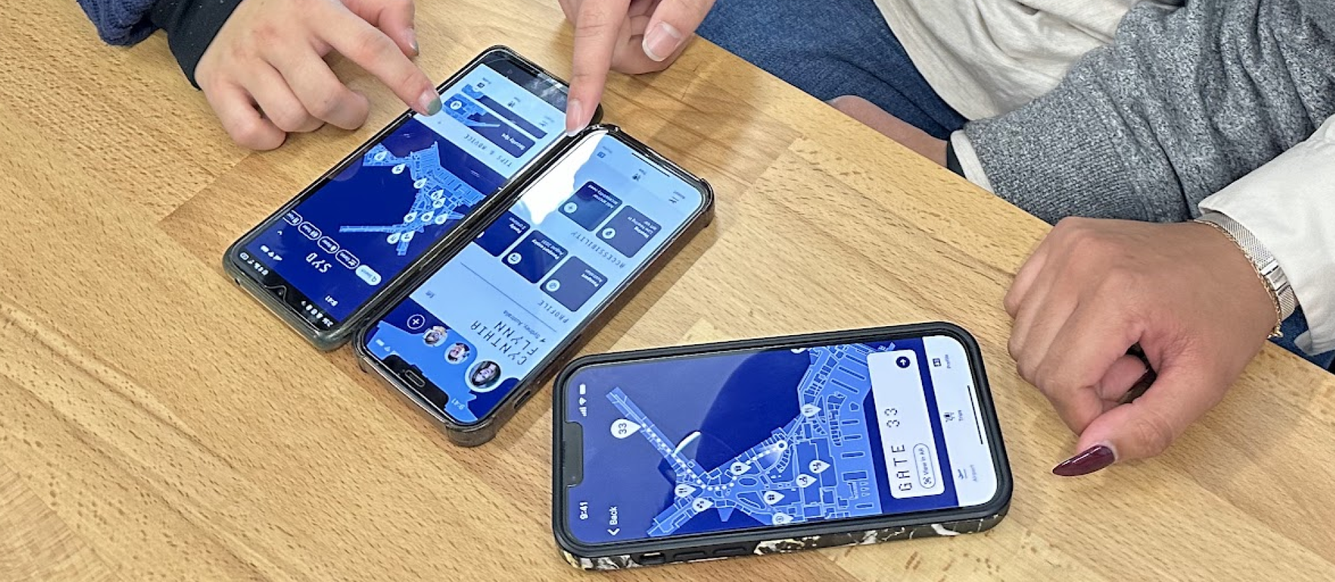
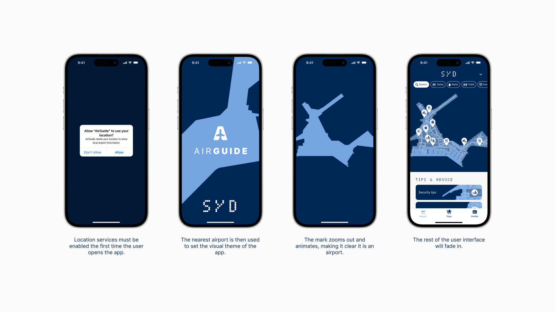
Central to the identity are the unique architecture of airports worldwide. These have been traced out based on aerial imagery and are called Airport Marks.
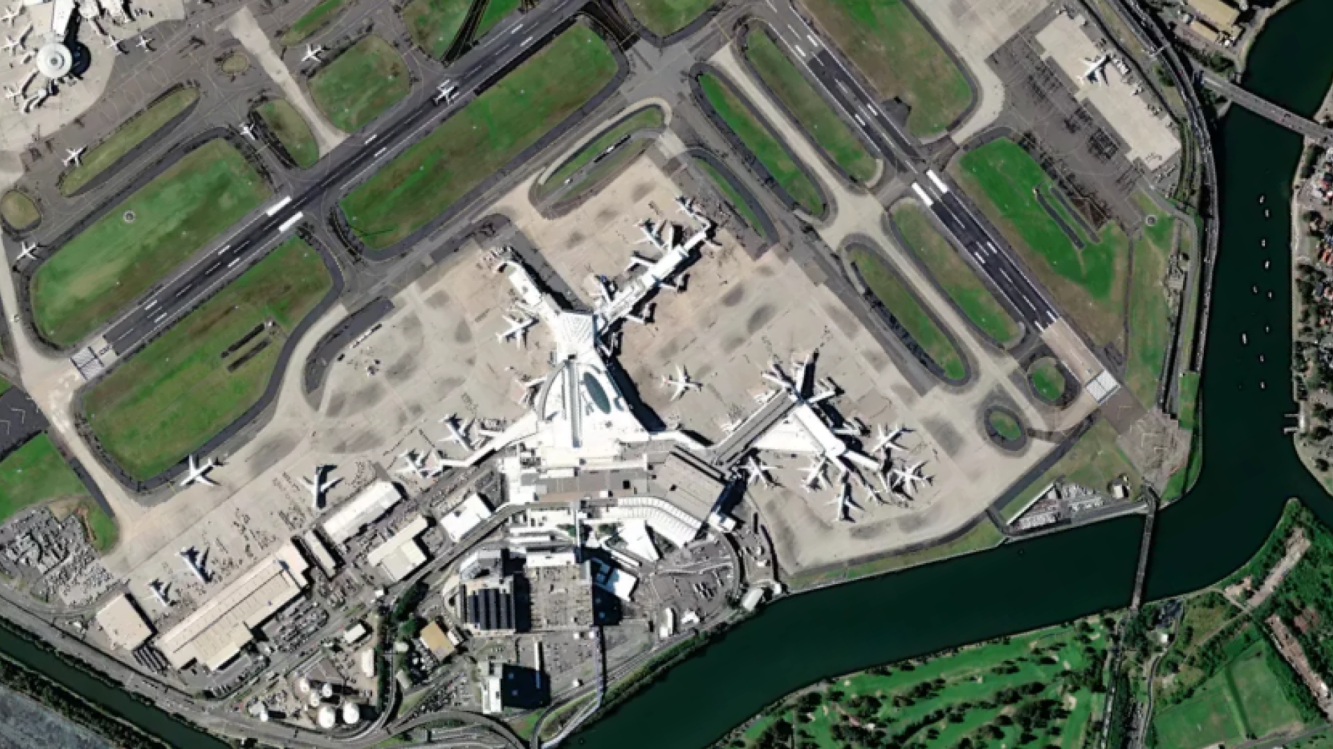
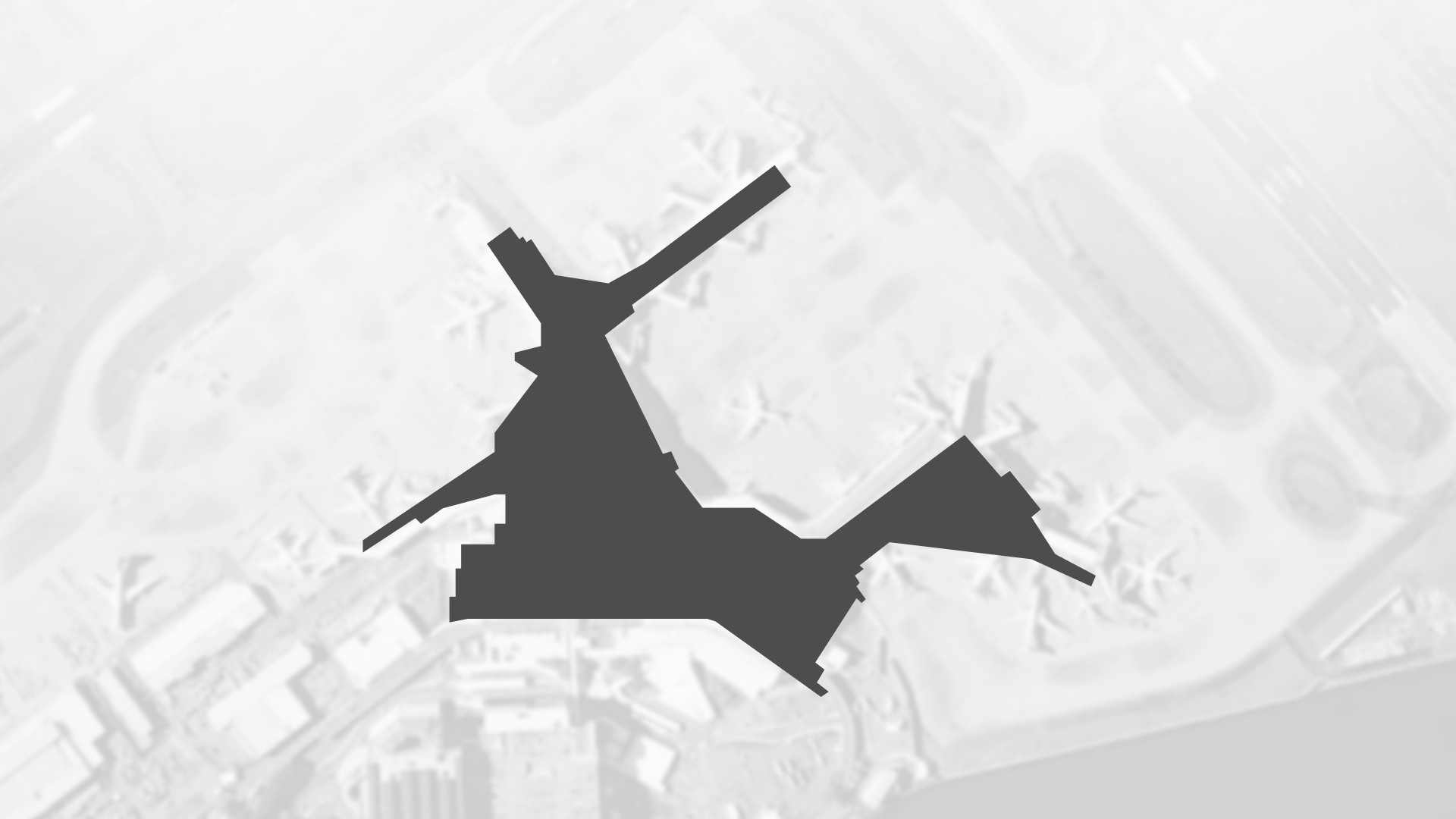
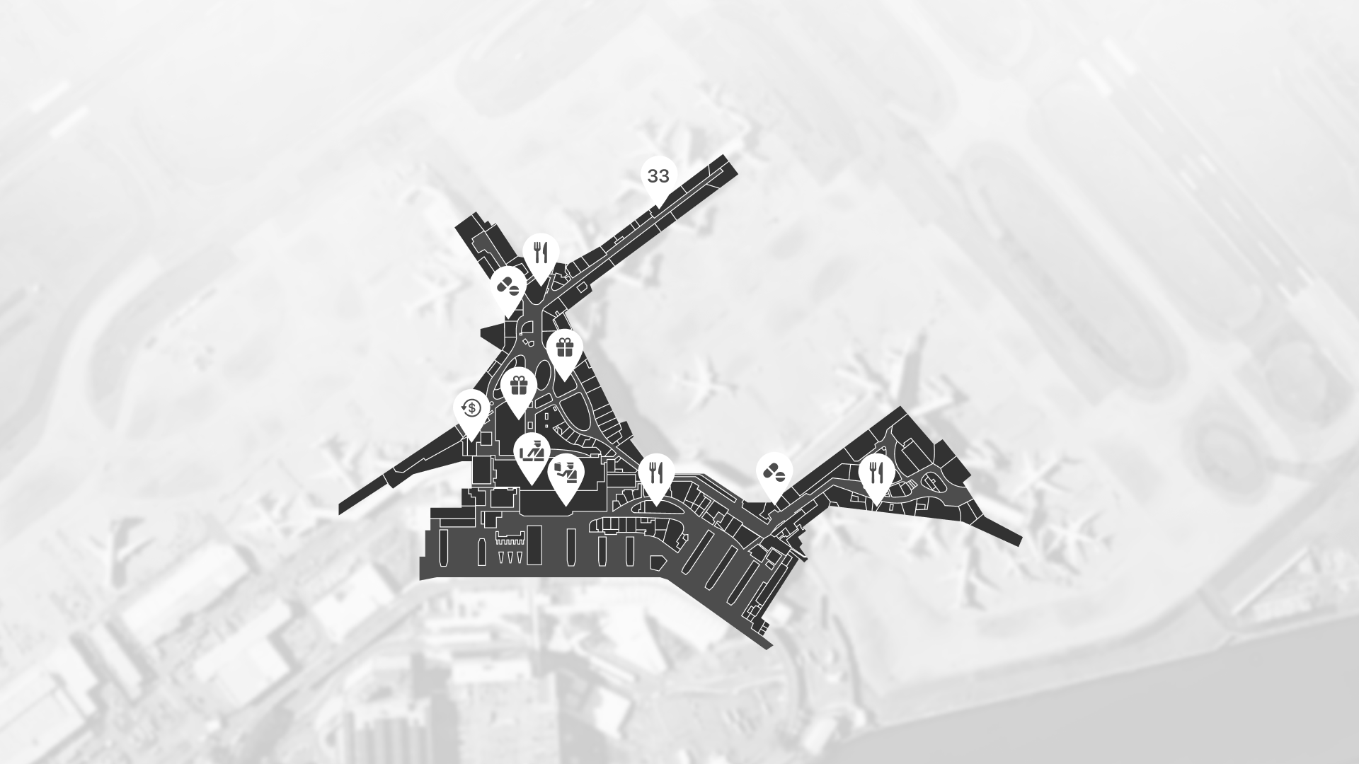
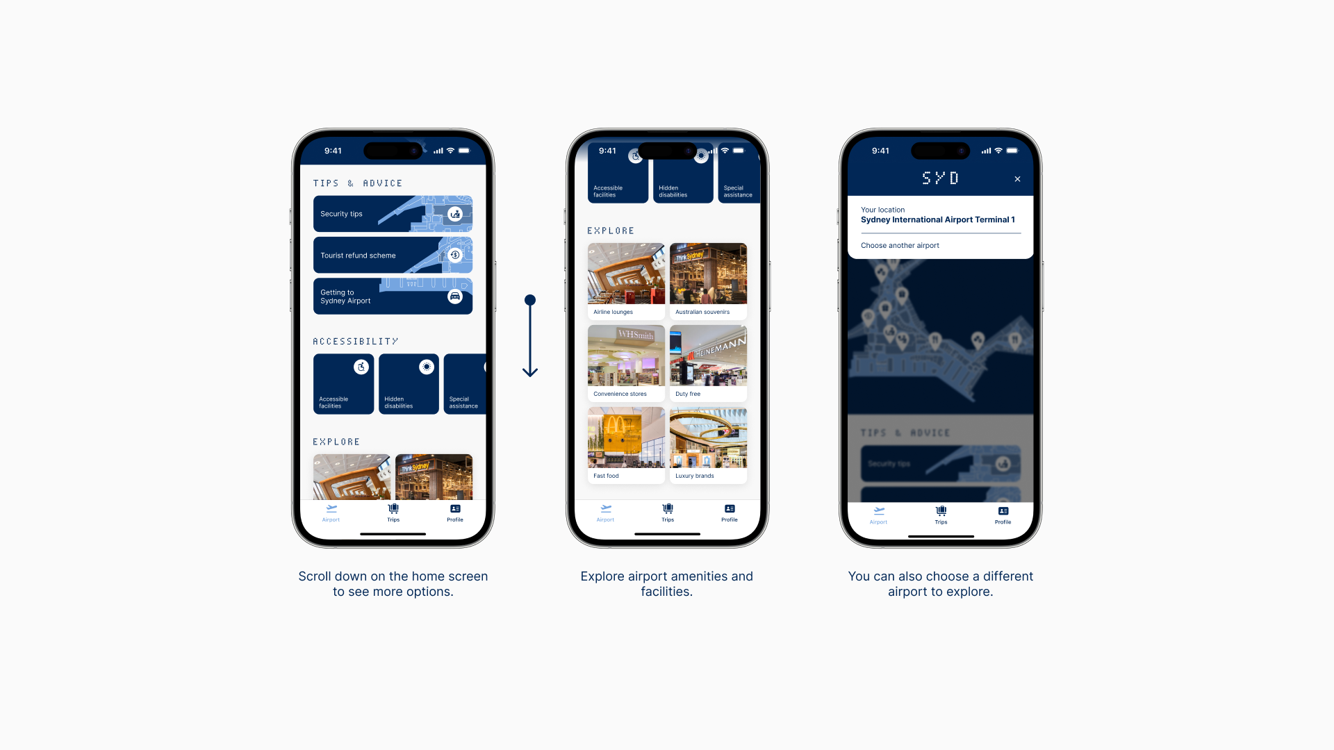
The Airport Marks can be used in an abstract way to create interesting visual effects or kept in full view for wayfinding purposes.
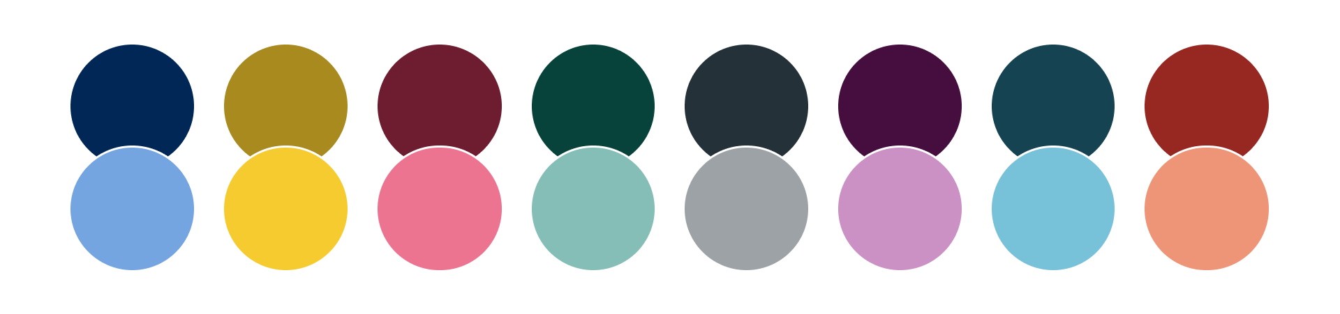
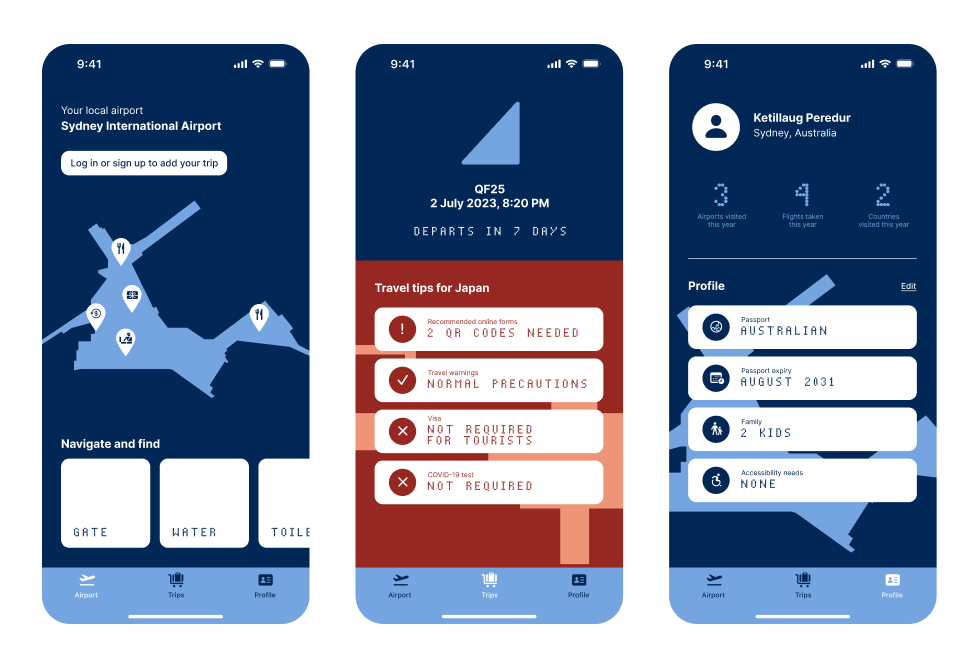
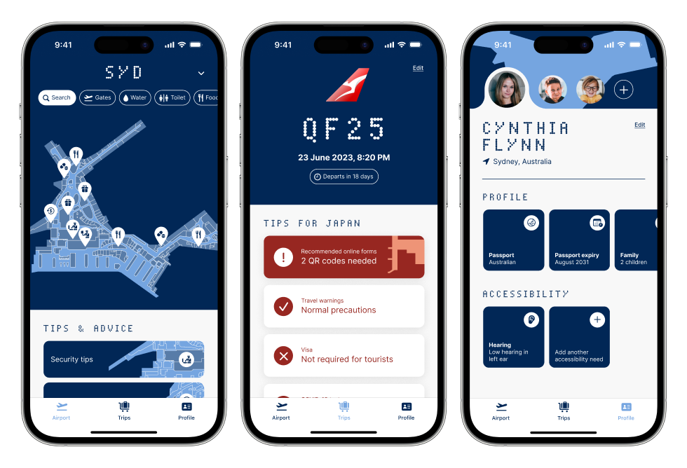
COLOUR
A wide selection of colours are available, reflecting the environmental colours of each airport. For example, yellow for Madrid and orange for Tokyo Haneda. Each colour has light and dark shades available.
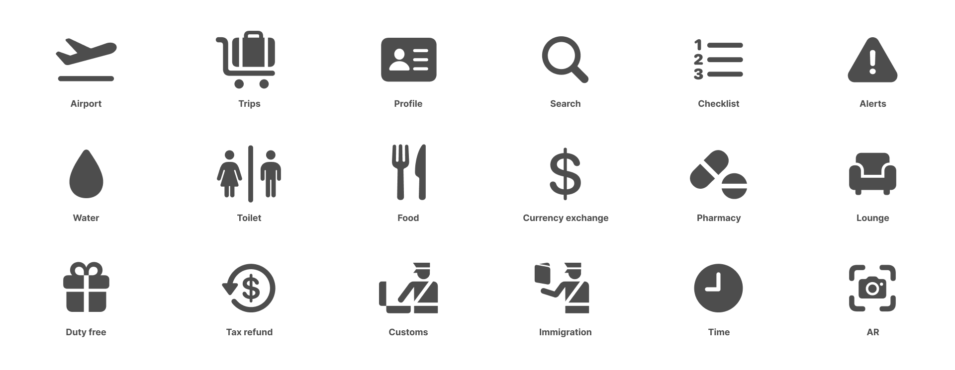
TYPOGRAPHY & ICONS
Inter is used as the primary typeface. It features a tall x-height to assist with readability, especially on digital screens. The secondary typeface is Dot Matrix, which is inspired by the traditional dot matrix displays used to display flight information.
A selection of icons are used throughout the app interface, which are taken from SF Symbols 5 or custom drawn if a suitable icon is not available.

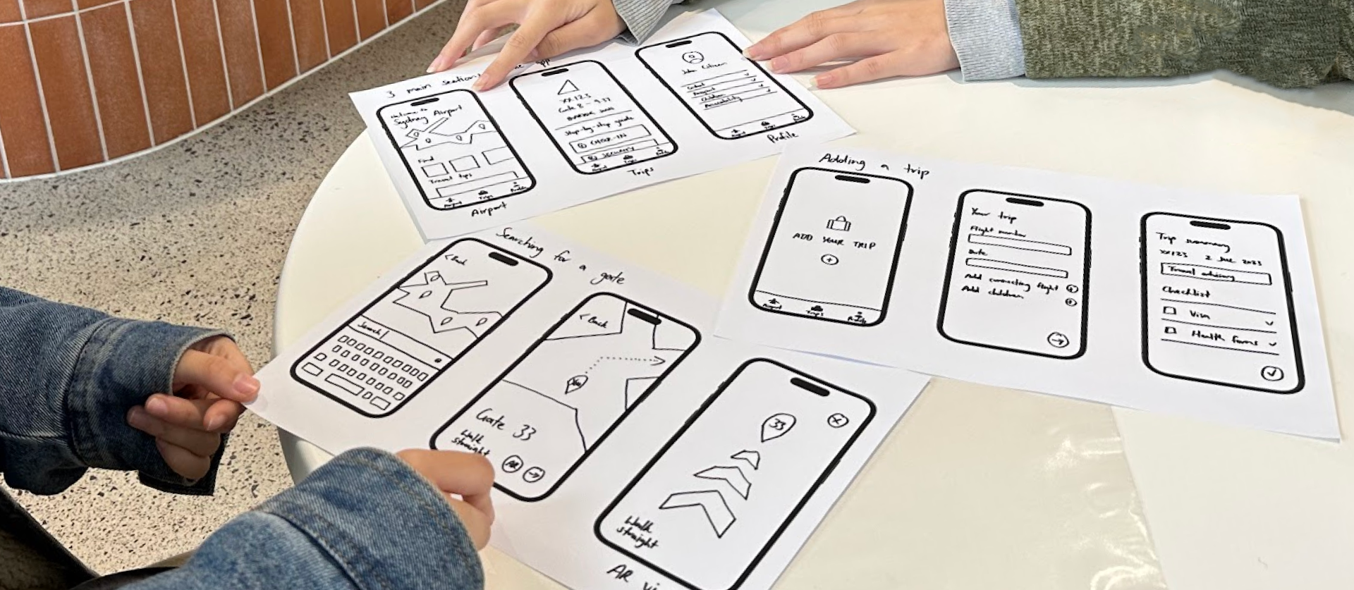
PROTOTYPE
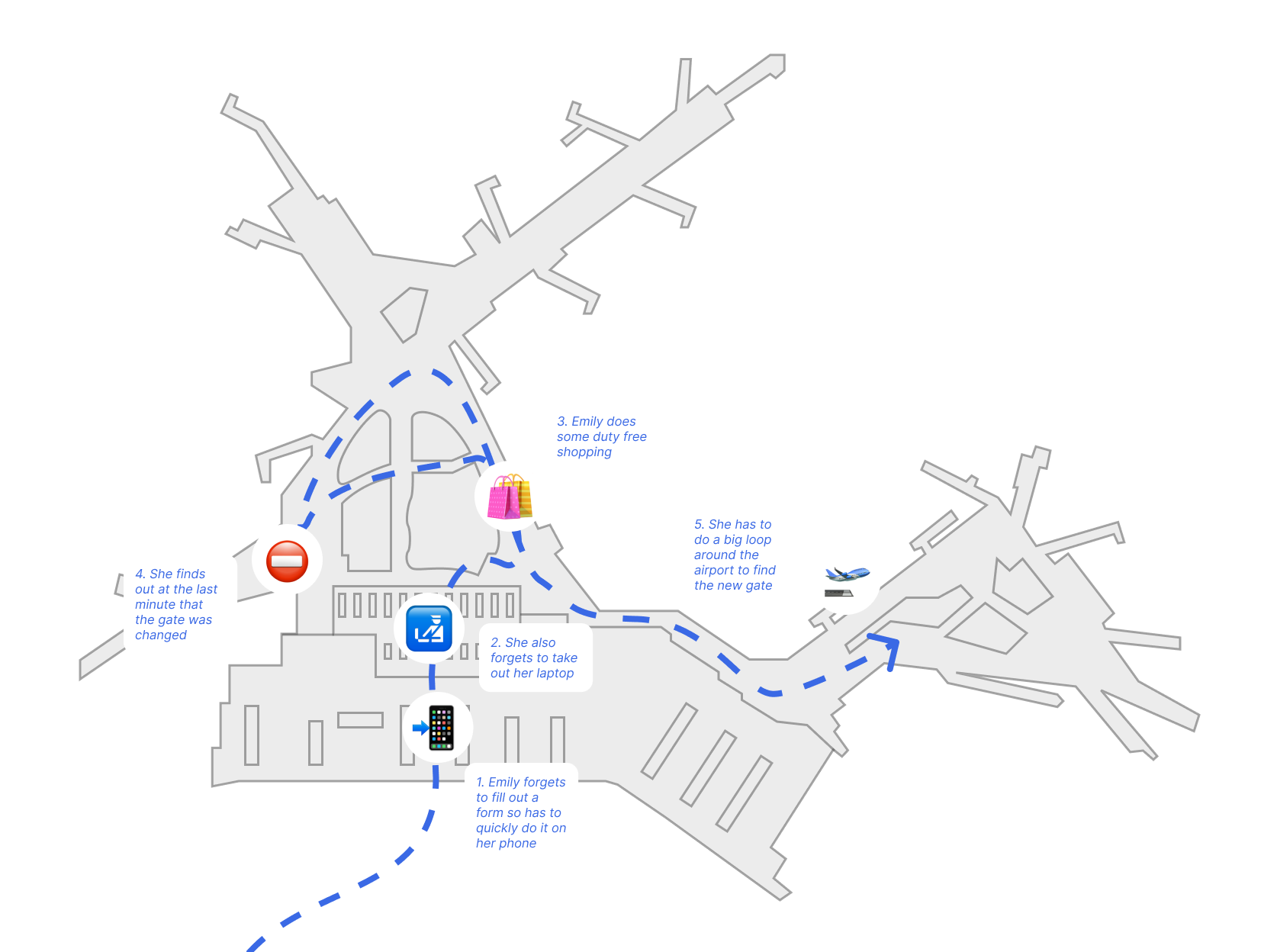

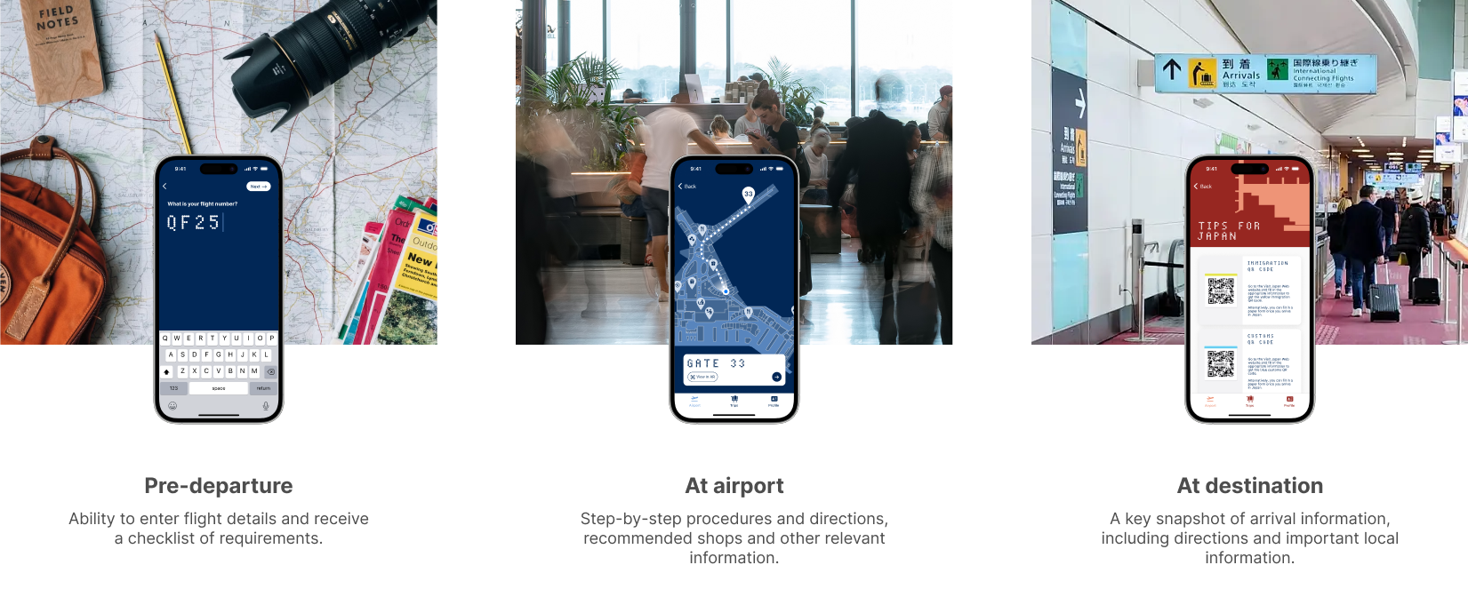
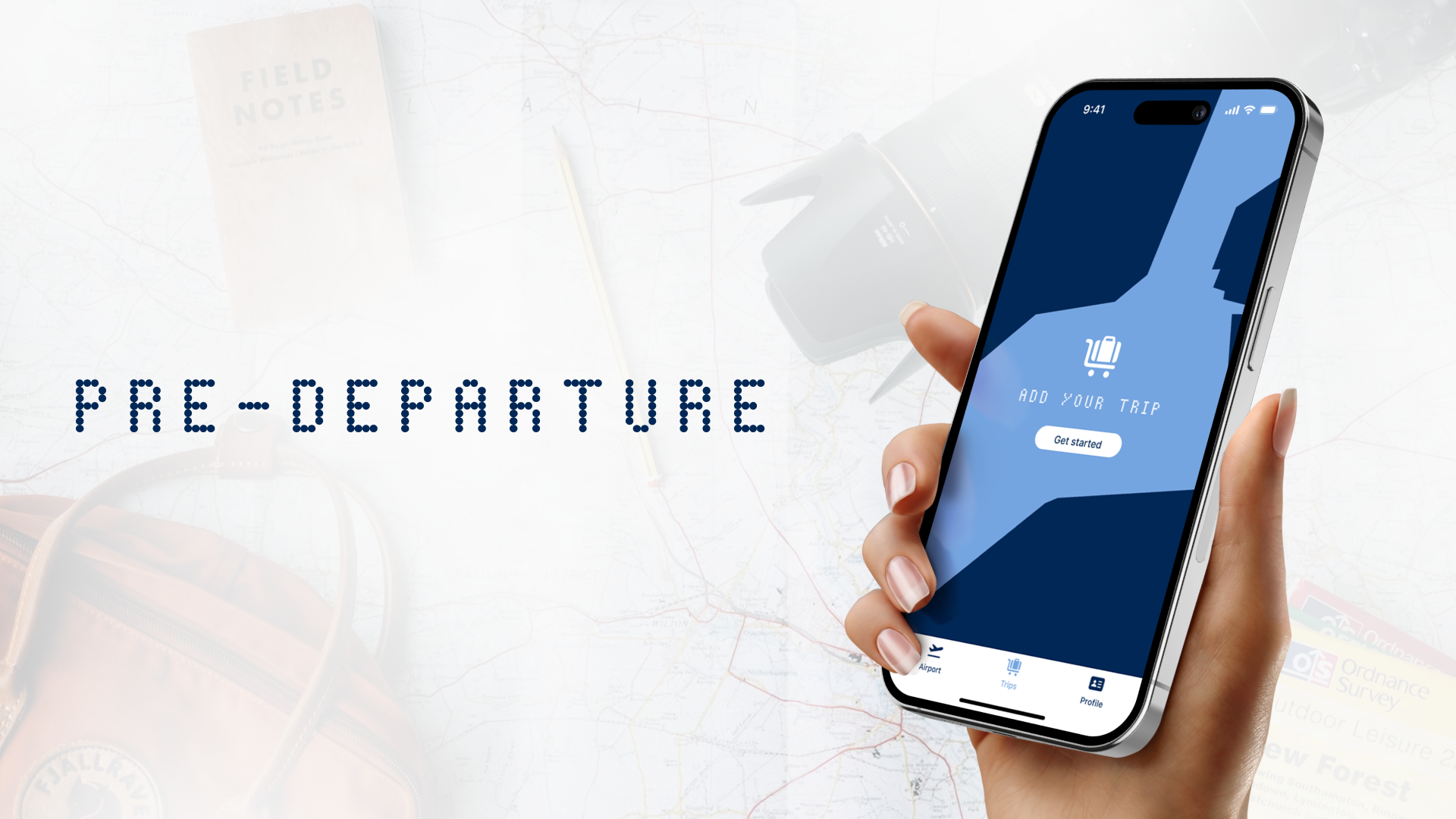
As evident from the persona and user journey, the current airport experience can lead to stressful situations. These initial sketches show how AirGuide aims to assist throughout the three stages of the airport experience: pre-departure, at the airport, and at the destination.
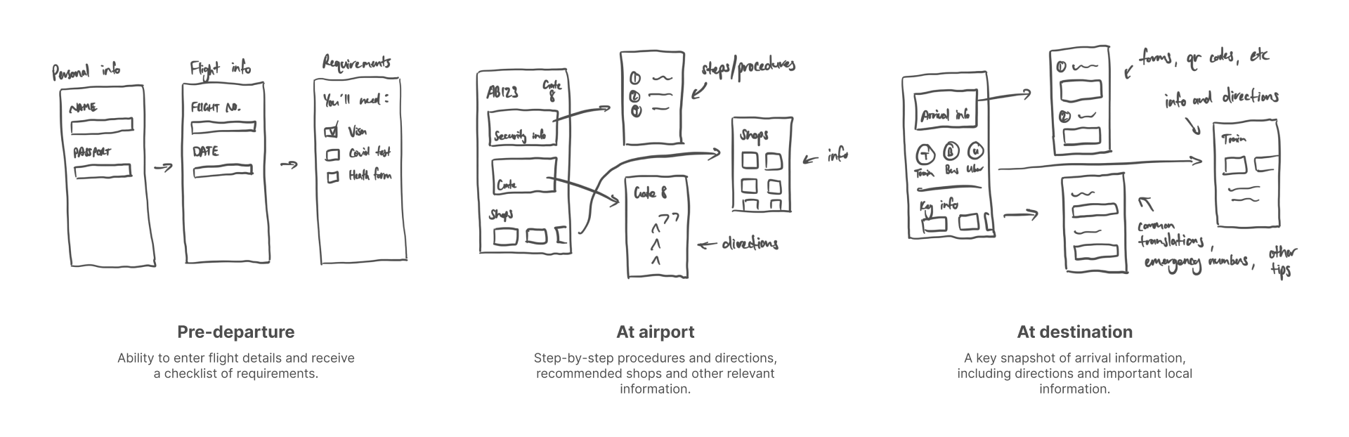
WIREFRAMES
Initial wireframes showing the basic user flow of AirGuide.
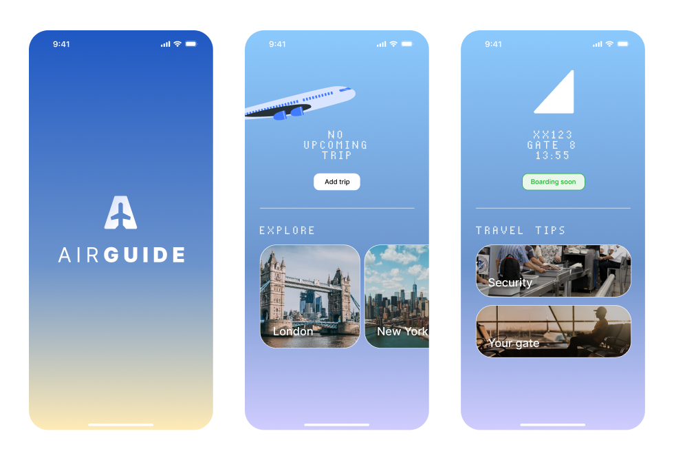
ITERATION 1
The first iteration of screens featured a gradient background, referencing the view of the sky outside of an aeroplane window. The selected hues of blue, purple and yellow offer a calming appearance. Feedback was positive, but the look was also reminiscent of many generic designs, so it was necessary to explore further directions.
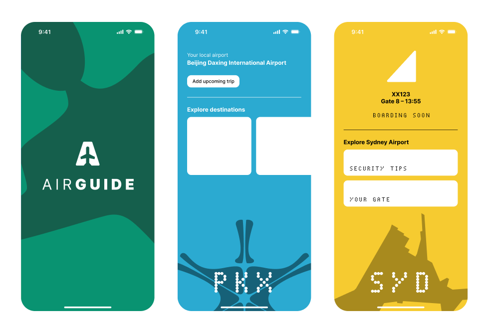
ITERATION 2
The Airport Marks were introduced and bright colours were used to stand out in a striking way However, peer feedback suggested that the colours seem mismatched to airports and looked aggressive.
ITERATION 3
Following user testing, iterations 1 and 2 were merged together. The gradient colours were applied to the Airport Marks and an extra animation was created to show the shape zooming out, making it more clear that they were an integral part of the wayfinding and app experience.
ITERATION 4
The fourth iteration finalised the concept of using the environmental colours of each airport to form the theme of the app.
ITERATION 5
Further refinements were made to ensure the design was visually cohesive, including tweaking clashing colours and ensuring clarity of information.
COLLABORATION & USER TESTING
Through peer collaboration at every stage, it was ensured that each app screen was easy to understand before commencing detailed prototyping in Figma.
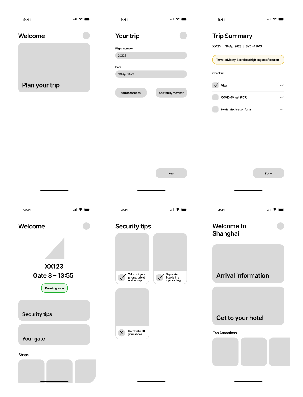
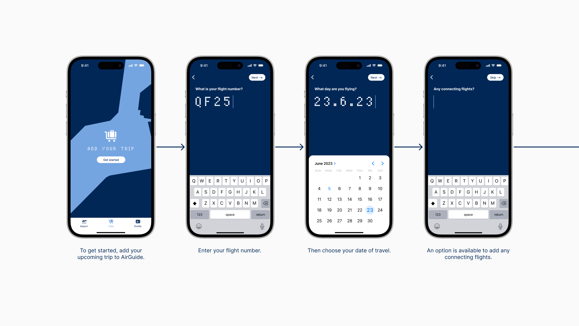
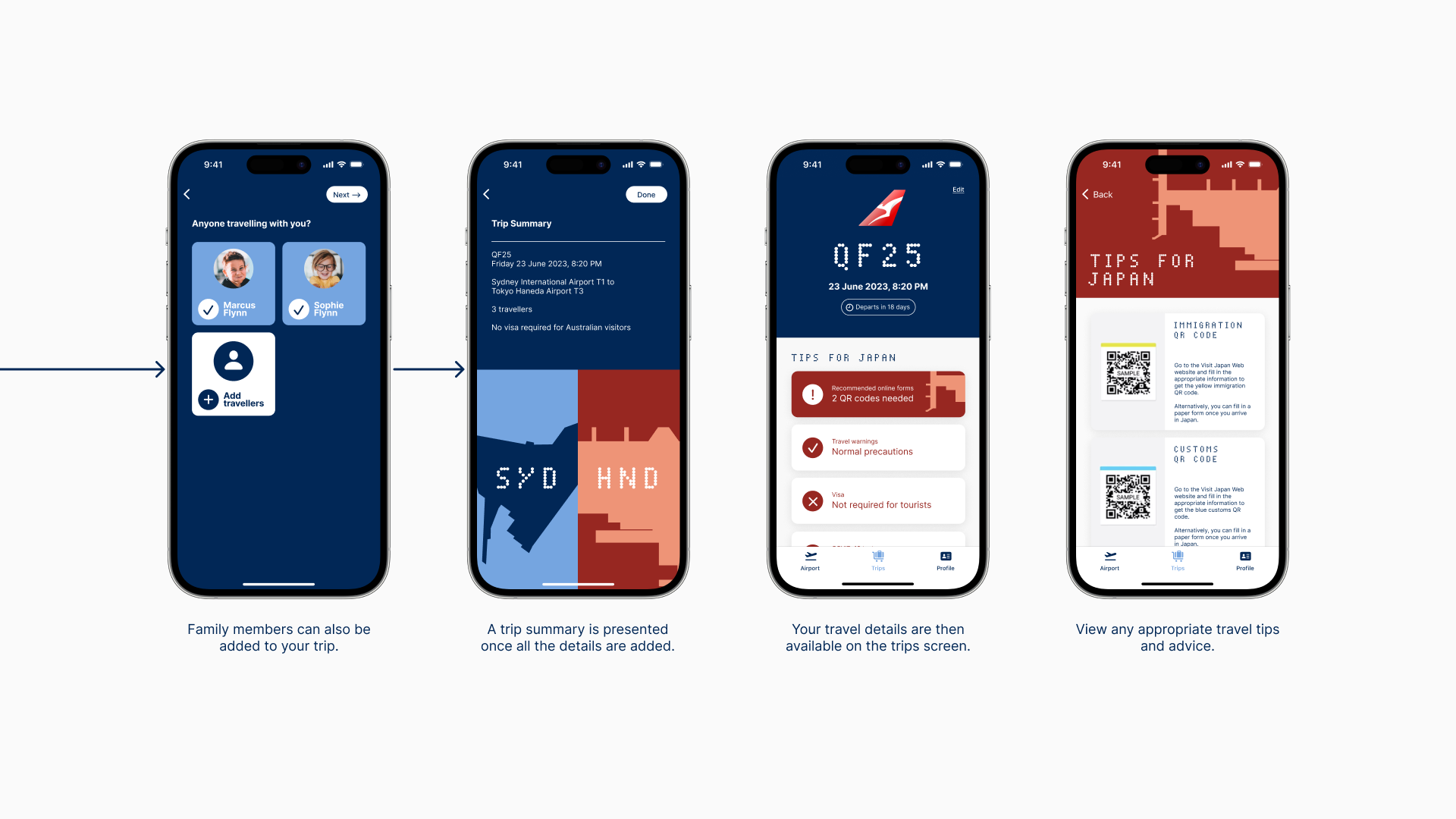
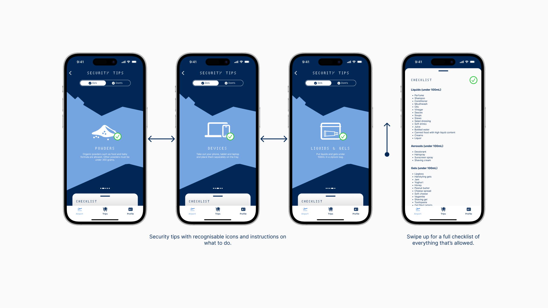
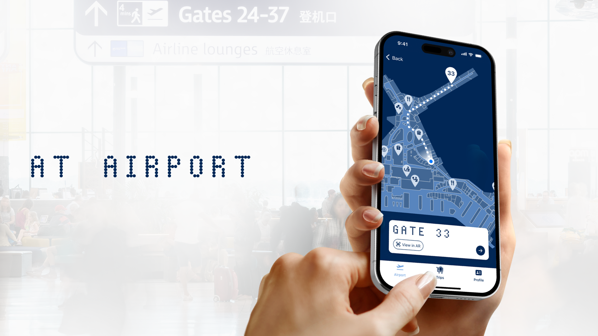
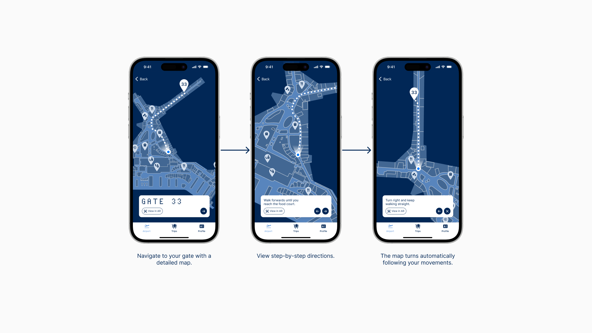
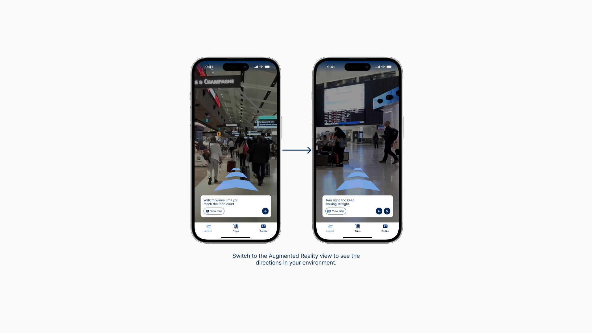
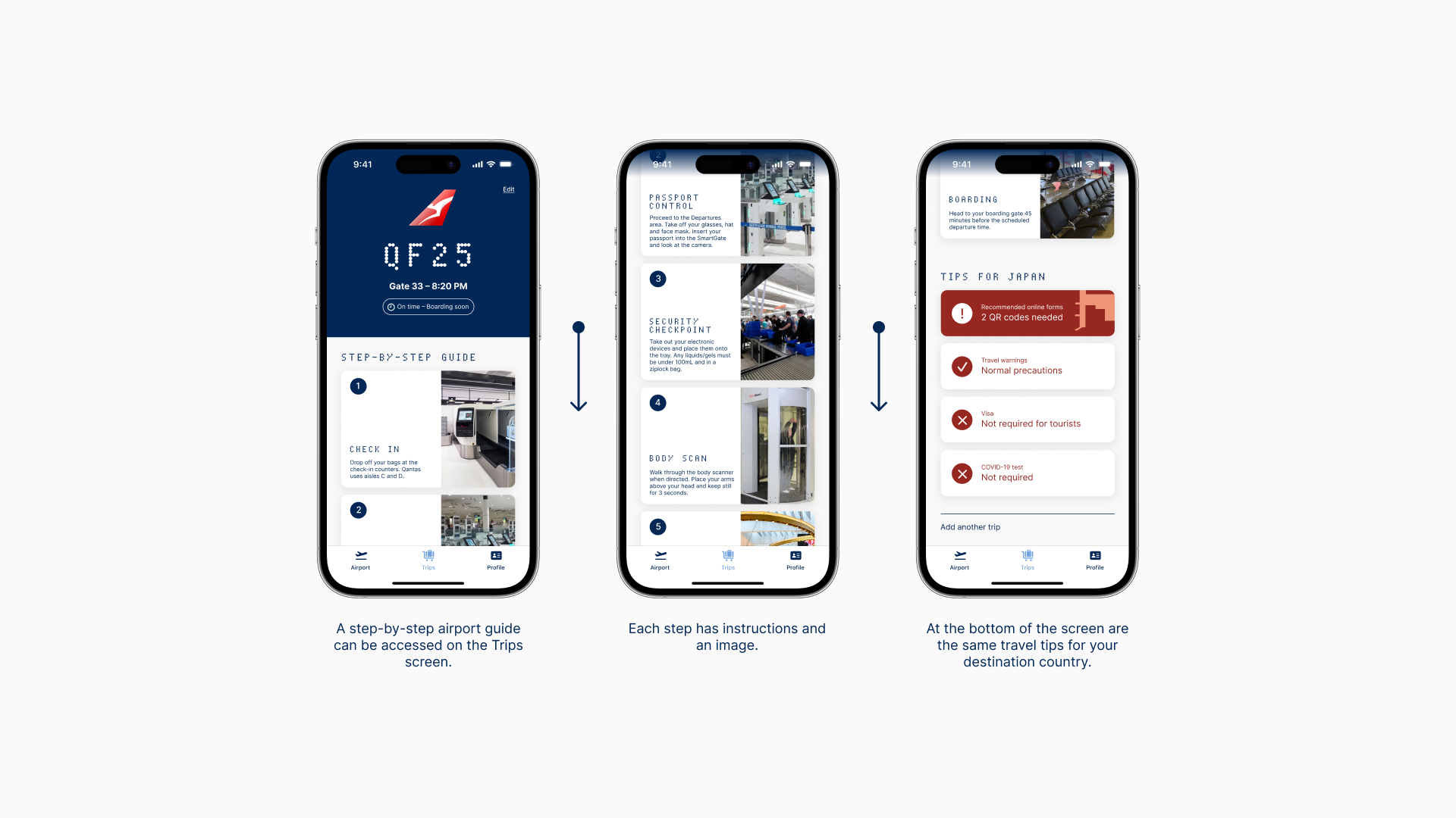
THE APP
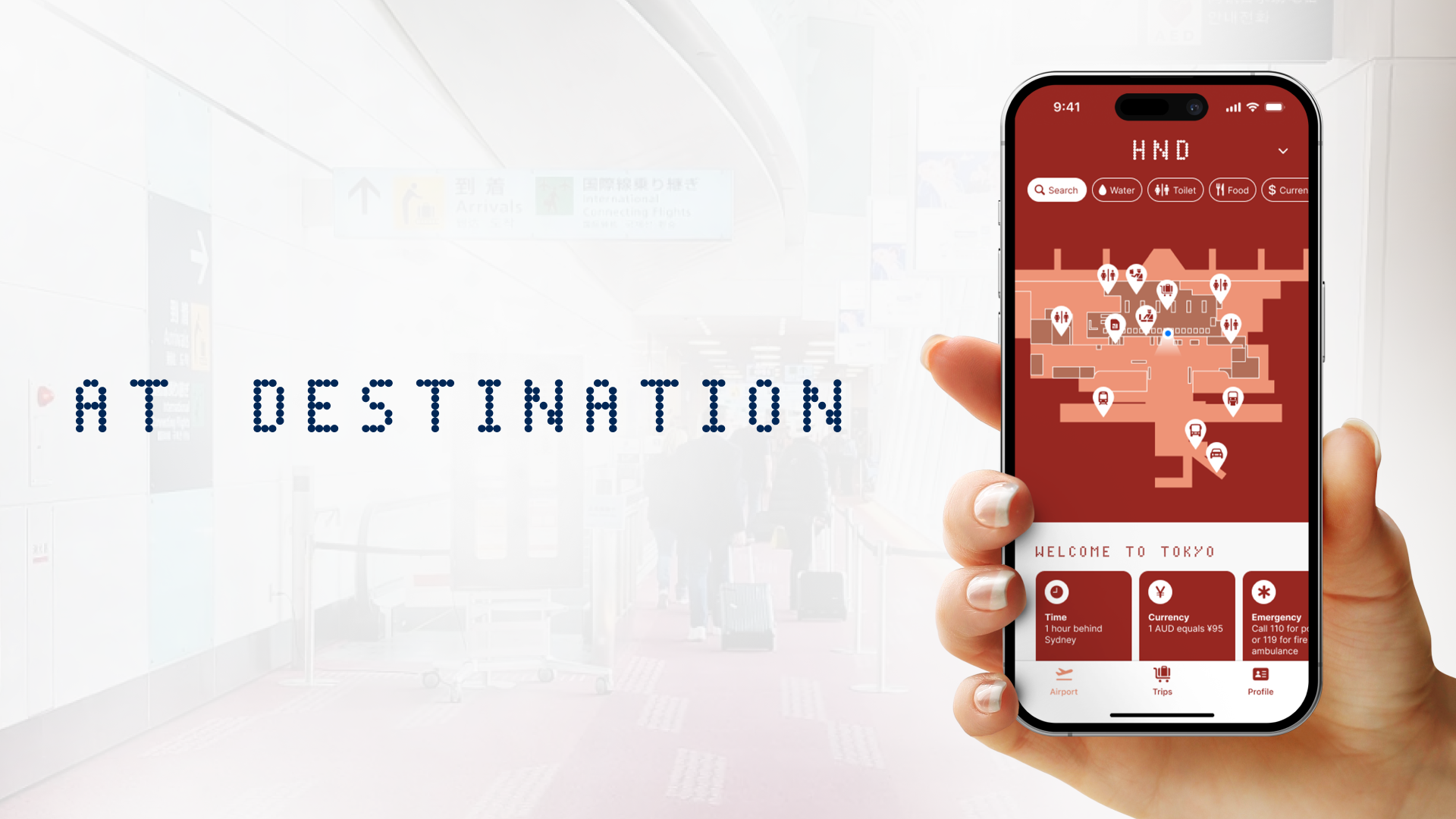
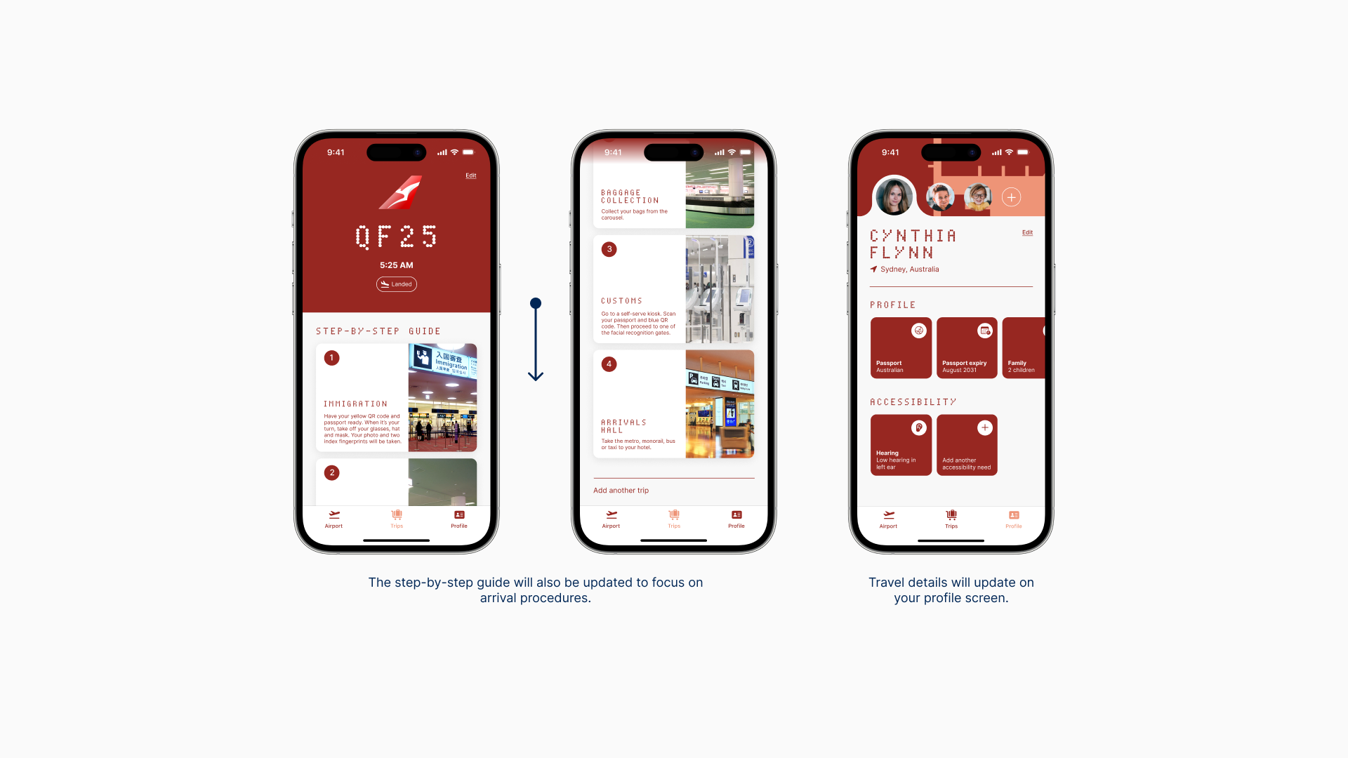
The airport journey can be broken down into three stages: pre-departure, at the airport, and at the destination, and AirGuide will assist at each stage.
USER FLOW
The user flow at all three stages shows how the user moves through the functions and screens of the app.
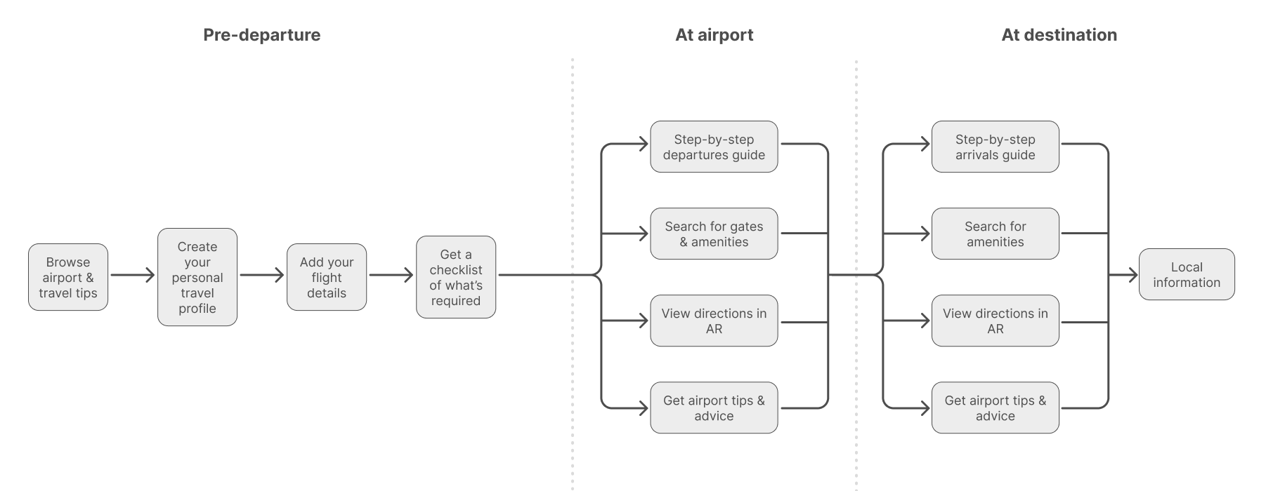
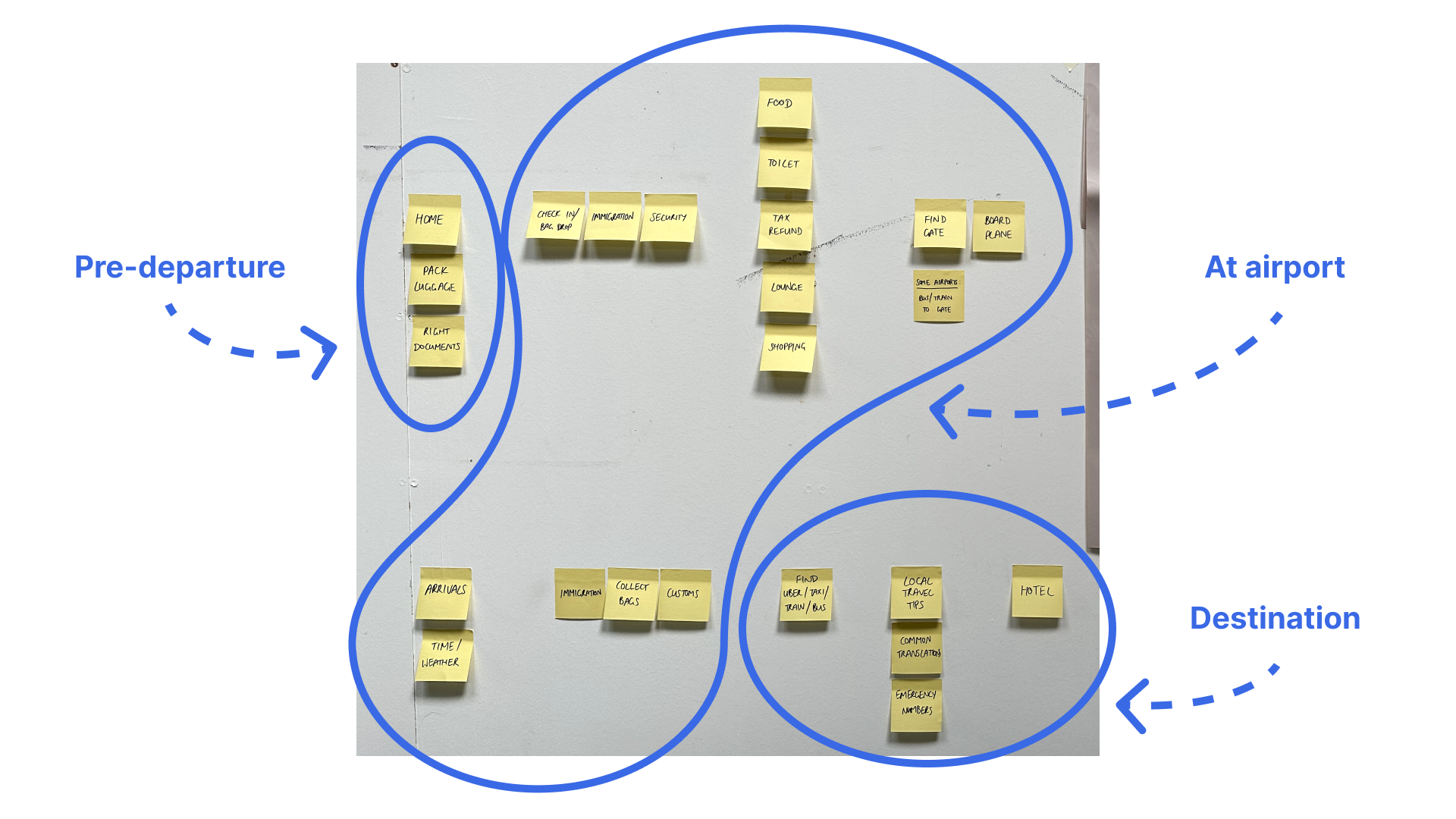
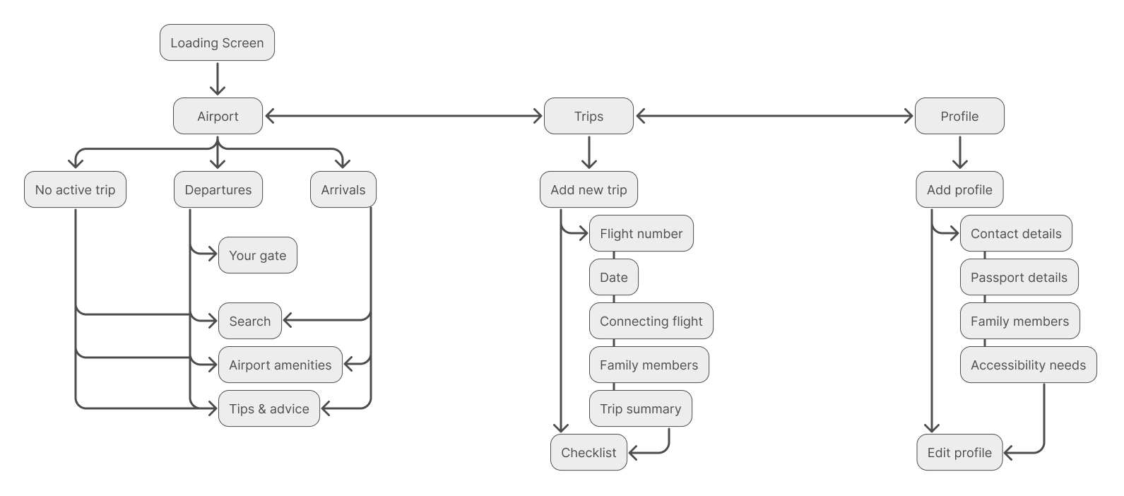
INFORMATION ARCHITECTURE
This diagram shows the hierarchy of key screens within the user flow, and the overall layout of the app.
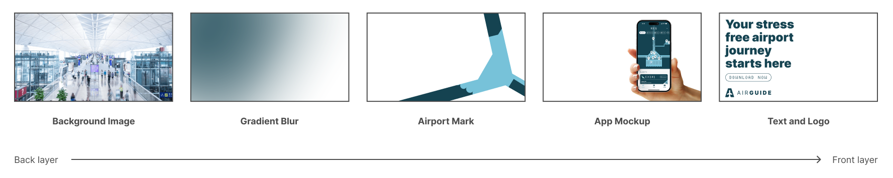
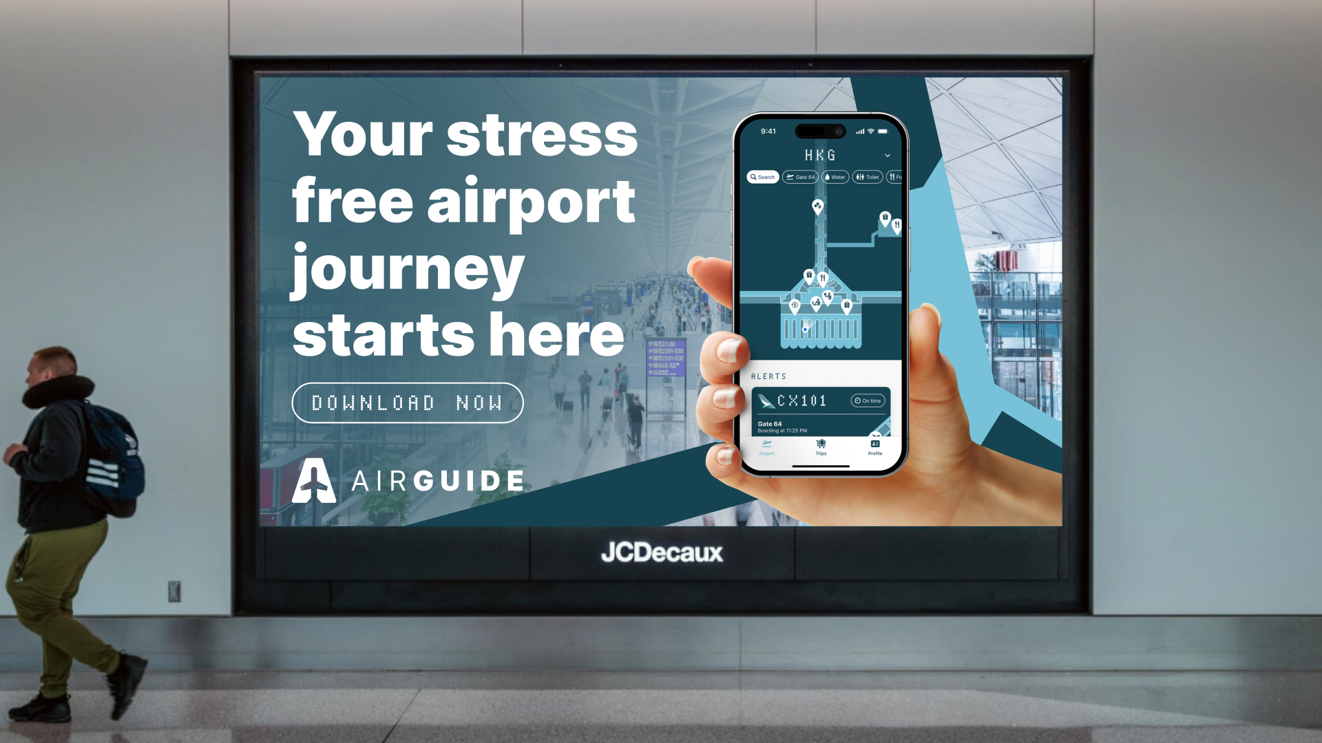
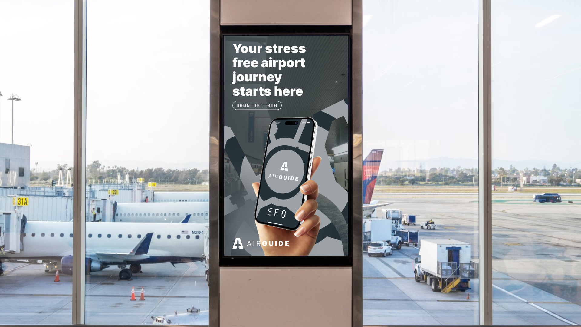
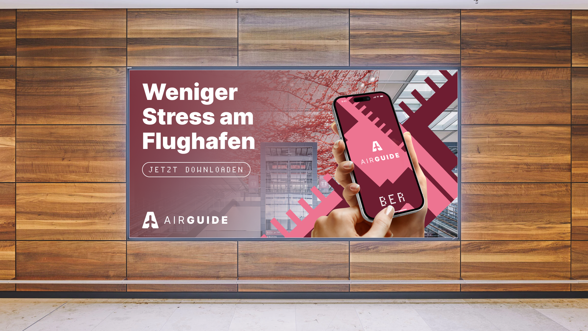
THE CAMPAIGN
A media campaign with both digital and physical touchpoints will be used to promote AirGuide and get people to download the app.
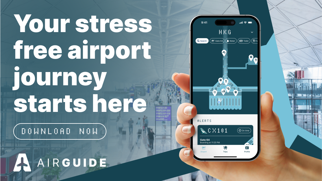
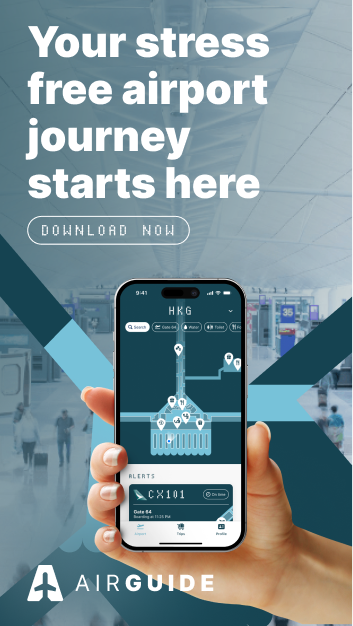
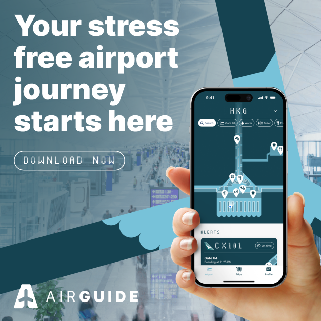
Each graphic consists of 5 layers that can be dynamically adjusted to suit each airport. Different screens and text can also be shown.
CONCLUSION
This project has been a monumental achievement and it is reassuring to look back at the past two terms of work and see it all come to fruition.
AirGuide represents a clear synthesis of everything that I’ve learnt in the past four years of university, culminating in a professional and refined design outcome and prototype.